Picture Postcard Workflow: Some simple channel blending strategies
Channel blending: what is it?
Channel blending is step two of the Picture Postcard Workflow. It is a technique that had me stumped for quite a while, even though I already learned about it before I had even heard of the PPW. In my PPW overview, I wrote: channel blending feels like black magic. To some extent, this is still the case, but I am getting the hang of it.
Dan Margulis first presented the method – at least in a book – in his Professional Photoshop 6 Color Correction of 2001. Chapter 16 of that book proudly starts with the line “Introducing a new technique!”
It is a variation of the plate blending technique that has been around even longer. The main differences between the two are that (1) plate blending was designed to work in CMYK (channel blending usually in RGB), and (2) channel blending – contrary to plate blending - is supposed to be done on a luminosity layer. However, these differences involve execution only. The underlying technique is the same.
The basic idea of channel blending is to improve an image’s contrast by:
- examining the strengths and weaknesses of its channels
- carefully replacing weaker channels by stronger ones
- restricting the result to luminosity only, to avoid color shifts
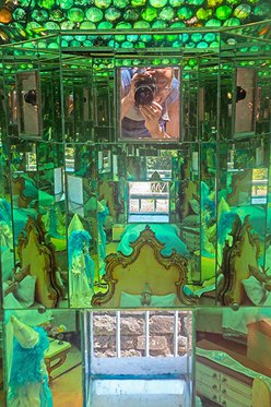
Parco di Pinocchio
Simple as this may seem, execution is often not so easy. To make things even more complicated, the step is followed by the (more tradional) curving for contrast, which roughly has the same goal of enhancing contrast on a per-channel basis. The PPW instructions allow these two steps to be, well, blended. Why not start with a curve on the green channel, and use the result for blending, something like that.
All in all, the retoucher is confronted with a number of questions to be answered:
- How to distinguish “strong” from “weak” channels?
- How to decide whether to curve first, or blend first?
- What to do when unwanted side-effects occur?
First, let me emphasize that channel blending, maybe more than any other PPW step, asks for creativity. There is often no right or wrong. Any two runs may give significantly different, but equally good, results. As such, it fits nicely in the philosophy of the workflow. It may pay to try different strategies and find out which way works best (or even blend the results).
Yet, over time I have learned that some basic strategies exist that often work for some general image types. Below, I elaborate some of these types and the corresponding strategies.
Category 1: Images consisting of one (subdued) color
See figure 1 below for a typical specimen. Other examples are flower macros, skies, portraits and abstract work.
Figure 1. Original image
It is my experience that in a good majority of these images, one channel is significantly better than the others. A simple strategy is then to use that channel as the blend source. See figure 2 for the three channels of our example image.
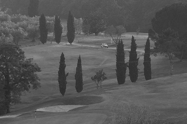
Figure 2. Red, green and blue channels of the image of fig.1.
Note how the red is clearly better than the others, at least in the most important areas like the meadow area and the foliage.
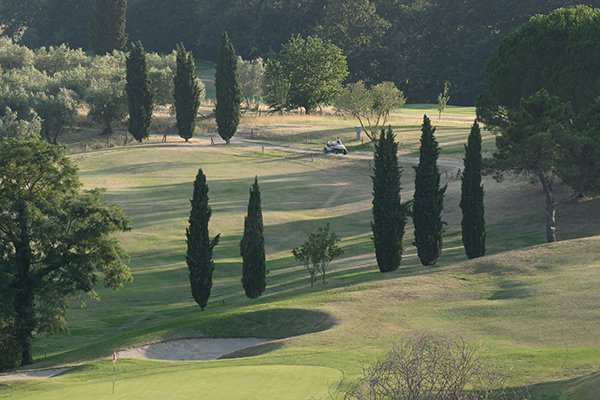
Figure 3. Result of using the red channel's luminosity on the example image
Figure 3 shows the result of putting the red channel in Luminosity mode on top of the image. The contrast benefit is obvious. Of course, much is left to do. The color seems to have weakened a bit, but the PPW’s later stages cope with that. Also, range is not full yet. But for a simple step, the blend is quite effective.
Some remarks worth mentioning.
- Be aware that the less color the original has, the less effective any blend will be. After all, less color means less difference between the channels.
- As we use only one channel, it doesn’t matter whether we curve first or blend first.
- Take care that no unwanted luminosity shifts occur. In our example image, this is the case with the small red flag in the foreground. In the red channel, it is very light. Hence it turns from dark red to pink. See figure 4.
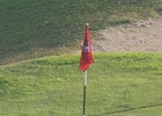

Figure 4. Small area before and after
For a small area like this, it’s best to mask it out. If this happens to large areas, we had chosen the wrong strategy: the image falls in a different category.
Category 2: Images consisting of one (saturated) color
The idea here is the same as in the previous paragraph. One channel is usually better than the others, but it may be too light or too dark to be used straight away (like in the first category). For very saturated colors, the differences between channels tend to be very high: some channels are very dark, some very light. One may be in doubt whether to use channel blending at all (as I have been many times).
The strategy here is to use the one channel that provides the best contrast despite the strong luminosity shift, but in a lower opacity. Afterwards, the whole image can be lightened or darkened if necessary.
Figure 5. Original image, plus red, green and blue channels
See figure 5 for an example, with the three channels shown next to it. Clearly, the blue has the strongest contrast. In fact, way too strong, but using its luminosity for 50% gives a good boost. See figure 6. This version clearly has a lot better contrast, but it’s still too dark. A simple curve is good enough to correct that without eliminating the benefit of the blend. See figure 7 for the curve and the resulting image.
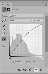

Figure 6. Using 50% of the the blue
Figure 7. The curve and applied to fig.6
Note how better the contrast is in figure 7. The wood structure has gotten an almost 3D-effect. If you are not convinced, see figure 8 for a comparison of some small detail.
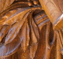
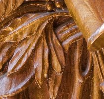
Figure 8. Detail before and after
One remark:
- Starting with a lightening curve on the blue channel, and then using it for a luminosity blend gives a similar result.
Category 3: Images consisting of two colors
This sounds easily recognizable: images consisting of two colors, but it’s not. I found that out when I searched for a typical example. The idea is that the image areas of both colors are in sore need of better contrast, and that such improvement of contrast cannot be accomplished by simple curves on the individual channels.

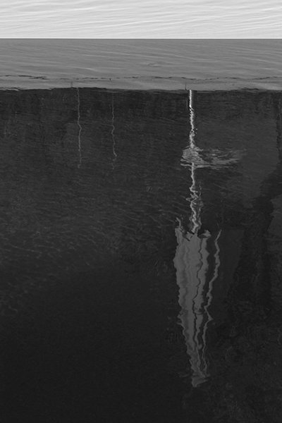
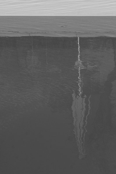
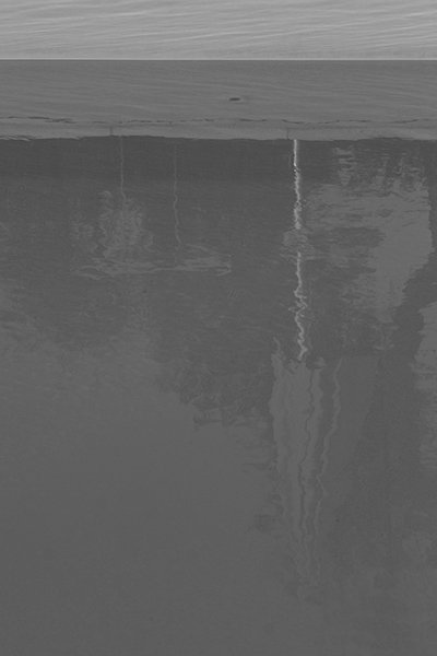
Figure 9. Original image, plus red, green and blue channels
See figure 9 for an example. We recognize two colors: a greenish dark blue and a light brown. Obviously, the blue area is most important, but it’s pretty dark and way too flat. Enhancing it by a set of curves while not blowing out the top light brown area is hard.
Have a look at the three channels of the original. Our strategy is that we search for the channel that shows the least luminance difference between the two colors of our image. In other words: the channel that brings the two colors closest to each other. In our example, it’s the blue. The blue channel has the flattest appearance, but don’t be misled by that. The idea is that it’s the best basis for effective curving afterwards.
Add a copy of the blue channel above the original and set layer mode to Luminosity. The result is so flat that it’s an easy prey for a powerful curve, bringing out lots of detail without blowing out anything.
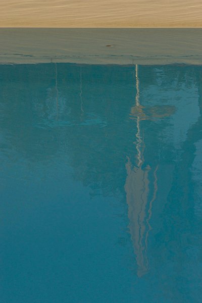
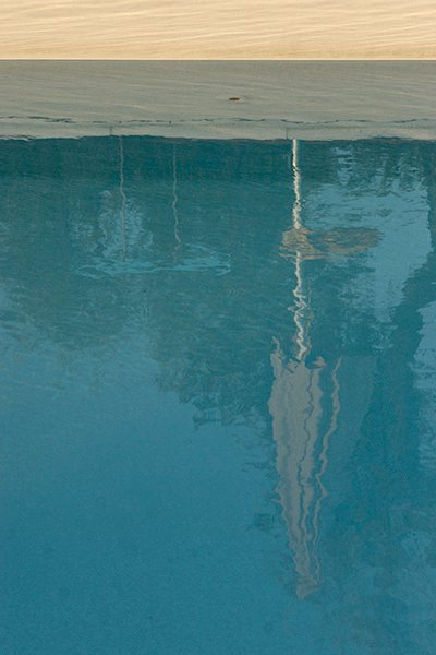
Figure 10. The blue channel applied
Figure 11. Curve (applied in luminosity) and resulting image
See figures 10 and 11 for what happens. (Contrast is so strengthened that a bunch of sensor spots bottom left, practically invisible in the original, stick out at once.)
Again, let me make some remarks.
- The procedure is not very effective when one of the colors is a flat area that doesn’t profit from more contrast. The obvious example is a bright blue sky – it may get darker and more noisy, but usually not much better.
- The main goal of the blend here is to prepare for an effective curve. If no channel provides the flatness that we search, try blending at a lower opacity; or alternatively, try mixing two channels.
- In the Modern Color Workflow book, Margulis presents an example where this procedure may apply: the flower example in chapter 4 (postcard 4.7). Margulis takes a different route there, but the above (simpler) strategy works as well.
Category 4: Images containing many distinct colors
The advice here is to not blend at all. I tried a good number of images that fall in this category, and never found a benificial blend. Whatever blend you try, some colors get darker, some lighter. Some areas improve, some worsen. If some sort of masking would help, fine, but there is always a risk of missing a crucial element and ruin the image.
Working with very saturated colors makes things even worse. A bright color is always dark in some channel and light in another. Any blend will make those bright colors considerably darker or lighter, usually unacceptable.
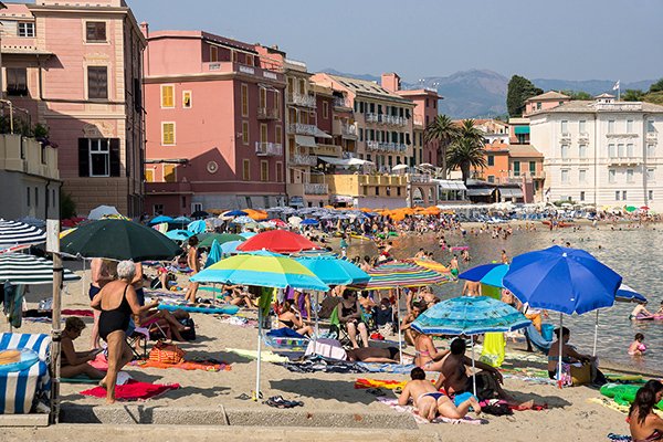
Figure 12. Original image
As an example, look at figure 12. Many bright colors in the parasols and bath towels. I tried three blends: once for each of red, green and blue, each in 50% to dampen the effect. See figure 13 for the results.

Figure 13. Red, green and blue applied in 50% on figure 12.
All three unacceptable if you ask me. The best version might be the middle one (green), but look at the red towel bottom left. More importantly, neither blend does much good to the image.
Final words
The above categories are really the simple cases. Likewise, my accompanying recommendations are simple applications of the channel blending technique. Most photographs cannot be categorized as easily as I did above. The conclusion must be (and is!) that for most photographs, finding an effective channel blend is not straightforward.
But the above ideas can function as a starting point for more complex blends. Understanding how simple examples can be handled may help to succeed in difficult cases. To some extent, of course. Because in the end, only creativity rules.
Margulis, in the example images in his books, goes way further than what I showed here. Blending in Darken or Lighten mode, blending one channel into another, multiple blending steps applied consecutively, multiple blending steps intermixed with multiple curving steps, etc. etc. Go read his work to see what I mean, but don’t tell me I didn’t warn you. It’s difficult stuff.
Gerald Bakker, 7 May 2016
Picture Postcard Workflow