Picture Postcard Workflow: Color by the Numbers compared with other methods
Color Correction by the Numbers
Color correction by the Numbers is step one of the Picture Postcard Workflow. It is very adequately explained in chapter 3 of Dan Margulis' Modern Color Workflow book. The retoucher is supposed to assess color by sampling and checking color values and if necessary, correct by a set of RGB curves.
The workflow summaries call it "Kill incorrect color with RGB curves" (pg. 338) and "Correct initial color problems" (pg. 439). None of these says anything about numbers, and rightly so. The "numbers" aspect is only a way towards the goal: removing a cast.
If retouchers prefer their own method of getting rid of a cast, with or without invoking numbers, fine. They can apply whatever they like and then follow the rest of the workflow.
Everyone would agree that a color cast is undesirable and must be corrected for optimal results. Many websites exist that explain how to do that and, like all Photoshop techniques, many different methods are recommended. In the current article, I will briefly give my comments to some of these methods and compare them to the "by the numbers" approach.
First, the theory. I present a number of statements that I find essential on the subject.
The Theory
1. People cannot trust their eyes to accurately judge color correctness.
This is something every serious retoucher agrees with. The fact is that our brain unconsciously corrects color casts in almost any environment. Shadow areas in sunlit scenes have a blue tint. I know this, I have often seen it in photographs, yet I fail to see it in the real world.
This automatic correction process is very effective, and also plays when looking at a photograph, although less so, because we can see a photograph in its environment. Yet, work some time with a photograph, and you get accustomed to its colors and lose awareness of a cast.
2. It is NOT possible to properly color correct an image without looking at, and understanding its contents
A simple example may illustrate this point.
Imagine a photo of a dress. Just a dress, nothing else. We don't know how the dress looks in reality, and we don't know under which circumstances it has been photographed. See figure 1.
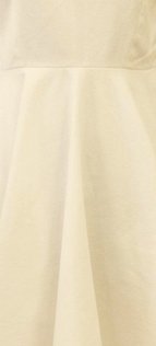
Figure 1
Can you know if the photo has correct colors? Obviously not. On the photo, it is light yellow. But whether it is light yellow in reality, or white but illuminated by yellow light and photographed with an incorrect white balance, we can't know.
Is there any Photoshop action, plug-in or tutorial that can successfully color correct this photograph? Obviously not. We can try, and such action will probably judge the image too yellow, take that for a cast and whiten the dress. Fine, but we don't know if the colors have improved or worsened.
Now imagine a photo of the same dress, but now it contains a piece of skin of the person wearing it. Can you know if it has a cast? Well, to some extent you can, provided that you roughly know the color of skin. If the skin on the photo looks too yellow, then the dress is probably too yellow too and we can correct for that. If it has a proper skin color then the color of the dress will probably be correct as well. But this reasoning only holds because we recognize the skin as skin.
A tutorial that doesn't take the presence of skin into account can never make this analysis. It will still judge the photograph by its dominating color, find out that it's very yellow and try to counter that.
3. One image can have multiple different casts
This is a nasty situation, but it happens. Differently colored light sources illuminate the scene to be photographed. Yellow light from the ceiling mixed with bluish light from a window. Very annoying and often hard to correct.
A more common situation is a sunlit landscape. Sunlit parts usually have a neutral or slightly warm white balance. Shadow however can have a pretty strong blue cast.
Color correcting such situations is often not possible without extensive masking. However, it always helps if we recognize a situation like this to choose an appropriate strategy: either spend a lot of time to get it really good, or go for a compromise, choose a clever curve and be done.
Alternative methods
Interestingly, many tutorials exist on the web that teach how to correct a color cast in a myriad of different ways. Below I shortly list a few of them:
- Average the color of the image and assume the result a cast that must be corrected
- Use Image: Adjustments: Match Color from the Photoshop menu and click the Neutralize box
- Use Image: Auto Color from the Photoshop menu
- Sample a pixel that has the color of the cast, and correct for that
- Use Image: Adjustments: Photo Filter and choose an appropriate color to neutralize the image
- Set correct white and black points on each of the R, G and B channels
- Choose an area that must be neutral and click the grey point sampler of the Curves dialog
- Use a grey card
Before going through each of these methods, I show an example photograph, see figure 2. This image was taken at the end of a summer afternoon, in the shade of a house. But more importantly, the camera was set on an incorrect white balance, I assume Tungsten. The cast is obvious here, but which color and how much exactly?
Let's see how well the various methods perform.
Figure 2. Original image

Figure 3. Result of method 1

Figure 4. Result of method 2
1. Average the color of the image and assume the result a cast that must be corrected
Method 1 prescribes that we copy the background layer, do Blur - Average, invert the result, set the layer mode to Color and then reduce opacity to taste. Usually around 40-50% opacity does the work. Note that the result also dulls the color considerably, see figure 3. The pitfall is that the method assumes the average color of a correct image to be neutral, i.e. some shade of grey. This is obviously an incorrect assumption for many images. Applying this method then worsens the hues, no matter which opacity is chosen. The cast is determined without taking the image contents into account, which means that it can't be accurate. Bottom line: it disobeys statement 2.
2. Use Image: Adjustments: Match Color from the Photoshop menu and click the Neutralize box
Method 2 is an automatic method. Copy the background layer, Image - Adjustments - Match Color and click the Neutralize button. I don't know exactly how it works, but it seems to do a reasonable job many times. See figure 4. But it has the same shortcoming of the previous method. There is no user input, and a correct image with one dominant color is incorrectly neutralized. Additionally, this method is unable to handle multiple casts in any way. In short: a sin against statements 2 and 3.
Figure 5. Result of method 3
Figure 6. Result of method 4
3. Use Image: Auto Color from the Photoshop menu
Method 3 is in the same area. Auto color does nothing more than find a highlight, shadow and midpoint, and adjust channels accordingly. An image with correct color can be messed up by this, and an image with a severe cast but correct target points will not be adjusted at all. Similarly to number 2, this method does not follow statements 2 and 3. It doesn't consider image content, and it cannot handle multiple casts.
4. Sample a pixel that has the color of the cast, and correct for that
Method 4 is similar to method 1, but instead of averaging an image to find the color deviation, here the retoucher is supposed to find it. This is both a strong and a weak point of the method. The instruction "Sample a pixel that has the color of the cast" requires one to actually look at and judge an image. However, it also assumes an ability to correctly find such pixel, which is questionable. In short: this method disobeys statement 1.
Figure 7. Result of method 5
Figure 8. Result of method 6
5. Use Image: Adjustments: Photo Filter and choose an appropriate color to neutralize the image
Method 5 is similar to method 1. Again the retoucher is supposed to somehow find a neutralizing color, and then use that in the Photo Filter adjustment. This may be pretty effective, but it has the same shortcoming as the previous method. How is someone supposed to find the correct color to apply? An approximation, sure, but not more. Statement 1 is neglected. See figure 7 for the result.
6. Set correct white and black points on each of the R, G and B channels
Method 6 usually works for small casts, but there is no guarantee. The idea is to find lightest and darkest points, and make sure they have fixed RGB values like 250,250,250 and 5,5,5 resp. This guarantees full range, but not correct color. See figure 8. It is similar to method 3, except that highlight and shadow points can be chosen by the user instead of by a computer. This is definitely better, but not good enough as it still does not take any image content into account apart from the lightest and darkest points. Additionally, this method cannot handle multiple casts because it always works on the full image. In short, statements 2 and 3 are not met.
Figure 9. Result of method 7
Figure 10. Result of method 8
7. Choose an area that must be neutral and click the grey point sampler of the Curves dialog
Method 7 is often recommended in combination with method 6. Find correct light and dark point to get full range, then correct cast by setting one neutral point. This may work pretty well, but it has an important flaw. The user is supposed to pick one neutral point. This may be not available. Many of my landscape images do not contain neutrals. Unfortunately, there is no instruction how to handle those cases.
Our example image does have a candidate: the background wall. See figure 9. But neutrality here is an assumption, we cannot be sure from the photo alone.
8. Use a grey card
Method 8 is obviously very good. However, it makes a demand on the shot taken. Given an image to retouch, we don't always have an equivalent image taken with grey card. Also, I feel that grey cards are optimally used in studio situations where the light is highly controllable. In outdoor situations it's simply not always possible to employ one.
What about the "by the numbers" method?
So, coming back to the PPW, step 1. Dan Margulis strongly advocates a correction "by the numbers".
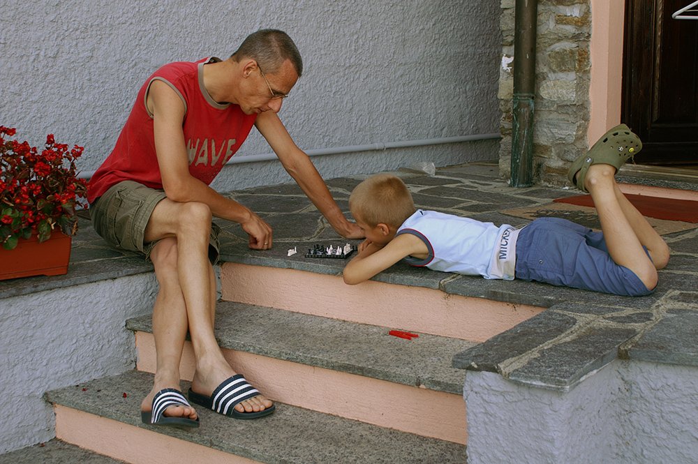
Figure 11. Correction "by the numbers"
Highly summarized, the idea is to:
- Carefully look at the image. Does it contain areas about which we can make certain assumptions concerning the relation between R, G and B values? Or alternatively, if you are fluent in LAB, the values of A and B?
- If so, then sample colors on those areas. Do not be too modest: the more samples, the better we can correct.
- If the samples indicate correct values, then we're done. Otherwise, depending on where the deviation is found (too much blue, not enough red, etc.) a set of RGB curves may do the job.
Not just in theory, but also in the practice of my example image, this method is better than all above alternatives, except possibly for the grey card option, if only I would have had it available. All three statements are covered. It forces one to actually look at the image and act on its contents. It doesn't rely on the human eye to judge color correctness. And to some extent it can handle multiple casts, although it is usually not possible to correct different casts in one set of curves.
The method is also the most difficult one. It requires discipline and sometimes perseverance. It cannot be automated. But who cares about a little more work if the results are better? At least, I don't. Since I learned this method, I always use it to correct color.
Gerald Bakker, 16 March 2015
Picture Postcard Workflow