Picture Postcard Workflow - My Connection
-- why I like Dan Margulis' books, his methods and the Picture Postcard Workflow
How it began
For years I am wondering why my prints always look different from what I see on the monitor. That is, prints on my own cheap, small, old inkjet printer. Prints that I order from a photo lab are usually very good.
But occasionally I want a quick print, so I trigger my good old Canon photo printer and load it with a sheet of photo paper. Alas, the resulting quality is always subpar. Flat colors and a greenish cast. Many times I tried to compensate for that, increased saturation and made my images a bit redder or pinker before sending them to the printer. That failed miserably. Settings that go well for one image ruin another.
I learned that color management, as this process of matching colors is called, is a difficult thing. What I needed was a good book, I thought. So I navigated to amazon.com and started to search. Lots of books came along; one especially caught my attention. Reviews told me that this book was "not easy" but "well worth the read", that it would open a whole new world for me, and that I would have to read it several times before understanding everything. I clicked "Look inside" and read the first few pages. My enthousiasm kept growing. A treatise about why one version of an image is better than another, not philosophical but very common-sense. How about the following sentence: "The next five hundred pages will try to help you (...) to detect problems that need to be fixed, and to identify the appropriate technique to get rid of them."
How could one resist such a book?
I gave in and clicked "Buy now".
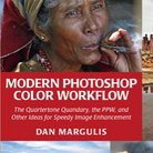
The title of that book was "Professional Photoshop: The Classic Guide to Color Correction (5th Edition)" written by Dan Margulis. The date was August 2012.
A whole new world
To say that I was blown away by this book is an understatement. It put everything I had learned about image correction upside down. Until then, image correction for me was mostly selecting an area to make it lighter, darker, less or more saturated, and additionally, clone away unwanted image elements. This new book learned me a complete different way of working. Use curves instead of levels. Sample RGB numbers (!) to check color accuracy. Examine channels for masking and to enhance contrast. Move to a different color space for better sharpening. And so on and so on. Really, a whole new world. It was so captivating that I forgot about my color management quest.
Let me pause for a moment and ask myself why I was so impressed by this book. Apart from the fact that it is really good (just read the reviews for that), it also seems to give a better match with my skills and interests than other Photoshop books.
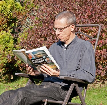
Figure 1. Reading my first Margulis book.
- First, there's the by-the-numbers approach. I have a background in mathematics, so I am not afraid of numbers at all.
But more importantly, I really believe in Margulis' assumption that most people cannot effectively assess a color cast just by looking at an image. Maybe visual artists are trained well enough for this, and maybe that's why most books and websites pay so little attention to this. For me, by-the-numbers is the only way that really works. - Second, the use of channels for masking. Good masks are a must in image retouching. Most Photoshop books tell you to make them by either starting with a good selection or by painting on a layer mask with an appropriate brush. Margulis on the contrary teaches to examine channels and use these for effective masking. If necessary, pick a channel from a different color space, combine multiple channels or invert them - or a combination of these. For me, making an accurate selection always caused me headaches (and still does), so this approach suits me a lot better.
- Third, everything is explained. Margulis rarely tells you to apply some procedure, action, etc. without explaining why. I love that. Not just did I learn new techniques, I picked up a lot of theory as well. Again, this is quite a rarity in the world of Photoshop books, but extremely helpful at the same time. How can you make a deliberate decision about an image enhancement step if you don't understand what you're doing?
Another book
Not long after I finished reading Professional Photoshop and started to apply his techniques on my own images, I heard that Margulis was writing a new book. "Modern Photoshop Color Workflow" was the title this time, with full emphasis on image enhancement. Needless to say, I was excited. As soon as the book came out, May 2013, I bought it.
The same virtues that I listed above apply to this book. But there are at least two more:
- A full color correction workflow. Not bits and parts that I could apply to some images, but one structured approach that works for every image.
- And last but no least, speed. I love to retouch my photographs, but it's an easy choice between a good result in 3 minutes and a good result in 30 minutes...
The Professional Photoshop book learned me a lot of things, but not all was useful for my everyday image processing. In the Modern Color Workflow book however, everything was useful. Right after I finished reading the book, I downloaded the PPW panel that supports the workflow and started to practice. The panel invites to experiment, just like the workflow itself. It took a while before I became fluent, and there is still much to learn. But the results were immediately apparent. See figure 2 for an example. Left: the original. Middle: a 2010 correction. Right: a correction with the new workflow.

Figure 2. An original image

The correction I did in 2010

A new correction using the PPW
The panel and the programmer
The PPW panel itself became an object of study and experimentation for me. I wanted to know more and started to unravel the Photoshop actions that come with it. After all, a Photoshop action is just a set of instructions, a simple piece of software. One can read it, make a copy and even update it as one pleases.
Stubborn as I am, I thought I could do better and started to write my own "better hammer" and "color boost in RGB". Most of these attempts were not so good, but one is a keeper: the "MMM Finetuned" action. You can read about it here. This MMM Finetuned action made its way to Margulis' color theory forum and, as a small reward for my work, it got a mention in his latest LAB book.
As a sign of my enthousiasm for Margulis' books and methods, I started my website almost a year ago. I do not get many reactions, and the average number of page visits per day is well under 100. So be it. I prefer a good article that is read by 10 people over a poor quality piece attracting 10,000,000 viewers.
And yes, I still get dull greenish prints from my inkjet printer. By now I understand better why that happens. People tell me I have to buy a good A3 printer, as they give good colors out of the box. Oh well...
Gerald Bakker, 17 Sep. 2015
Picture Postcard Workflow