Picture Postcard Workflow: One year later
One year ago
My very first article in the Picture Postcard Workflow series is called "Overview and Comments" and was published on 1 Feb. 2015 - exactly one year ago as I publish this. Back then I deliberately avoided the term "Review" as I judged myself not skilled enough to write a real *review*. So I wrote down what I had experienced until then, admitting that some parts were still difficult to me, and other parts I had hardly used at all.
Margulis, in his first comment after having read the article, wrote "a lot of thoughtful comments and explanations of what is working and what remains to be proven." Absolutely, a lot remained to be proven.
A year of experimentation and study followed. Plus two handful of website articles, a few Photoshop actions that build on the PPW, a retouching portfolio and a lecture for an Apple user community. I may still be not competent enough to fully review the PPW, but my judgement has developed considerably. Reading back what I wrote one year ago, there is a lot that I don't agree with any more. So, let me try to record the current state of affairs. How do I use the PPW today, in what way did my preferences change, which steps do I skip now and which do I prefer?
I will try to answer these questions, but without repeating what I wrote last year. So this is not a full overview of the PPW, it is an overview of what I learned in the past year.
General remarks
- By now I am convinced that proper raw processing is crucial to get the best end result. I will definitely write an article about that in the near future. If possible, don't start the PPW with an image that is too contrasty or even too colorful. It's definitely better to recover higlights in the raw converter than to run Bigger Hammer on an image that is full of almost whites. (This is adequately covered in the MPCW book chapter 14, but for me it's a lesson learned the hard way...)
- The PPW in all its power can evoke considerable artifacts, notably halos and noise. It is not always one phase that is to blame, often multiple phases contribute, each a bit, leaving you with an unacceptable end result. This is something I often struggle with. If you don't know where the problem comes from, how can you circumvent it in a second run? Halos are mostly avoidable, but noise is a nuisance. Honestly, I think noise reduction - the counterpart of sharpening - should be part of the workflow. After all, it concerns luminosity.
I will now list the steps that I can tell something new about. Simultaneously I process an image that I find representative for what the PPW can do. See figure 1 for the original.
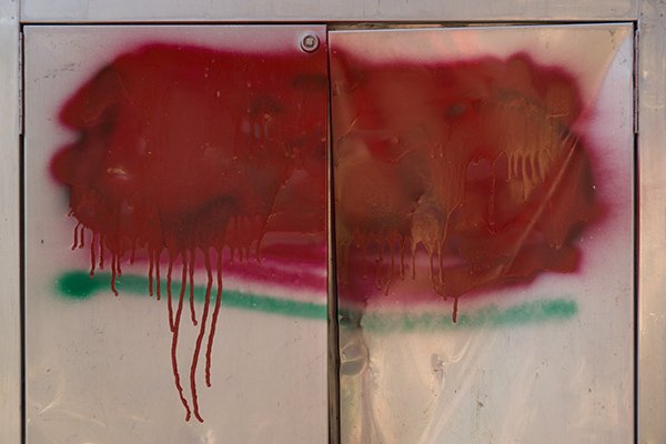
Figure 1. Original image
The example image of one year ago
Step 1b. Identify lightest and darkest area
For me this really means: find highlight and shadow point and try to make them neutral. This has become routine part of my image enhancement work. See the article I wrote about this. Surprisingly, I don't fully agree any more with what I wrote in that article. Not every image has a proper white point. (I should have know better.) Yet striving for it is important as it will always yield better range.
See figure 2 for the result after applying this step.
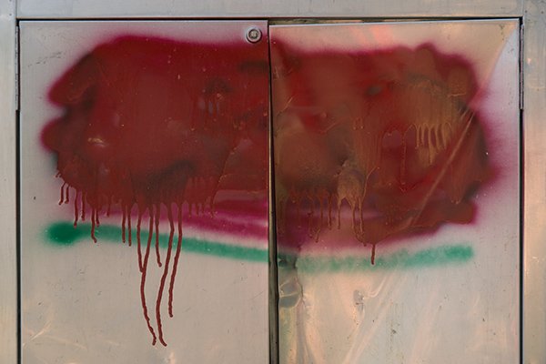
Figure 2. Result after neutralizing endpoints
Step 2. Channel blending
This is a step that I am slowly but steadily getting control of. By now I recognize image categories that lend themselves for certain kinds of blend (plus, other categories that do NOT).
Example? Images with one main color only (think greenery, flower macros, etc.) usually have one channel that contains significantly better detail than the others. Replacing the image by that channel in luminosity mode often works. Images with two dominating colors require a different strategy.
I find that many images do not lend themselves for blending at all. It remains a risky procedure. I have often seen deep reds that became light pink because I overenthousiastically used the red channel for a blend. Also, I never perform advanced blends like "blend 40% of the green into the blue in Darken mode" or whatever. Margulis is a master in this work, but I really wonder how many of his followers actually work this way.
See figure 3 for the result after the contrast phase. (No channel blend was applied here.)
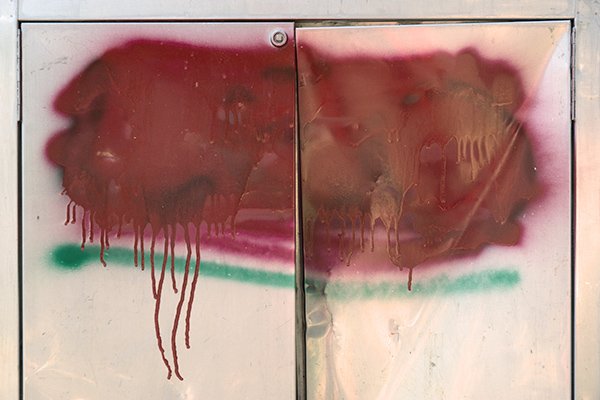
Figure 3. Result after applying contrast-enhancing curves
Step 4. Shadows/Highlights or the Hammers
Today, I am far more in favor of the Bigger Hammer than one year ago. It is a lot more powerful than its alternatives, not just when highlight detail is crucial. I am often surprised that it effectively enhances image areas that I didn't know I wanted to see enhanced. But Bigger Hammer needs to be tamed: the real challenge is to use its power and at the same time suppress its drawbacks. My preferences reflect this aim: I always use "RGB Desaturated" as the base for the Overlay layer, not the (default) Red. Also, I prefer to add the "Retain Original Color" layer, sometimes even setting it to 100%. Color strengthening works better in the later PPW phases.
And the halos? Well, they can be nasty. But when they occur, I first try to get rid of them instead of giving up and running Lesser or Velvet Hammer. I spent quite some time searching for an automatic way of removing halos. This was moderately successful: there is no "one size fits all" action, but I did find a generic procedure that has proven itself reasonably effective. Bigger Hammer plus halo removal often gives a better result than Lesser or Velvet Hammer, that's my current opinion.
See figure 4 for the result after applying Bigger Hammer. Note the better detail, especially in the right half of the image.
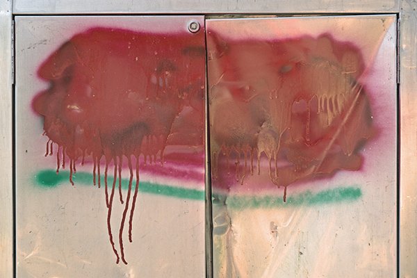
Figure 4. Result after applying Bigger Hammer
Step 6. Lighten and Multiply
For some time, I have been comparing this action with the hammers, and always found that it gave flatter results. That is, until I realized that it applies to a different type of image. For images with distinct light and dark areas and not much in-between, where extra highlight or shadow detail is not desired, this action works better than the hammers. Just look back at the example image in the article that I wrote about this action. Should I apply Bigger Hammer on that photograph, the background wall would be way too much emphasized. For such images, Lighten and Multiply is the preferred action.
But the procedure to follow is cumbersome. See the article that explains why. For that reason alone, I have created an alternative action that gives equivalent results - a one-button action that generates two layers, one for lightening dark areas, and one for darkening light areas; each layer on 40% opacity so that adjustment is easy and straightforward.
Step 7. Helmholtz-Kohlrausch
The only image type to which I apply this action in full confidence is one that contains some colorful spots that really need to stand out against an (almost) neutral background. The action retains the neutrals better after running MMM+CB: a clear winner. For such cases, it's H-K's Color layer that does the trick.
In all other situations... I don't know. Unless I go through the remaining phases twice - once with and once without H-K applied - I never know if it will yield a better end result. The difficulty of H-K is that it always degrades the image. It's an action that makes a photograph darker and duller - one needs a lot of trust to invoke it.
Helmholtz-Kohlrausch clearly "remains to be proven". Stay tuned for 1 Feb. 2017!
See figure 5 for a default application of H-K.
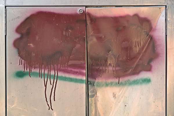
Figure 5. Result after applying Helmholtz-Kohlrausch
Step 9a. MMM and MMM Finetuned
Still the most distinctive step of the workflow. I must say, I don't use the original Modern Man from Mars that much any more, preferring my own MMM Finetuned instead. Yet, also MMM Finetuned has a few drawbacks. See the article I wrote about it.
The strength of MMM Finetuned is its weakness at the same time. The action produces a different mask than the original MMM, supposedly only including image areas that are similar to the advisory selection. The question is, what is "similar". The action calls Photoshop's "Select Similar" with a Tolerance value of 10, in the LAB color space. Tolerance 10 is a value that often works - but sometimes it doesn't, resulting in either too much or not enough being included. What we really need is an options panel with a slider for Tolerance value, enabling the retoucher to set a higher or lower value if the image calls for it. PPW Panel version 5 maybe...?
Oh well... there is always room for improvement.
See figure 6 for the result after applying MMM Finetuned and figure 7 after applying Color Boost.
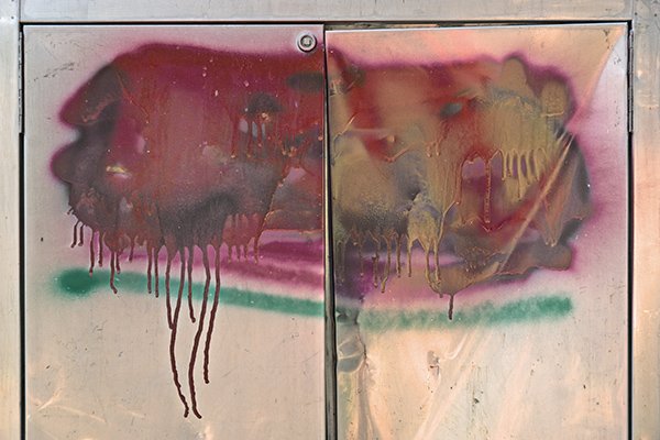
Figure 6. After applying MMM Finetuned
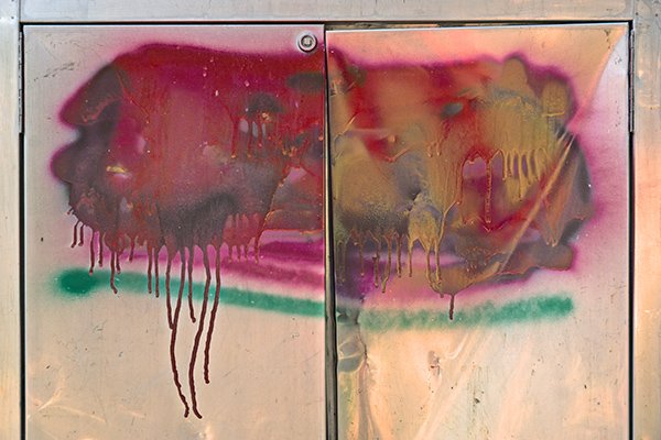
Figure 7. After applying Color Boost
Step 10. Finalize contrast, including endpoints
I apply this step a lot more than a year ago. Actually, "Finalize contrast" feels too restricted. After having gone through the complete workflow, more final touch may be necessary. Local correction: the upper right corner has become too light, let me darken that part a bit. Color adjustment: the processed image comes out slightly too yellow: why not correct that at this phase?
From a workflow/user interface perspective, I would prefer to decouple this step from the Color Boost action. (In the panel, one button creates both.) After all, it has nothing to do with Color Boost. If an image doesn't need Color Boost, I could still want a contrast or whatever adjustment. But that's just nitpicking.
See figure 8 after applying this step: increasing contrast and slightly lightening the image.
Figure 8. Result after finalizing contrast
Step 12. Consider blend with other version
It seems that Margulis himself is continuously developing his view on this procedure. In his Modern Color Workflow book, the general idea is: if you have time, create two or more versions from scratch and blend the best of each. Later he noticed that a better way of working would be for any next version to try to avoid the weaknesses of previous attempts. And not long ago, in a blog he presented an even different approach: before you begin, start to think about a strategy for multiple alternatives - something like "I don't know if a dark or a light background will work better so I'll try both" - and then work out multiple versions accordingly.
Much as I appreciate such advices, execution of this step can be tricky because it's not always obvious how to blend. Two versions, both good, both dripping with color, both strong in contrast... It is rarely so simple that one is better in one aspect, the other in all other aspects. There is always an exception of some kind. Version A has better contrast, except for some parts of the background. Version B has better color, except for some unfavorable bluish shadows. Etcetera.
Have a look at figure 9, two final versions of the example image (left, equal to figure 8 above, and right, an earlier attempt).
Figure 9. Two alternative versions
How to blend? The left image in figure 9 has stronger and more varied color. This is nice for the graffiti but less so for the metal surface. So I created a luminosity mask to pick the darks (graffiti) from version A and the lights (metal) from version B. Almost there, but - there is the "except"! - we are left with some nasty halos around the dark red paint drips on the left. (See figure 10.)
Solution? Paint over the halo areas in the new mask. See figure 11 for the updated mask and the result of that update. This finishes the blend.
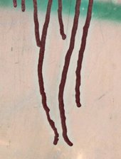
Figure 10. Cyanish halos
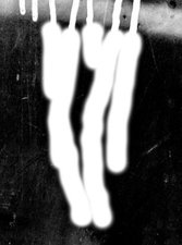
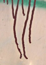
Figure 11. Updated mask and disappeared halos
Mind you, these blue halos have nothing to do with the blend process. They are the result of a sloppy application of the workflow, in this case of the older version. But these things happen (see my second general remark above) and they may well become apparent at blend time. The retoucher is supposed to blend away any weaknesses, but this isn't always straightforward.
Before and after versions compared
Enough about the blend process. Only sharpening is left to do. Have a look at figure 12 for original and final versions juxtaposed. Despite all may critical remarks, the end result is superb. What I concluded one year ago about the PPW still stands. Results are always good, probably better than what any other method can accomplish.

Figure 12. Before and after versions compared
As this photograph is more of an abstract type, I didn't have to be careful about keeping everything natural. Some vigor works well here, and the PPW is the perfect tool to deliver that.
Gerald Bakker, 1 Feb. 2016
Picture Postcard Workflow