Picture Postcard Workflow: Overview and Comments
"The overview and discussion of PPW at (...) is the best discussion I’ve seen, a lot of thoughtful comments and explanations of what is working and what remains to be proven. So I would strongly recommend it to anyone wishing to understand more of what’s involved."
- Dan Margulis, March 2015
PPW: What is it?
The acronym PPW stands for "Picture Postcard Workflow" and has been devised by Dan Margulis.
As explained in the Picture Postcard Workflow main page, it is a workflow for color and contrast enhancement. PPW is also the name of a Photoshop plug-in panel (officially named PPW Tools). See figure 1.
For me, the results of applying the workflow on my own images were astonishing. I applied PPW on a large number of photographs and the result was always better than what I had previously accomplished. Over the time I have gotten a reasonable feeling of what works and what doesn't.
In the current article, I will give an overview of the workflow, interspersed with my own experiences and comments. It is my intention to focus on individual workflow steps in future articles which will contain more in-depth reviews.
General remarks
- The workflow has the obvious goal to enhance an image as much as possible, but explicitly states to do that in the shortest possible time. Hmm, everyone will suspect two conflicting goals here, so let me rephrase that into one goal: to enhance an image as much as possible within a time limit of just a few minutes.
Dan Margulis, experienced as he is, takes 3 minutes maximum, but less experienced people will need more. Still, one important aspect of the workflow is that it never needs complex selections or masks. Plus, the panel automates most of the steps. - The workflow tries to separate color steps from contrast steps. Never try to enhance both in one step, because interference may occur. In later steps, this principle blurs somewhat: the MMM and the H-K steps both touch contrast and color, but they do that in different layers.
In some cases, I have the feeling that we could go even further and separate Color into Hue and Saturation. - Some of the panel actions have extreme effects, but this is deliberate. The user is then supposed to set an appropriate mask, reduce opacity or activate blend-if sliders to reduce the effect as needed. The correct way to back off often turns out to be the main challenge, not the action itself.
- Downloading and installing the panel is definitely not enough to become a PPW workflow expert. One needs explanation, preferably from the book. The panel comes with extensive documentation. I haven't read all of that, so cannot give my definitive judgement, but I expect the book to be a far better source of information. Be aware that not all workflow steps are covered by a panel action.
Together with below overview, I will show an example image (figure 2) and intermediate results of some of the workflow steps.

Figure 2. Original image
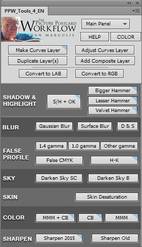
Figure 1
Step 1a. Remove color cast
This step is easier said than done. Various tutorials exist on the web explaining how to fix incorrect color. Many of them forget the most difficult part: how to recognize incorrect color. "Here we have a photo that is too red, now we'll show you how to correct that."
Very nice, thank you very much, but many casts, especially small ones, are hard to recognize, so how do I know what to correct in the first place? Besides, an image that looks "too red" may in reality have an orange cast, or a pink cast, or anything in-between. Casts are often subtle, and it is hard to distinguish between a minor orange cast and a minor red cast by using one's eyes only.
Fortunately, Dan Margulis has always propagated the only correct way: assess color by the numbers. Open the info panel and sample points for which you can assume certain RGB (or LAB) value ranges: neutrals, sky, skin, greenery etc. If those are fine then no cast has to be corrected. Otherwise, the deviation is the basis for the correction.
Like Margulis, I emphasize that this is a very important step. In later phases of the workflow, color and contrast are strengthened to the limits of believability. Should we start with an uncorrected cast, it would be strengthened as well. Not good. And even if we already have nice saturated colors to begin with, correcting a cast always makes a photograph look better.
Unlike many people however, I don't find this the most difficult step. For me, the goal is clear, and unless the image was taken in very bad light conditions (e.g. illuminated by differently colored light sources) correction is straightforward.
Obviously, there is no button in the panel to automatically correct incorrect color. It is a manual action. Figure 3 shows the effect of this step on our example image. Just a small correction of a blue cast in the shadow areas.
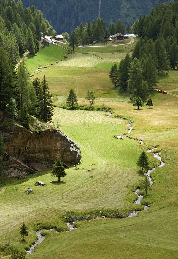
Figure 3. Before (same as fig.2) and after removing cast
Step 1b. Identify lightest and darkest area
I am not sure why this is listed here. Like in all good workflows, setting proper highlights and shadows is a must. Make sure the lightest point of your image is white or almost white, and the darkest point is black or almost black, or you will miss some potential contrast.
The workflow however allows this to be done at a later stage. Fair enough, the current step doesn't say "Set" but "Identify". All right then, we do that and move on to the next step.
Step 2. Channel blending
For me, this is the most difficult step. Unlike in step 1, here I often don't know what I am about to accomplish. According to the book (chapter 4 second section) multiple "cases" (i.e. goals) exist for this step.
The basic idea is to enhance contrast in each of the R, G and B channels by cleverly blending one into another. The blend may be a goal in itself (e.g. when one channel is worse than another, replace it) but it may also prepare for more efficient curving in the next step.
The previous sentence already contains two difficulties. First, in many images it is not clear to me which channels are "better" than others. More often than not, part of an image looks better in the green, another part in the red. Hmm, how to move on with the blending then? Sometimes the blue looks promising but is darker than the others. Is it worse because it is darker, or can it be used despite its darkness?
And second, as multiple goals exist, for each image there is a choice to make. Do we pick the "better" channel to replace the "worse" one, or does that hinder in later curving?
Questions, questions.
The layer on which we execute this blending is supposed to be set to Luminosity blend mode, because otherwise it would ruin the color that we have set correctly in step 1. At this stage the distinction color-contrast is still very strict (and rightly so).
However, in order to see and be able to use the different channels, the switch from Normal to Luminosity is only done after step 3 is finished. That means that we don't see the result until after the next step. Needless to say, this doesn't make the procedure easier.
Despite much exercising, I don't always get good results from this step. Yes, contrast improves in many cases, but rarely by much, and sometimes bad side effects occur, like increased noise, or areas that get an unwanted shift in luminosity. The whole step feels like black magic. Blend the green into the red 50%, blend the blue into the green darken mode 30%, switch to Luminosity, and tadaaaaaa... a reborn picture reveals itself. Or not.
Step 3. Curving for contrast
This is a step from the traditional workflow, except that it is supposed to go on a Luminosity layer. This step (like the previous one) concerns contrast, so we keep the color and change luminosity only.
The benefit of this step is beyond doubt. The large majority of images can use an increase of contrast. An S-curve almost always works. Margulis advises to determine the "most important" area of the picture, and try to increase contrast in that area. Find out the range of R, G and B values in that area and steepen the curve on that range. Obviously, curving the R, G and B separately gives better results than curving the (default) RGB.
Figure 4 shows the effect.The emphasis was on better detail in the dark areas.

Figure 4. Before and after blending and curving
Step 4. Shadows/Highlights or Bigger Hammer
Another contrast step. Here the goal is a bit more subtle. We are not trying to increase contrast but decrease it... well, not quite.
Let me explain. Target for this step is an image that lacks detail in highlight and/or shadow areas. The first thought could be, apply an inverse S-curve, lightening the shadows and darkening the highlights, so that more detail will be exposed. But that's a bad idea, because it kills local contrast too. Everything gets flatter, which is never what we want.
We need an action that makes dark areas lighter and/or light areas darker while preserving local contrast. The Shadows/Highlights adjustment in Photoshop does exactly that, but it's often not strong enough. For that reason, a new action was devised called "Bigger Hammer".
To be honest, I am not too fond of the Bigger Hammer action. You may have noticed that Shadows/Highlights often causes halos around sharply defined edges, notably at horizons. Unfortunately, the Bigger Hammer has the same side-effect but, well, bigger. The halos have become more pronounced too. A major disadvantage in my opinion.
Two variants have been made available in the PPW Panel, called "Lesser Hammer" and "Velvet Hammer". Of these, only Velvet Hammer seems to effectively avoid haloing. I use it a lot, more than the other two.
Figure 5 shows what happens. Note significantly better detail in the lighter grass areas.
Figure 5. Before and after application of the Bigger Hammer action
Step 5. Boost to sky
A simple action that tries to darken skies, i.e. blue colored areas. The panel supplies two variants, one ("Darken Sky SC") more applicable to quieter, simpler skies, one ("Darken Sky B") for more complex, dramatic skies. The distinction seems not so clear, as for the case of complex skies, Margulis advises to try both actions and choose what looks best.
I don't use this action as often as I should. When a sky is too light, I routinely pick one of the hammers. Let me change that and go for the Sky Boost more often.
Step 6. Lighten and Multiply
This is another variant of the shadows/highlights types of adjustment. It is supposed to lighten up dark areas more than any of the hammers. The idea of this step is not to enhance contrast in dark areas, but to unveil detail that was too dark to be visible at all.
The action works by setting a "false profile" on an image, specifically a smaller gamma (1.0 or even 0.75). The simple effect of this is that the image is considerably lightened. To counter this for the highlights, a composite layer is added in Multiply mode.
For the example pictures in the book, this is an action that works particularly well. Still, the difficulty of all the hammers and this action is to determine when to use which. I would prefer to have one action covering all cases, where fine-tuning can be done by moving opacity sliders or switching on/off moderation layers. Not sure if this is possible at all, but at some time I will come back on this.
Step 7. H-K action
H-K is the abbreviation of Helmholtz-Kohlrausch, which is the name for a phenomenon related to human vision. Roughly said, the H-K effect means that humans experience less saturated (more gray) colors darker than more saturated colors of equal luminance. Here the human vision differs from cameras and computers.
The workflow step advises to consider applying the H-K effect, i.e. make neutrals slightly darker.
Conveniently, the panel has a button which does exactly that, but it does more. It also tries to "redistribute" saturation, i.e. desaturate all colors except the purest ones, but more so for duller colors than for brighter ones.
I find the combination of these two effects (put on two separate layers in one group) rather confusing. Try the action for a colorful image, and you will notice that the Color effect is much more pronounced than the Luminosity effect. However, despite the action as a whole is called H-K, I believe the color part has little or nothing to do with the Helmholtz-Kohlrausch effect. Instead, it is a preparation for the Color Boost and MMM steps that follow. Distribute saturation better over the image so that the Color Boost steps give a more pleasing effect. Fair enough (and pretty effective indeed), but that's not what the Helmholtz-Kohlrausch effect is about, is it?
Whether the real H-K layer (the one for contrast) also yields better results later, I am not convinced. The whole idea of applying the H-K effect which our visual system already seems to apply itself, feels illogical. Our eyes see neutrals darker than strong colors, so the logical step would be to counter that and make the neutrals lighter, not darker. But no, this step is not a correction, it is an enhancement that gives many pictures a beneficial "deeper look".
I'm sure at some time I will have a lot to say about this action, but for now I've said enough. Figure 6 shows the effect. Note darkening and desaturating of certain image areas.

Figure 6. Before and after applying the H-K action
Step 8. Desaturate skintone
Similar to the previous Color part of the H-K action, this action reduces saturation of skin tones. Obviously, the action doesn't do face or skin recognition, but applies to certain color ranges only. Consequently, it may touch non-skin areas too. Wood colors specifically seem to suffer from that. Usually, a simple mask is sufficient when this side-effect is unwanted.
The benefit of this step is evident, but I question its place in the workflow. In my opinion, the logical order would be to apply the Color Boost steps first and then determine if and how much to reduce the effect for skin tones. The workflow suggests the other way round. First, reduce skin tone color, then boost the whole image's colors. Fair enough, but what if the resulting image is too colorful except for the skins (so, less skin tone reduction would be required)? Or the other way round, what if the skins are already oversaturated but the rest of the image could use more color?
Likely there is an escape from any of these situations, but wouldn't it be logical to first boost color, and then reduce skin saturation to taste? Or is it harder to target skin tones after colors have been exploded?
Anyway, I don't do portrait photography very much, so I don't use this action that much. Also, one can wonder if color boost is advisable for images containing people. Boost all colors except skin's, doesn't that quickly look unnatural?
Step 9a. Modern Man from Mars
This action (mostly abbreviated to MMM) is so unique and powerful that I consider it the highlight of the workflow and of the panel.
By using some clever tricks in the LAB color space, the action manages to "separate" colors, i.e. pull them apart. Prerequisite is a selection containing colors that need to be separated, but the whole image is affected - except neutrals, which are excluded by a mask.
On first thought, one might think that this is not good. In step 1 we did our best to get correct hues, and now we have an action that deliberately shifts them? But in practice, MMM provides a great effect - under the condition that it is appropriately toned down.
It is the "toning down" that is the key to success. Let me give an example. Many landscape pictures contain a lot of green - grass and leaves. Variation in those areas is often more limited than we would prefer, no matter if the greens have correct hues. So we select the greens - a rough selection is usually good enough - and run the action.
The effect is twofold.
- First, greens - depending on the range of the selection, but anywhere in the picture - are moved apart: so, bluish greens get bluer, and yellowish greens get yellower. Less saturated greens get even duller, and strong greens stronger.
- Second, other colors anywhere in the picture - neutrals excluded - move away from the target greens.
The first effect is wonderful and just what we want (or we wouldn't have chosen the correct selection). All greenery gets livelier, more sparkling. It's different from anything else I've ever seen.
The second effect is often questionable. Skies move towards magenta and thus get a purplish hue. Browns (tree trunks and branches) become redder. In most cases, I feel the need to reduce the second effect, most effectively by activating blend-if sliders.
Some more remarks.
- The MMM action supplies two layers, one for color, one for luminosity. This is questionable as we are doing a color step, and not a contrast step. In my experience, the luminosity effect is similar to the 'Curves for Contrast' step. Contrast is increased in the selected area, sacrificing contrast in other parts. I believe this is not good, as it may damage what we have accomplished in earlier steps. That we selected greens (or any other color for that matter) for an MMM run, doesn't mean that this area is important contrast-wise.
- The explanation of the MMM action in the book mainly emphasizes the hue shift, but the action also increases saturation. I therefore sometimes split the MMM Color layer into an MMM Hue layer and an MMM Saturation layer. This enables me to give each their own opacity. Sometimes the hue shift is more important (and can stand a higher opacity) than the saturation increase, sometimes it's the other way round.
Step 9b. Color Boost
Color Boost is just that: a boost of the color. The CB panel action is very simple. It works in the LAB color space, and consists of two very steep curves on each of LAB's color channels, set on an adjustment layer. To preserve neutrals, the curves go through the exact midpoint.
The default opacity of the layer is 75% which for most images yields way too much color. This is not bad per se. No two images are equal, so practically every image needs an opacity change anyway.
For me, the action has one surprising side-effect. It is supposed to cause no hue shift, neutrals remain neutrals, just an increase in saturation. Well, this turns out not to be true.
The catch is that the A and B curves are not equally steep. The A curve is steeper. So, every color that has non-zero A and B components will move slightly towards green if the A is negative, and slightly towards magenta if the A is positive. One can easily check this by switching the Color Boost layer blend mode between color and saturation.
Whether this is good or not, I don't know. To be honest, in most cases the MMM gives so good results that I don't feel the need to apply Color Boost too.
Last but not least, a disadvantage of the Color Boost is that the more saturated the color is, the more it gets boosted. There is no protection against oversaturation. Some images ask for a color boost of the less saturated areas, and leave the already pure colors alone. (A bit like the Vibrance slider in ACR.) One would have to do some clever masking to accomplish that on PPW's Color Boost layer.
Figure 7 shows the effect of the "MMM + CB" step of the PPW panel, which combines steps 9a and 9b in one action.
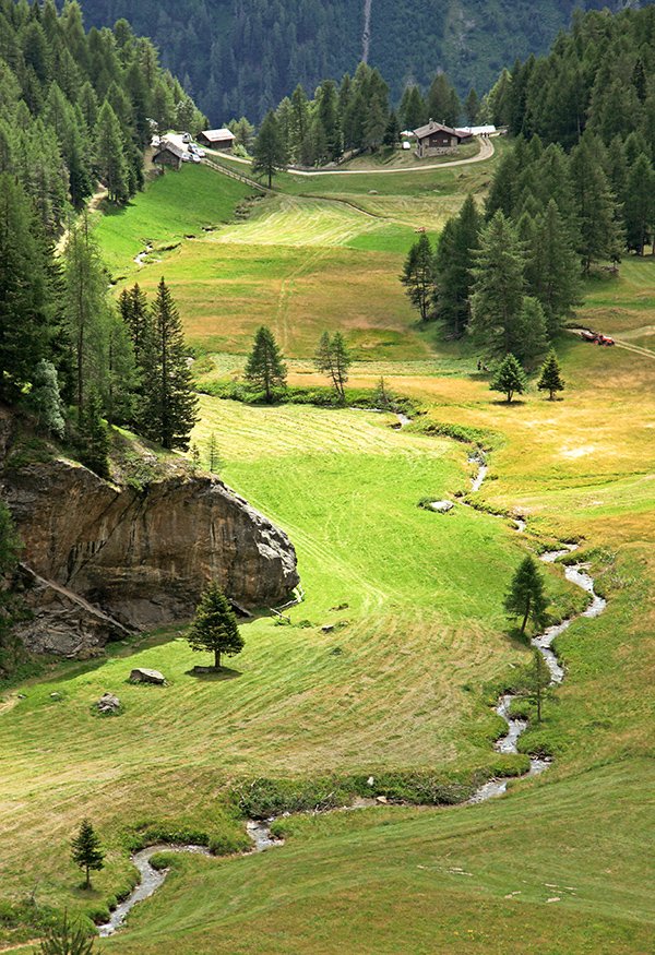
Figure 7. Before and after the MMM + Color Boost steps
Step 10. Finalize contrast, including endpoints
Now that we've done all contrast and color moves, it is time to do the step that was already hinted to in step 2. If the image doesn't already cover full luminosity range, now time has come to correct that. Obviously, the LAB color space requires a simple L curve to accomplish that, or even a Levels adjustment would suffice too.
The Color Boost action provides an extra layer called Endpoint Adjustment. In cases where a Color Boost is not desired, such a layer can be added manually.
Obviously some of the previous moves already increase contrast, some considerably. In my experience, for a majority of the images no "finalize contrast" is necessary at all.
Step 11. Sharpen
Every serious workflow prescribes a sharpen step somewhere at the end. The PPW is no different in that respect. But of course, the normal Unsharp Mask is too simple for Dan Margulis. He studied the sharpen process and split it into a number of small substeps: dark haloing, light haloing, dark hiraloam, light hiraloam and hiraloam color. Each of these steps is put on separate layers, each with its own default opacity, and some of which have a mask to prevent artifacting. The result is a well sharpened image, rarely looking overdone, and with the extra advantage of tailoring per layer. Do the dark halos stick out? Reduce opacity of the corresponding layer. Could the image use some more light haloing? Increase opacity of that layer, or lighten (or even remove) its mask.
The action puts a disabled copy of the original on top of the layer stack, so that parts of the image can be blended back, at any opacity.
Putting sharpen as the last step of the workflow is nothing new, but the PPW panel action for it is extremely sophisticated. Even if you don't use the PPW (panel or workflow) at all, this Sharpen action is highly recommended.

Figure 8. Before and after Sharpen
Step 12. Consider blend with other version
The book lists this step after the sharpen step. I would find it more logical to switch those.
The idea behind this step is, if time and resources permit, to color-correct an image twice or even more times, compare the results and blend to get the best of each. Version one is the best color-wise, version two has better contrast so let's stack version two above version one in Luminosity mode.
I have a different way of working, but I think above approach is better. I always keep all layers of an image. When I don't like some aspect of the final result, I move through my layers and see which step causes the anomaly. I then try to redo that step and work further upwards through the layer stack, until I am content with the result.
That may be a more economical policy, but it misses the case where a final result looks good, no obvious flaws, but a second run would still be better in some aspect.
I remember reading an advice by Dan Margulis for a compromise: if you have time available, redo the picture from scratch, but pay special attention to the weaknesses of version one. That may well be the best path to follow.
Before and after versions compare
Figure 9 below shows the before (original) and after versions of the example image, where the final version is the result of a blend of figure 8 with a second run. The differences over single steps are not dramatic, but the comparison below shows the full effect of the workflow.
Gerald Bakker, 1 Feb. 2015
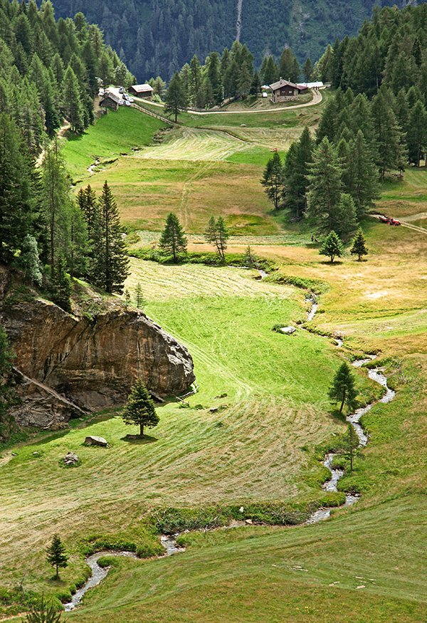
Figure 9: Original image and final version after blending two full runs of the PPW
Picture Postcard Workflow