Details and analysis of the PPW Straight workflow
Introduction
PPW Straight is a new workflow, similar to and inspired by the Picture Postcard Workflow, but different in some respects. The main goal is to have a color correction workflow that is straightforward, easy to learn and less vulnerable to mistakes. I announced it in this article and presented general characteristics and overall structure in this article.
Today the third writing, where I will give background, more in-depth explanations and possible alternatives for each of the workflow steps.
For each of the five phases that the workflow comprises, I summarize the instructions from the previous article, and then give my commentary. Also, like in the previous article, I illustrate the text with the processing of one example image.
Workflow phase 1: Preparation
In the preparation phase, in short, you have to correct your image for white balance and exposure, and prevent strong contrast and saturation.
Analysis
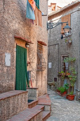
Backstreet, Italy
The workflow, just like the full PPW, keeps color and luminosity separate. Simply said: we strive for better color and better luminosity, and keep the two separate in our workflow. In a way, we can say that we need to redistribute those. Redistribute colors and luminosity values to make the image look better. To be able to do that, we need headroom, moving space. It’s not ideal to work on a high-contrast image, even if the photographed scene was high-contrast. Too much contrast means: too little room to apply any enhancements. Similarly, start with too bright, saturated colors, and it’s hard for any color optimization to be successful.
This is the basis for what I call the preparation phase. You are supposed to do the following things in this phase:
- Make sure the exposure and color are roughly correct.
- Make sure contrast is on the flat side and color is on the dull side.
These steps are maybe the most difficult ones to define. What’s on the flat side or on the dull side? When are exposure and color roughly correct? Taste obviously doesn’t play a role here. The image won’t look better after the preparation phase. In fact, if your image still looks very lively then you probably haven’t gone far enough.
For the contrast and exposure assessments, a look at the histogram may help. Do you see spikes on either end? That indicates (too) high contrast. Is the graph leaning to the left or right? Your image may be too dark or too light. For color problems I refer to my series of “Color Correction by the Numbers” articles.
I am convinced that these preparation steps make further processing more effective. Interestingly, Dan Margulis gives roughly the same recommendation for the raw phase, in the MPCW book chapter 14. I think it applies to JPG’s as well.
Don’t worry too much about the exact outcome of this phase. The rest of the workflow is quite forgiving. Small deviations here can easily be corrected later; especially the finalization phase is meant for that.
Alternatives
Many alternatives are available for the various steps of this phase. I list some of them below:
- For the luminosity aspects (exposure and contrast), you can use the Brightness/Contrast adjustment.
- In Camera Raw, you can use the Contrast slider to reduce contrast.
- It may be tempting to use the Shadows/Highlights command to reduce contrast. But be careful, this can cause halos later, especially where dark objects border to featureless light areas. For this reason, I advise against it, but it can work for certain images.
- Many options exist on the PPW panel to reduce contrast. Of these, the three hammers have extra mechanisms to retain local (mid-tone) contrast, something that an inverted S-curve doesn’t do. The idea of PPW Straight is to first bring variation in important image areas (phase 2). Local contrast is recovered in phase 4.
- Many alternatives exist to correct a color cast. Any one may work on a given image, but they may fail as often. See this article where I do a comparison. Feel free to use your own favorite procedure, but my advice is to do it by RGB curves.
Example image
Figure 1 is a photograph of a miniature patio somewhere in an Italian village. The original is in fact a raw file, and the left version shows the default representation that Camera Raw provides. The right version shows the state of affairs after the Preparation phase has taken place. The top row is the full image, the bottom row a detail zoomed in.
Note: Click on any of the below images to see a bigger version. This helps to better see what's happening!
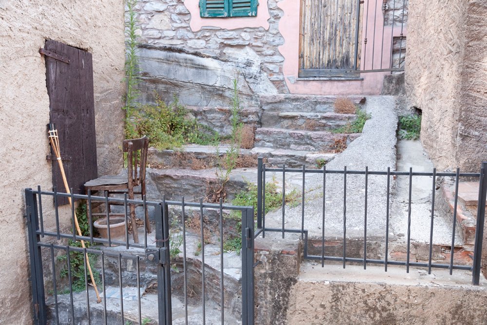
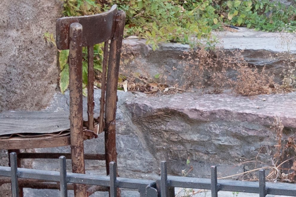

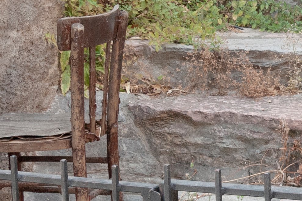
Figure 1. Top left: Original image (default raw conversion). Top right: Converted for workflow phase 1.
Bottom left: Original image zoomed in. Bottom right: Converted image zoomed in.
The full Preparation phase has been done in Camera Raw, namely:
- Temp: 6500 (a warmer color)
- Tint: -6 (remove a slight pinkish cast)
- Contrast: -20 (reduce contrast)
- Highlights: -50 (darken highlights to further reduce contrast)
- Saturation: -10 (reduce color)
The image is now warmer and considerably less vibrant. Hold on, it gets better!
Workflow phase 2: Variation
The second phase increases variation in flat image areas by means of one or more runs of the MMM Finetuned action.
Analysis
To get better color, the PPW prescribes to work on two things: color variation and color intensity. PPW Straight is not different. Color intensity (saturation) is the purpose of the next phase, color variation is handled now.
Whenever you try to increase color variation, colors will inevitably shift. This is always risky, as the viewer may notice a color that’s not right. It's easy to accept a sky that was made darker or lighter in post-processing, but not a sky that turned green. Color variation is a good thing, provided such anomalies do not happen.
The best tool that usually does a safe job is the MMM Finetuned action that I wrote as a variation of Dan Margulis' MMM (Modern Man from Mars). It uses the same technique but limits the enhancements to areas that are similar to the initial advisory selection. For those who want more information on how this all works, an extensive explanation can be found in this article.
The original MMM action was primarily designed to induce color variation. Interestingly, MMM Finetuned appears to be very effective for luminance variation too. It can thus be used to improve the look of near-neutral areas like flowing water or gray stones.
For now, it's important to understand the mechanics from user interface perspective. The crucial question you need to ask is: which image area can use more varied, livelier color and/or detail? It doesn’t need to be an important area from artistic perspective. An unimportant background can be a candidate as well, even though you should avoid taking too much attention away from the main subject, if there is any.
Make a rough selection that represents the chosen area in terms of color and luminosity. The actual selection determines what happens, in the following ways:
- Select a small range of color/luminosity values, and the impacted image area will be small but the actual update can be strong.
- Select a wide range of color/luminosity values, and the impacted image area will be larger but the actual update will be limited.
- Select a dark area, and you'll notice that (similar) dark areas will be lightened. This can be an effective way of getting detail in very dark image areas.
- Similarly, select a light area, and light areas will increase detail.
Be aware that the actual update is not limited to the selected area. The selection is only advisory, and will be discarded after the action has started. All pixels that are similar to what was in the original selection are included in the process.
MMM Finetuned runs in LAB, but it will convert automatically if your image resides in a different color space. The action creates two layers, one for Color only and one for Contrast only. Check each of these: often opacities need to be adjusted, or either of the two removed completely.
The MMM Finetuned action does not work in either of the following cases:
- when the full image is selected; the workaround being to remove a small unimportant corner from the selection
- when no selection exists (for obvious reasons)
Last but not least, it is well possible to run the action multiple times on one image. Each execution creates a new group. However, prevent the same color/luminosity range included in your selections multiple times, as this may cause extreme effects and even artifacting.
Alternatives
The MMM action in the PPW panel has a tendency to shift colors that are different from what the user selected. I rarely use it myself, but it certainly works for many images.
Example image
Figure 2 shows before and after of the Variation phase for our example image.
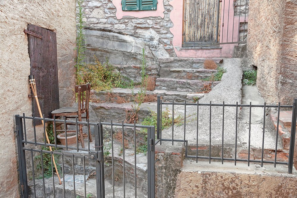
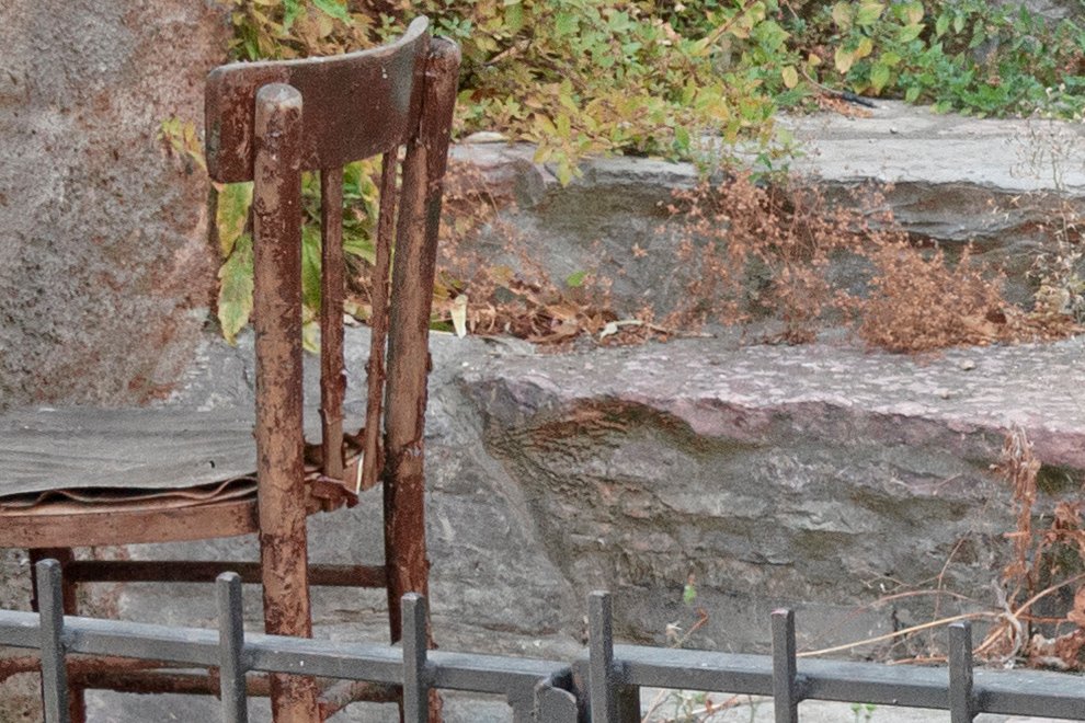
Figure 2. Before and after execution of the MMM Finetuned action.
Top: full image. Bottom: detail zoomed in.
In fact, I did as many as three runs of the action. First, using a selection of the top right wall, I got most of the walls and stairs included. Next, I used the Magic Wand tool to get a selection of the greenery. And third, a selection of the wooden door on the left, to target the darks in the image.
The actual effect is hard to describe, but it's less subtle than you think. Image elements within the same color and luminosity range are spread apart, making them more pronounced.
Workflow phase 3: Saturation
The goal for phase 3 is very simple: increase color intensity.
Analysis
The PPW tool for this phase is the Color Boost action. The philosophy behind it is: boost colors beyond reason, then decide how to back off. Say, the reds and blues have been taken too far but other colors are within acceptable range. The user is then supposed to reduce reds and blues while retaining other colors.
In my opinion, this is not an intuitive task. It requires distinguishing which colors are objectionable in an image that usually looks completely garish, plus master the technique to selectively tone down those colors. For this reason, I suggest a different approach: simply strengthen saturation, not in LAB but in RGB. The Saturation slider of the Vibrance adjustment is a good alternative for the simple Color Boost, as I showed in this article. However, it has one major drawback: it cannot target single colors, as the Hue/Saturation adjustment can. Well, Color Boost cannot do that either, but it runs in LAB where the user can invoke blend-if sliders on the color channels to reduce certain colors. In RGB, this is not possible, and unfortunately, Vibrance is not available in LAB.
So I go for a compromise: use Vibrance/Saturation for the full image, and another Hue/Saturation if individual colors need an extra boost. I believe this is good enough for the large majority of images.
Alternatives
Of course, PPW’s Color Boost is a good alternative, provided you understand the reasoning and mechanics behind it. I can say that the new Color Boost 2018 that comes in My Own Actions of the PPW panel version 5, is definitely better than the original Color Boost.
Another interesting alternative is the Vibrance slider of the Vibrance adjustment. It seems weaker than the Saturation slider, but in fact it favors some colors over others. In particular, reds are held back, which avoids making skin colors look too orange-red.
Example image
Figure 3 shows what happens to our example image, after applying Vibrance/Saturation +20.


Figure 3. Before and After application of the Saturation phase.
Top: full image. Bottom: detail zoomed in.
Workflow phase 4: Accentuation
I made “local contrast” or “high-radius sharpening” a separate phase as I think it’s a powerful way of improving the look of an image, something that works for almost every photograph.
Analysis
Jeff Schewe, in his book “The Digital Negative”, describes Camera Raw’s Clarity control as “one part tone mapping, one part sharpening and one part magic.” This inspired me to develop a clarity-like action – Clarity Power – that combines multiple local contrast enhancing techniques. Each of these is applied at a relatively low strength, on its own layer in a five-layer group. The benefits of this are: a strong net result, high customizability (every layer can be adjusted or switched off if needed), while minimizing the risk of artifacts. To avoid confusion with the Clarity control, I called this phase Accentuation.
An advantage of Clarity Power is that it runs from within Photoshop, without needing the Camera Raw filter. This makes it available for Photoshop versions older than CC.
There are disadvantages as well. The action may have a bad effect on almost-flat image areas, like a cloudy sky. It tries to squeeze detail from where none really is present. Again, switching off one or more layers can be a solution - masking out the problem areas is another.
Alternatives
Users of Photoshop CC or higher can invoke the Camera Raw filter and move the Clarity slider. I don’t say this is inferior or superior to what Clarity Power does – they always give similar results but never exactly the same.
Users of the PPW panel have the Sharpen action. Part of that is the so-called Hiraloam sharpening, which is in fact a local contrast enhancer. It has its own share of artifacts, as you can read in this article.
Example image
Figure 4 shows the effect of the Clarity Power action, at its default settings.
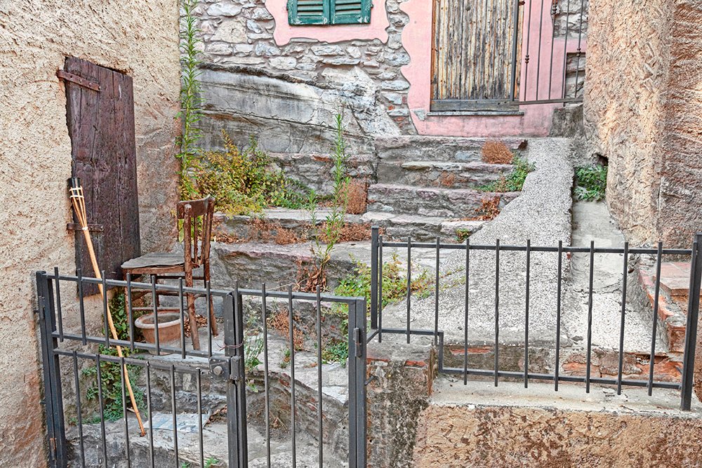

Figure 4. Before and after applying the Clarity Power action.
Top: full image. Bottom: detail zoomed in.
Workflow phase 5: Finalization
Whatever’s left to improve – range, weight, noise, color, etc. – can be done in this phase.
Analysis
Probably the most important thing left to correct now is range. Add a Curves adjustment layer. If the lightest point of your image is not close to the lightest possible point, correct that by moving the top right endpoint of the curve inwards. Similar for the darkest point. The simplest check for this is a look at the histogram. But a histogram can be deceiving, because the lightest points in your image may well be some specular highlights or larger image areas that don’t need to contain detail.
The PPW prescribes to take this into account, look at the image itself and choose the lightest and darkest significant points at the beginning of the workflow. This is certainly a good idea for PPW Straight as well – which should then happen at the end of the Preparation phase. During the Finalization phase, the lightest point should be set to RGB values around 250, and the darkest point to around 5.
The second important thing to consider is increasing global contrast. Simply said: making lights lighter and shadows darker, while preserving the extremes. An S-curve will usually do the job, especially when contrast had been reduced during the Preparation phase. If the image comes out slightly too dark or too light, this can be corrected on the same curve. Set the involved layer to Luminosity mode - in Normal mode it would strengthen colors, which is not desirable.
In principle, the workflow is then finished. However, as happens to me often enough, you may be left with a feeling like: okay, this looks good, except it’s a little bit too... and fill in something like: cool, noisy, red, etc. No problem: do whatever you think is necessary to fine-tune your image. Reduce the noise, make a small color shift, anything. Major adjustments are not expected here, but small ones are fine.
Alternatives
None really. Or anything, as this is a very open phase.
Example image
Figure 5 shows original and final result. A moderate S-curve was applied, nothing else.

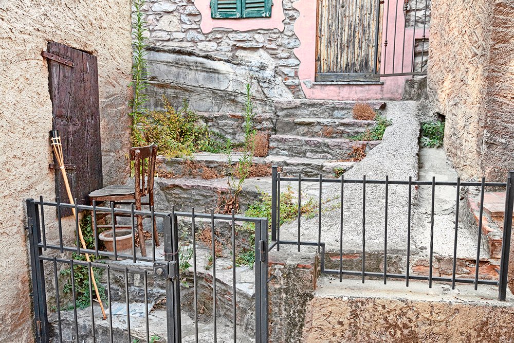
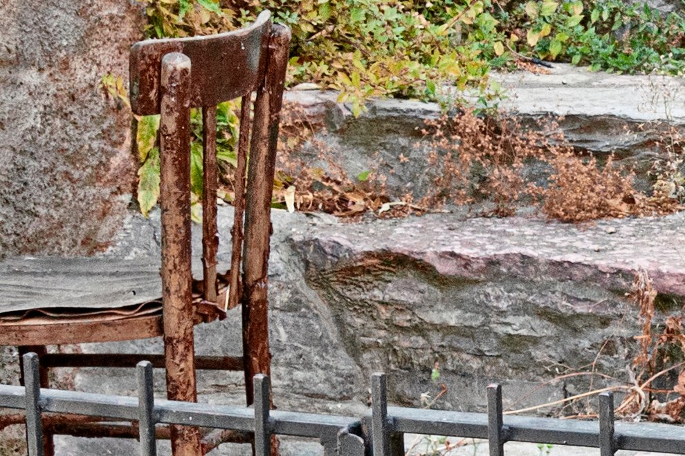
Figure 5. Original and final version juxtaposed.
Top: full image. Bottom: detail zoomed in.
Final thoughts
Of course, further development of the workflow is possible. In fact, once you feel comfortable applying PPW Straight, you can attain even better color correction results by moving towards the full PPW. Below I list some PPW steps that can easily be included in the PPW Straight workflow:
- The Darken Sky action is in fact a way to reduce contrast in an image, so can be executed as part of the Preparation phase.
- The Skin Desaturation action reduces some of the color in an image, so can be executed as part of the Preparation phase.
- The three Hammer actions help to reduce contrast in an image, but they also retain local contrast. So they belong partially to the Preparation phase and partially to the Accentuation phase.
- Channel blending has multiple appearances. Sometimes it can be effective to bring lights and darks of a contrasty image closer together – which would fit in the Preparation phase of PPW Straight. Other times it can strengthen local or global contrast, and could thus help the Accentuation or Finalization phases.
- You can master advanced Photoshop features like Blend-If and Apply Image that are perfectly usable in multiple phases of the PPW Straight workflow: to selectively reduce color adjustments or to create channel masks for instance.
- And last but not least, all the versatility of the full PPW enables you to make multiple image versions that differ enough to creatively combine them into something even better.
And now, I wait for your reactions! More than ever, I want your feedback. Are you willing to try the PPW Straight workflow? Any more explanation you need? Images you struggle with? Strange or bad results? Send me your images and I will try to help you.
Love to hear from you!
Gerald Bakker, 2 Nov. 2018
Related articles
Picture Postcard Workflow