Two more examples of the PPW Straight workflow
Recap
I recently made an attempt to define a color correction workflow. This was inspired by my feeling that Dan Margulis’ Picture Postcard Workflow (PPW) is overly complex, and therefore hard to master. I got similar statements from some of the readers of my website.
I called the result PPW Straight. Its main purpose is to achieve results that are close-to-equivalent to the real PPW, while avoiding the hard-to-learn and more ambiguous steps. The PPW, with all its flexibility, can be prone to "mistakes" – incorrect decisions leading to inferior results. This happens often enough in my own experience. PPW Straight tries to avoid that – it won't always succeed of course, but the odds are higher.
The drawback is that it's not very suitable to produce multiple versions for creative blending, which is one of the principle ideas of the PPW. This may be seen as a weakness, but in many cases it can be an acceptable and even preferable compromise.
The articles can be accessed from http://geraldbakker.nl/PPWF/ppw-straight/index.html.
In the previous article, I showed the processing of two example images, and promised two more. These will be covered here. You will see:
Façade
- a landscape, 24 MP raw
- an outdoor architecture shot, 42 MP raw
In both cases, processing starts from the raw file.
Note: The example files (originals) are available for download! Click on the following links to get the example image files, so you can replay the provided steps:
- geraldbakker.nl/Example3.ARW - the landscape (24.3 MB)
- geraldbakker.nl/Example4.ARW - the architecture image (41.3 MB)
Example 3: The landscape
Let’s start with the first example of this article (number 3 in total).
Note: Click on any of the below images to see a bigger version. This helps to better see what's happening!
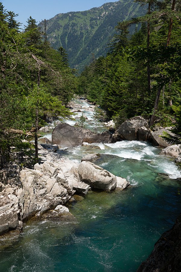
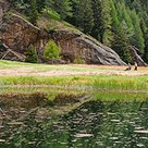
Figure 1. Original image
See figure 1, which shows the result of default processing of the original raw file. This original suffers from some common weaknesses of landscapes: harsh contrasts and bland greenery. Even though the composition is fine and the colors are accurate, there is a lot to improve.
1. Preparation
The preparation phase prescribes to correct overall exposure and color problems, and to reduce contrast and saturation until the image is slightly dull and flat. Well, I would say color-wise there is not much to do here, but the luminosity definitely needs some adjustments. The image is both on the dark side and very contrasty.
We use the raw processor to make the necessary adjustments. Don’t stress over the exact values that I give below. Follow the above guidelines – fine-tuning will be done in later phases.
To make the image lighter, I set Exposure to +0.30.
To make the image less contrasty, I set the following values:
- Contrast -30
- Highlights -17
- Shadows +32
That’s it. Well, I reduced Saturation by -20. Maybe not necessary, but just to be on the safe side.
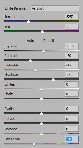

Figure 2. Camera Raw adjustments and resulting version
Figure 2 shows the Camera Raw basic panel and the resulting intermediate versions. Yes, the image hasn’t improved, but at least better detail is visible in the shadows and in the highlights.
2. Variation
We finish the raw processing phase and open the image in Photoshop. Copy the background layer and convert the copy to a smart object. Open it.
Like in the previous examples, we search for image areas that can use more color and/or luminosity variation. I think there are two clear candidates: the gray stones and the greens.
First, the grays. Remember that the original MMM action was designed to intensify color variation? Well, these stones have hardly any color, yet the MMM Finetuned action makes them look a lot better. Figure 3 shows the advisory selection, figure 4 shows the result (all defaults) and figure 5 shows a detail of the stone area, before and after.
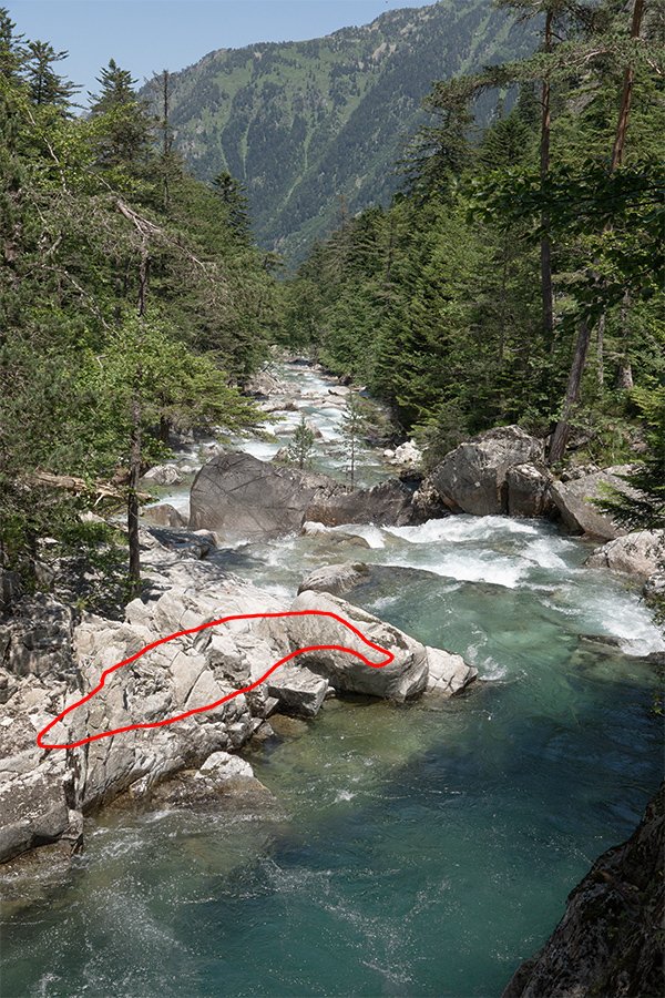
Figure 3. Advisory selection for the stones area
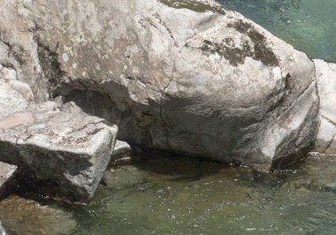

Figure 4. Result after running the MMM Finetuned action
Figure 5. Detail of the stones, before and after
Next, the greens. I selected the distant trees, but the effect is much more extended than just greenery. As the water is greenish as well, it is affected too. And not for the worse: it gets a cyanish tinge, which I like because it contrasts nicely against the warmer greens of the trees.
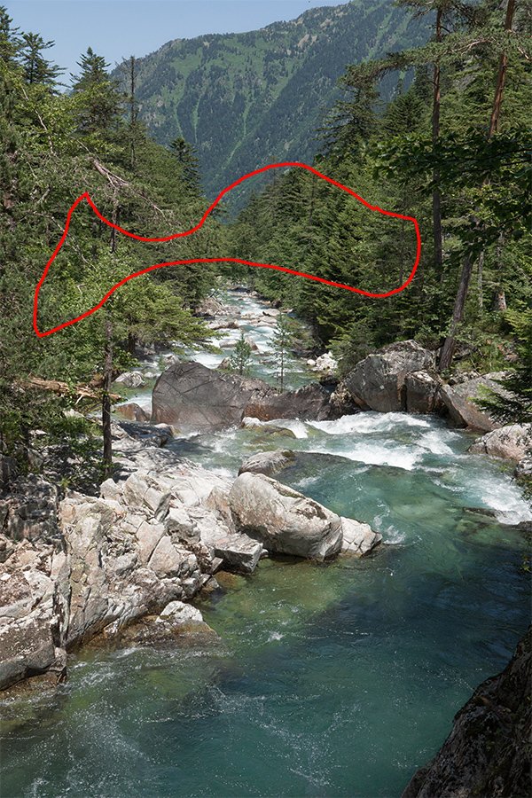
Figure 6. Advisory selection for the greens

Figure 7. Result of two MMM Finetuned runs
See figure 6 for the actual selection, and figure 7 for the result of the Variation phase. Look carefully at the trees and water and you will agree that the action has done wonders, like it often does to landscape images.
Save and close the smart object.
3. Saturation
As the Variation phase already produced quite some color, not much extra is required in phase 3. I added a Vibrance adjustment layer and set Saturation to +15. See figure 8 for the result.
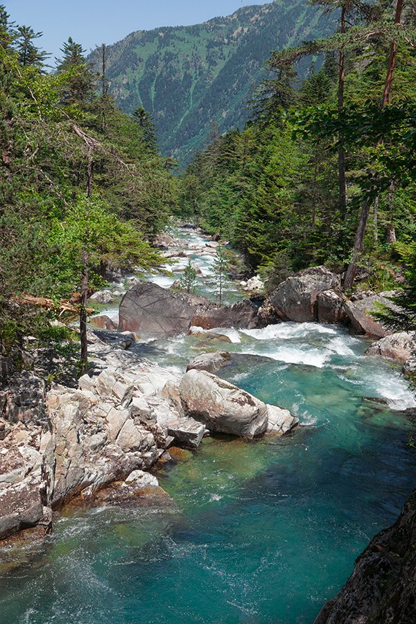
Figure 8. Result of increasing saturation

Figure 9. Result of running Clarity Power action
4. Accentuation
For phase 4, we have the new Clarity Power action. I ran it for this image and got a nice result. See figure 9. No obtrusive noise has become visible, the default result is perfect.
5. Finalization
Looking at the result so far, the only thing I don’t like is that the image is on the dark side. So I applied the curve as shown in figure 10 on a new layer that I set to Luminosity. The result, compared with the original, is shown in figure 11.
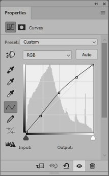
Figure 10. Curve as applied for phase 5

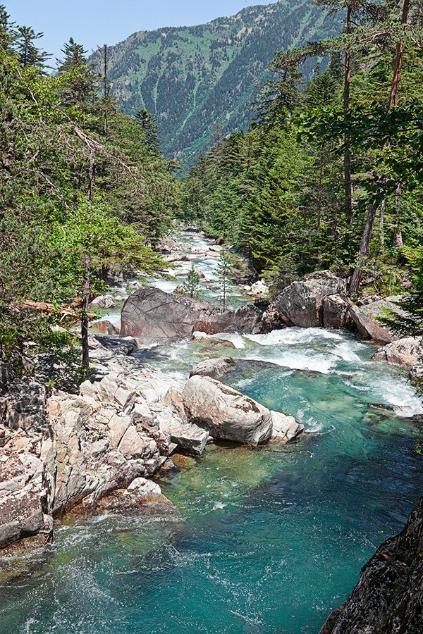
Figure 11. Comparison of original (left) and final (right) versions
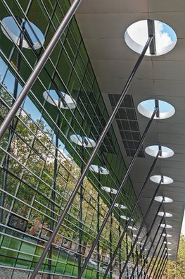
Example 4: The architecture image
The last example is shown in figure 12. It’s an outdoor area of Heartsfield-Jackson International airport Atlanta.
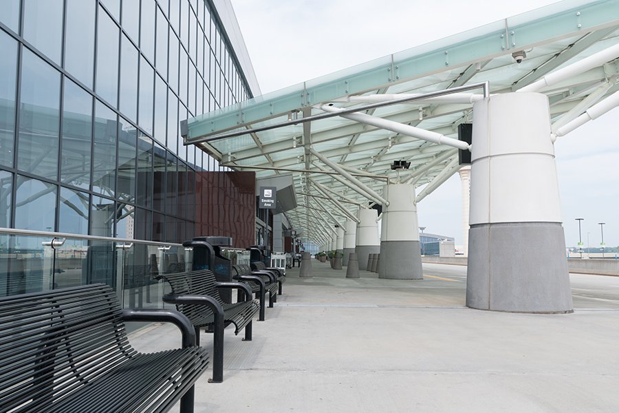
Figure 12. Original image
The photograph was again taken in raw, so what you are looking at in figure 12 is the result of default processing. It's a decent composition but both color and detail are pretty boring. Time to apply our PPW Straight procedure!
1. Preparation
As prescribed, we do the Preparation phase in the raw processor. Not much to do anyway. I don’t find the image too dark nor too light. A bit on the contrasty side maybe, so why not set Contrast to -30? And now that we’re looking at it, the highlights (look at the sky) are very flat. So: Highlights -100.
And color? Looking very carefully (and taking some samples), I notice that the image is a tad on the blue side. So I raised Temperature from 5250 to 5450. That’s it. Enough flat and boring to move to the next phase. Open the image in Photoshop. Figure 13 shows its look right now.

Figure 13. After having gone through the Preparation phase
2. Variation
In Photoshop, the first thing we do is copy the background layer and convert the copy to a smart object. Open the smart object and ask yourself, where to increase variation?
This is another example where the answer to this question is not obvious. Color variation? There is not much color at all. A bit of grayish and greenish blue, plus a brown rectangle, that’s it. Most of the image is close to neutral.
Well, the strategy for cases like this is to forget color and divide the image into dark and light instead. You will be surprised how much color and detail that will reveal after all. First, the darks. Why not pick the brown-dark gray panel just left of the middle for the initial selection? (See figure 14.)
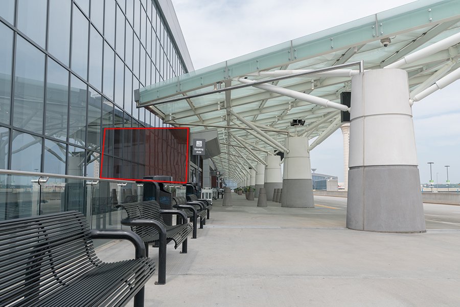
Figure 14. Selection for the first MMM Finetuned run
Figure 15. Result of this run
Run the MMM Finetuned action, figure 15 shows the result. Not groundbreaking, but look carefully and you’ll see a lot of added variation, mainly in the bottom left quarter of the image.
Next, the light areas. I drew a selection as shown in figure 16.
Figure 16. Selection for the second MMM Finetuned run
Figure 17. Result of default MMM Finetuned run
An important remark here. Be sure to include some of the darker areas (the pillars). If not, the luminosity range of the selected area is so limited that the effect may be too strong. The shown selection is just right. Run the MMM Finetuned action again – figure 17 shows the result.
This time I’m not quite happy with what the action gave me. There is too much color; note the yellow spots on the concrete and the strong cyanish blue on the windows left. Too much of a good thing. Also, I’d prefer some more contrast on the foreground concrete. I updated the Contrast layer to 40% and the Color layer to 20%. See figure 18 for a comparison of before and after phase 2. That’s pretty impressive if you ask me.

Figure 18. Before (left) and after (right) of the Variation phase
On to the next phase.
3. Saturation
We have to be careful not to make the image too colorful. The previous phase has already delivered a good bit of it. I added a Vibrance adjustment layer and set the Saturation slider to +25. That may be too much, but we can always tone down after having seen the final version.
Figure 19 shows the result.
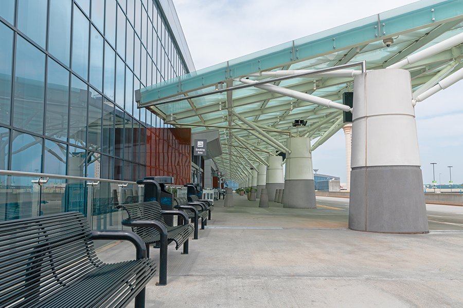
Figure 19. Result of Saturation phase
4. Accentuation
Run the Clarity Power action. Nice! No noise to speak of. No need to adjust any opacities. Figure 20 shows the result, and figure 21 a small detail before and after to better see what goes on.
Figure 20. Result of Accentuation phase

Figure 21. Detail before (left) and after (right) of the Clarity Power action
5. Finalization
What’s left to do? No color issues. Maybe the image could use a little more midtone contrast. I applied a moderate S-curve on a layer set to Luminosity and called it a day.

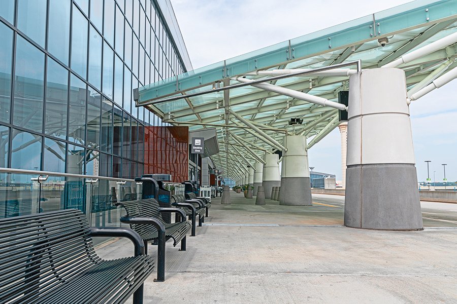
Figure 22. Original and final versions of example 4
Figure 22 shows original and final versions next to each other. Again, I find that very impressive. Could the full PPW do better? Maybe. Could a Lightroom-only enhancement do better? I don’t think so. Especially the MMM Finetuned action did a very special job here to extract color from areas that are almost neutral in the original. I don’t know of any alternative that can do the same.
Closing remarks
As I see it now, this is the final piece in the Picture Postcard Workflow series. Thirty-three articles, who would have thought that a few years ago when I wrote my “Overview and Comments”? Certainly not me. All this writing has given me an enormous amount of satisfaction, a lot of gained insight in many Photoshop techniques, a few friends and, almost from the beginning, the attention of PPW author Dan Margulis. It was in summer 2016 that Dan invited me for the four-day ACT course in San Diego. I was not able to come over at that time, but the idea of joining this class has not let go since then, and this spring I took the plunge and applied for it – not in San Diego but in Atlanta. All things considered, my writing about the PPW was the initial trigger that eventually led to this trip.
I can’t resist citing Dan who wrote the following on the Applied Color Theory forum:
“At a class earlier this year in Atlanta Gerald developed the annoying habit of producing better versions than mine.”
Well, this certainly was not the case for every image we corrected, but yeah, it happened a few times. More generally speaking, I am getting the feeling that there is not much left for me to learn in the area of color correction. I am ready for a new challenge.
So… coming spring I plan to start a photography training. In search, not only of a new challenge, but of new inspiration as well. And who knows what inspiration I will find there to start a new series of articles...
Gerald Bakker, 30 Dec. 2018
Related articles
Picture Postcard Workflow