An overview of the PPW Straight workflow
Introduction
A few weeks ago I announced "PPW Straight". A new workflow, similar to and certainly inspired by the Picture Postcard Workflow, but different in some respects. The main goal is to have a color correction workflow that is straightforward, easy to learn and less vulnerable to mistakes.
Today I will present it, not in full detail but as a quick overview. I start with some general characteristics – to inform you what you can and can’t expect. Also I present one new and one updated action which you will need during execution of the workflow. They are available for download from my actions page.
The actual overview of steps will be presented in a very concise manner, illustrated by the start-to-finish processing of an example image. To prevent an overload of information, I decided to postpone most explanations until the next article. Those who are already familiar with the PPW may however get enough information from today's article to actually start applying the new workflow. Others may find here that a few simple steps can produce impressive improvements to their photos.
General features and scope
Right! So, let’s start with a list of general features, so you know what lies ahead.
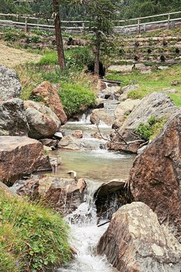
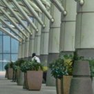
Dolomites, Italy
- The scope of PPW Straight is the same as the original PPW’s. It doesn’t cover composition aspects (e.g. cropping or straightening), local retouching, lens corrections, etc. It’s about what is often called “color correction”, which in fact means: optimization of color and contrast. Composition is taken for granted.
- The workflow strives for livelier color and snappier contrast. If your image is not expected to improve from that – think of a misty landscape scene – or if your image is already full of detail and bright colors, the whole exercise may be useless. Ask yourself what you expect.
- Similarly, when an important object in your image is something with a delicate surface, the workflow may turn out counterproductive. Think of flower leaves or human skin. In general, I find the PPW itself not very effective for portraits. None of contrast enhancement, color variation and color boost are in general very flattering for the human skin.
- The workflow will likely give subpar results for bad originals. The assumption is: start with a reasonably exposed original. In fact, the workflow was designed with the photographer in mind, i.e. starting from an unprocessed shot. This can be either a raw or a JPG file. Preferably no enhancements should have been done before, except standard in-camera processing. Of course, minor adjustments beforehand are no problem.
- The workflow does not give much room for variation. Two runs will likely give similar results. This is a key difference with the PPW! It follows that creative blending – making multiple versions and picking the best of each for an even better result – is not very beneficial and will not be explained below. On the other hand, any PPW Straight result can be used for blending with an original PPW-processed version.
- PPW Straight doesn’t require installation of the PPW panel. All required actions are downloadable from my Actions page and everything else is standard Photoshop.
- You need to have a basic Photoshop knowledge. For example, I won’t explain what an adjustment layer is and how to create one. Many Photoshop books, and many free websites as well, explain such things.
- Needless to say, you will need a good eye! I give you tools and instructions, but choices have to be made along the way. It’s up to you to make the necessary decisions about contrast and color. We strive for some optimum: not too flat, not too loud. I can’t say when that’s the case, so open your eyes and make that assessment yourself.
- Noise reduction, sharpening and local enhancements are not included either. Raw processing however is included.
Downloadable actions
Each of the following actions must be downloaded from my Actions page and loaded into Photoshop for use in the workflow.
- Clarity Power. I am very fond of the Clarity adjustment of Camera Raw. I use it for almost all my photos, provided I don't take them into Photoshop for color correction.
For that reason, I did a considerable effort to replicate Clarity in a Photoshop action. The result is now here, and it’s called Clarity Power. The underlying philosophy is similar to the Sharpen action of the PPW panel: many layers that individually have a limited effect, but together are very powerful, while minimizing the risk of artifacts. It is indeed very strong, and group opacity should always be reviewed. - MMM Finetuned v.2. This action has been around for over 3 years, but I released a second version of it. I simply added v.2 to the name, which is also shown in the groups that it creates. It's almost the same as the first version, but I found the original action sometimes created a color halo. This risk has now practically been eliminated.
Example image and processing
Figure 1 is the example image that I will follow along with the workflow.
Figure 1. Example image
Note that you can click this and all subsequent figures to see larger versions.
My instructions come in the form of a tutorial, and I use a non-destructive approach: so I tell you to put every adjustment on a separate layer. One of the phases is done in LAB, and my suggestion is to do that in a smart object. Of course, you are free to flatten whenever you want (and skip the smart object conversion), but this disables any possibility to revert to previous adjustments.
Enough introduction, time for action!
Workflow phase 1: Preparation
In the preparation phase, in short, you have to correct your image for white balance and exposure, and prevent strong contrast and saturation. This makes later processing more effective.
A. If you start with a raw file
Open your image in Photoshop; it will open in the Camera Raw plugin.
- If your image is either darker or lighter than you think it should be, correct that by moving the Exposure slider. There is no need to set black and white points yet.
- If your image has a color cast, correct that by moving the White Balance sliders (Temperature and Tint).
- If your image doesn't look flat already, either move the Shadows slider right or the Highlights slider left, or both - until it looks a bit less contrasty than what you consider natural.
- If your image is not dull already (except maybe for some small insignificant spots), move the Saturation slider left until everything looks a bit duller than what you consider natural.
When done, click “Open image” to open your image in Photoshop.
B. If you start with a non-raw file (JPG, TIFF, etc.)
Open your image in Photoshop proper.
- If your image is either darker or lighter than you think it should be, correct that with a Curves adjustment layer, set to Luminosity blend mode. No need to set black and white points yet.
- If your image has a color cast, add a Curves adjustment layer and make any necessary corrections with RGB curves. Set the layer to Color blend mode.
- If your image doesn't look flat already, correct that by applying an inverted S-curve on a Curves adjustment layer (obviously, the same layer as in step 1 can be used). The result should be a bit less contrasty than what you consider natural.
- If your image is not dull already (except maybe for some small insignificant spots), add a Hue/Saturation adjustment layer and move the Saturation slider left until everything looks a bit duller than what you consider natural. Set the layer to Color blend mode.
Example image
For the example image, I don’t see a problem with the exposure or color. Steps 1 and 2 need no action. Contrast is limited enough, at least there is enough detail everywhere. Color however seems on the bright side to me. So I added a Hue/Saturation adjustment layer and moved Saturation (Master) to -20. The result is shown in figure 2 (before and after). The top row shows the full image, the bottom row a detail zoomed in.
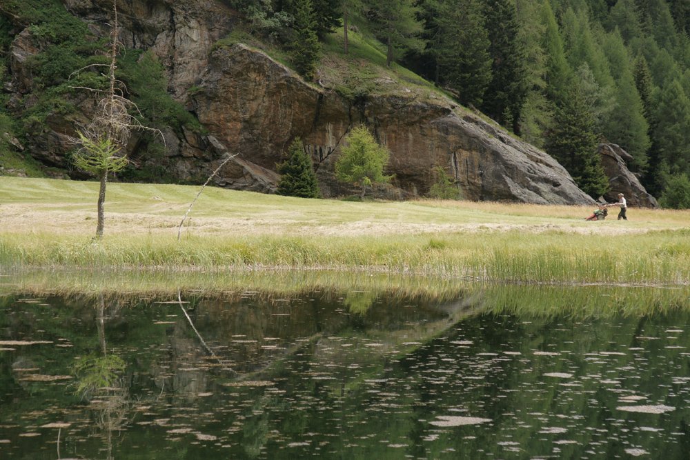
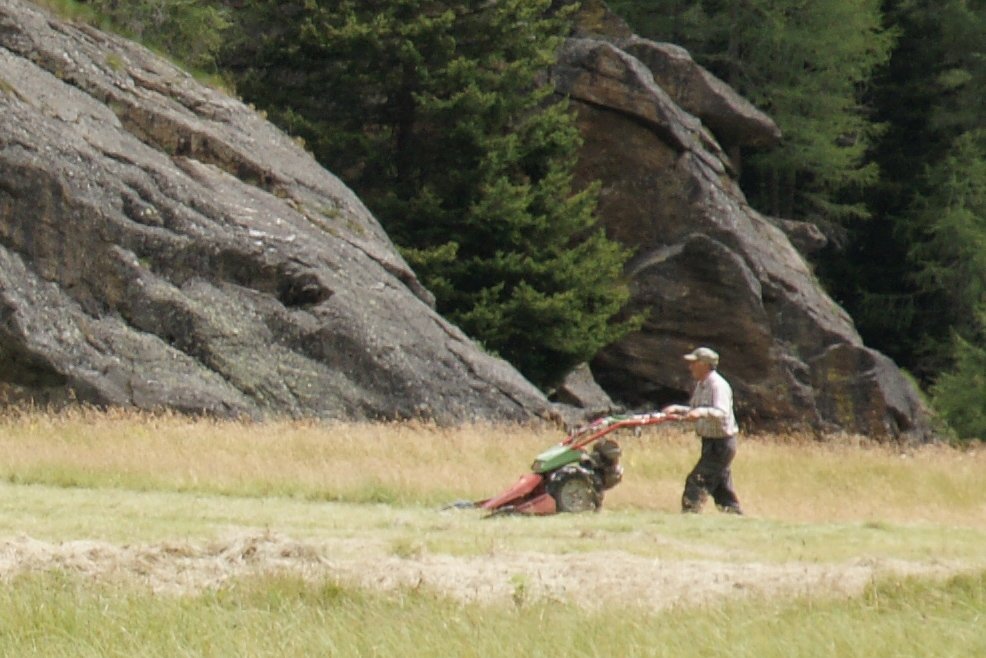
Figure 2. Before and after execution of phase 1: reduction of saturation.
Top: full image. Bottom: detail zoomed in.
Workflow phase 2: Variation
Color variation is the main goal of this phase, but a good deal of luminance variation is also acquired. The procedure works in the LAB color mode – for that reason, I do it in a smart object.
- Make a compositie layer and give it a meaningful name. Convert to smart object and open it.
- Establish an image area that is important enought to get better color and/or detail. The area should already contain some variation: greenery is almost always a good candidate, a clear blue sky is not. Make a rough selection that represents the area in terms of color and luminosity.
- Run the MMM Finetuned v.2 action. Be aware that the actual update is not limited to the selected area. The selection is only advisory, and will be discarded as soon as the action is started.
- The action creates two layers, one for Color only and one for Contrast only. Check each of these: sometimes opacities need to be adjusted, or either of the two removed completely.
- Optionally, repeat steps 2-4 for different image areas. The action will create a new group every time it is executed. Prevent the same color/luminosity range included in your selection multiple times, as this may cause extreme effects and even artifacting.
- Save and exit the smart object.
Example image
For the example image, I ran MMM Finetuned twice: once for the dark green trees (selection upper right corner) and once for the light greens (grass area). The result is shown in figure 3 (before and after).
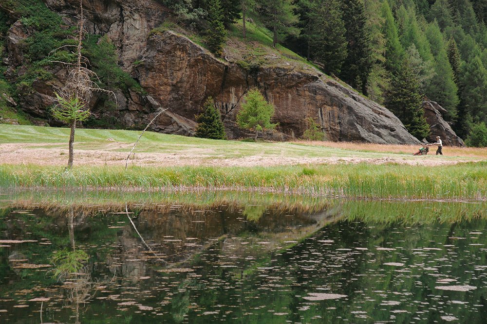

Figure 3. Before and after execution of phase 2: increase variation.
Top: full image. Bottom: detail zoomed in.
Workflow phase 3: Saturation
This phase will simply increase color saturation.
- Add a Vibrance adjustment layer and move the Saturation slider right until colors start to get overly saturated.
The disadvantage of this method is that colors cannot be individually targeted. When this is needed (e.g. greens need to be boosted more than reds), continue with step 2. - Add a Hue/Saturation adjustment layer and increase saturation for colors that need even more strengthening.
Example image
In the case of our example image, I applied Saturation +15 in a Vibrance adjustment layer. The result, before and after, is shown in figure 4.

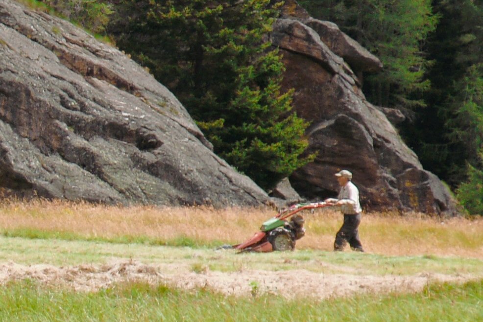
Figure 4. Before and after execution of phase 3: increase saturation.
Top: full image. Bottom: Detail zoomed in.
Workflow phase 4: Accentuation
This phase consists of running the new Clarity Power action and, if necessary, adjusting the result.
- Run the new Clarity Power action. The action creates a group consisting of five layers.
- Review the group opacity. Default is 50%, hence it can be adjusted in both directions, but in my experience, reducing is much more common than raising. The action is at its default settings indeed quite powerful.
- Carefully check for artifacts (halos and noise are the most common). If you find them, open the group and switch off those layers that contribute most to it. When this happens, most likely the artifact was already there and got strengthened by the action.
- Close the group to prevent new adjustment layers being created inside it.
Example image
I applied the new action on the example image and did no further adjustments. See figure 5 for the result, again before and after.

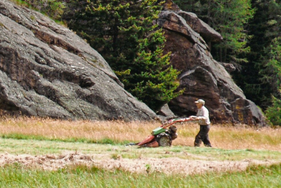
Figure 5. Before and after execution of phase 4: the Clarity Power action.
Top: full image. Bottom: detail zoomed in.
Workflow phase 5: Finalization
We finish with some touch-up. The main goal is to restore range, but other small corrections like fixing a color cast are also covered here.
- Add a Curves adjustment layer to fix global contrast. Set layer blend mode to Luminosity.
- If your image doesn’t cover full range, fix that now by moving the endpoints of the curve inwards.
- If your image lacks contrast, apply an S-curve. If your image is too light or too dark, correct this as well by moving the curve down or up.
- If there is a color problem, like the image is too cool, too red, etc., create another Curves adjustment layer, set to Color blend mode, and apply a fix for the problem.
Example image
Figure 6 shows the result for the example image, this time compared with the original. A moderate S-curve was applied, plus a slight warming of the color.


Figure 6. Original and final version.
Top: full image. Bottom: detail zoomed in.
Final remarks
One web page to describe a full color correction workflow is absolutely insufficient. Yet, I made the deliberate choice to do it this way. The current article can serve as a quick reference. A lot of extra explanatory text would obscure the overall process.
But of course additional information is required: explaining what goes on, how to prevent exceptional situations, tips and tricks, available alternatives, etc. So the next article will again give an overview of the workflow, but this time with a lot of commentary.
What I plan to do after that is, choose a representative set of photos and show you how to process them using the PPW Straight workflow, while carefully explaining every step and the choices to be made. In the end, I think that is more helpful than listing even more instructions and exceptions.
Gerald Bakker, 24 Oct. 2018 - rev. 2 Nov. 2018
Thanks to Bill Iverson for his valuable comments on an earlier version of this article.
Related articles
Picture Postcard Workflow