Picture Postcard Workflow and raw processing: How to treat color?
Contrast and color
After having discussed white balance, noise reduction and sharpening, it is time to cover what may be the most important aspects of raw processing: color and contrast. Let’s go back to what I said in my introduction article of this series: For best results, avoid contrast and color enhancement during the raw processing. Enter the PPW with a version that can be called “dull but not too dull”. I distilled this statement more or less from chapter 14 of the Modern Color Workflow book. Now I want to do some sort of verification: what if we do two runs of the PPW, one from a flat original and one from a well processed version? Do we see significant difference, and if so, which is better, and, more interestingly, why?
In order to keep matters manageable, for now I focus on color only. Contrast will be subject of a next article.
Introducing the trial
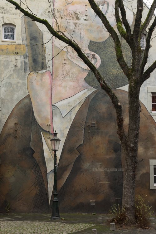
Have a look at figure 1, an original taken in a small street in Maastricht. (For those who want to know, the artist of this drawing is the French illustrator Roland Topor.) The painting is obviously the main subject, but it’s pretty dull. We need to enliven the colors – so this is a very suitable test image for our investigation.

Abstract
Figure 1. Original
Figure 2. Processed for color in Lightroom
Right – so I prepared two versions of my photo in the raw processor. The first one is figure 1. It has gone through Lightroom with White Balance set to Cloudy and all sliders untouched except for a slight Noise Reduction. The second one (figure 2) version differs from the first as follows:
- Vibrance +18
- Saturation +11
- In the Color panel, Red Saturation +26, Orange +33 and Yellow +12
Note that I left all contrast sliders alone, to limit the analysis to color only. Clearly version 2 has fuller, richer color, definitely putting more focus to the painting. Give it some better contrast and it could be a reasonable final version.
A quick PPW run: Color, Contrast, …
But our experiment has only just begun. Both versions go through the Picture Postcard Workflow. Step 1, color, is omitted. I assume the color (hue) to be correct from the white balance setting in Lightroom. Next, the contrast steps are performed.
- Lightest point is the white of the window frame top left. Darkest point somewhere in the bunch of branches, bottom right. Both are near neutral, but the white point needs to be lightened.
- I did a 50% blend of the red channel into the others. The red has the best contrast in the dark brown paint.
- Then I applied Velvet Hammer on both versions. The darks could use a little boost but not much. The action was left at default values, except that I switched off the Lightening curve layer as recommended.
The intermediate results are shown in figures 3 and 4. Color is still bleak, even more so than in the starting versions. Version 2 though has still stronger color.
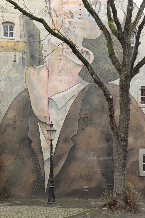
Figure 3. Version 1 processed for contrast
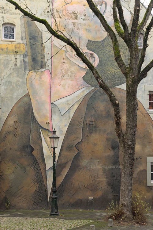
Figure 4. Version 2 processed for contrast
A quick PPW run: … Color again
We are entering the important phase: color again. My experiment is becoming tricky now, as the processing for the two contestants can no longer be equal. I have to do serious color enhancements on two image versions that have significantly different color. How do I keep the comparison honest?
The answer: I cannot guarantee anything but I can perform two runs like I would do routinely, and try to match the results for color intensity. Doing that, I prevent an outcome like “Version X is better because it has more color.” After all, we are searching for better color, not more color.
So, let’s go. My usual strategy for the second color phase is: identify areas that are important enough for an MMM application, run MMM Finetuned for those, and if the color can still use some strengthening, run Color Boost after that.
First, version 1 (the flatter one). Clearly, the brown of the jacket can use more color variation. I run MMM Finetuned on it and reduce opacity of the Color layer from 30% to 20% as the default is too much.
On version 2, I do the same, and I decide to set the same opacities. In both versions, the effect is considerable.
Next, I run the action again for the yellow-beige-pinkish areas of the top left quarter. Here, I switch off the Contrast layer as it makes the wall too dirty. For version 1, the Color layer gets opacity 20% again. In version 2, I set it to 10% as the color in that area is strong enough already.
See figures 5 and 6 for the intermediate results.
Figure 5. Version 1 after MMM applied
Figure 6. Version 2 after MMM applied
Version 1 is still bleaker than version 2; now I will try to compensate for that with different applications of the Color Boost action.
Version 1, Color Boost at 20% seems reasonable. Arguably, the pink edge around the man’s mouth gets too much color, but I decide to leave it. I run Color Boost also on version 2, and comparing the two I decide to set opacity to 10% there. That seems to give the two versions about the same color intensity.
One last step to make the comparison easier. Both versions are somewhat dark, version 2 more so than version 1. So I use the Endpoint Adjustment layer that Color Boost adds and lighten both images until they have roughly equal luminosity. Figures 7 and 8 show the final result (no sharpening applied).
Figure 7. Final version 1
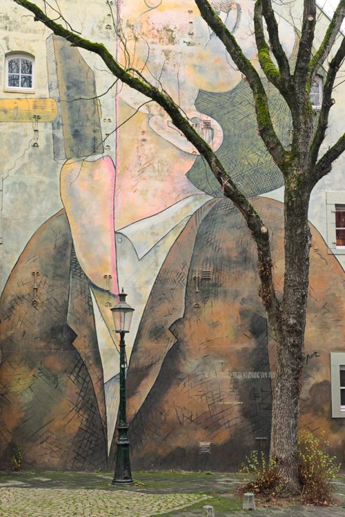
Figure 8. Final version 2
The verdict
So what’s the verdict? I definitely prefer version 1, and for me it’s clear what I like more: it has stronger color variation. It seems that the MMM action had more impact on version 1 than on version 2.
It’s not hard to understand why there is this difference. When I applied MMM, version 1 was still a lot duller than version 2. Hence the selections that told MMM where to create color variation were flatter in version 1. Now if you remember how MMM works – see this earlier article that more or less explains it – you may understand that spreading colors from a flat, pale area has a stronger effect than doing it from a more colorful area. That’s the difference between versions 1 and 2. To see some example comparisons, look at figure 9.
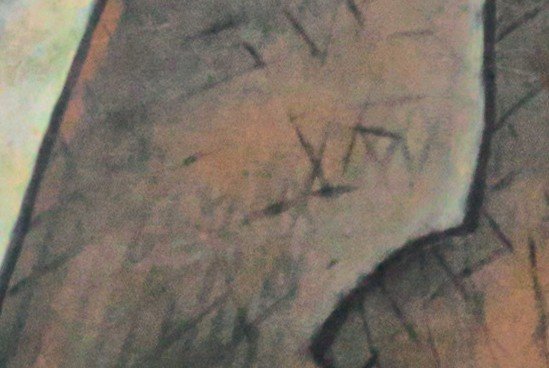
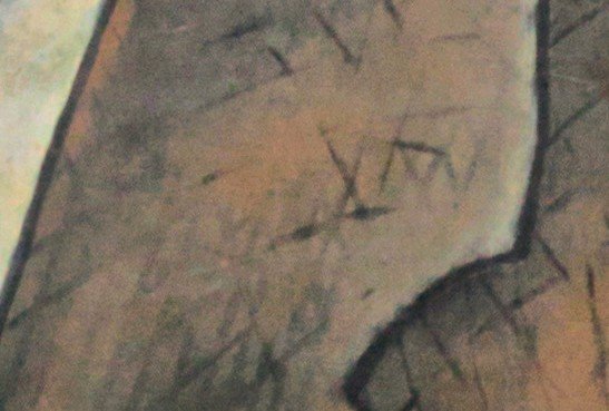
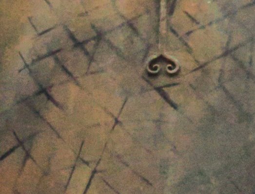
Figure 9. Left: fragments of version 1. Right: of version 2.
The distinction may be subtle, but look at the bluish shades on the left fragments. They provide just a bit extra contrast with the browns that makes the area more lively.
Now the question may be, can we redo version 2 differently to get the look of version 1? Well, we can certainly try. Here are some ideas:
- Increase opacity of the first MMM Color layer (the layer that enhances the brown paint). Yes, this yields more variation, but the stronger browns explode. Parts of the image are already too saturated to keep this amount of variation believable.
See figures 10 and 11 where I compare final version 1 with alternative version 2. Note the fierce orange that I believe is too much and degrades the image. - Same as idea 1, but add a blend-if to the MMM Color layer to exclude high B-values. This will mitigate the strongest browns and indeed bring version 2 closer to version 1. See figure 12. Yet version 1 shows a fresher, more light-hearted brown. The browns of figure 12 are still flatter.

Figure 10. Version 1
Figure 11. Version 2 alternative 1
Figure 12. Version 2 alternative 2
Surely I could go on and at some point get an image that is equivalent or maybe even better than version 1. This is not the point though. Question yourself, if figure 8 would be your final result, would you think about the two ideas above to improve it? Version 1 provides that better result automatically, without further thinking or tweaking.
The recommendation
All the above analysis may ultimately be a matter of taste. One could prefer figure 8 over figure 7 - fair enough. Yet, the color variation that MMM provides is crucial in the PPW - Dan Margulis even calls MMM the “signature move”. Starting with an image version that leaves enough room for an effective MMM application is always preferable over handling one that doesn’t. So that’s the basis for my recommendation.
- During the raw processing phase, avoid strengthening colors; better start the PPW from a dull image. For a strongly saturated original, it’s even advisable to reduce color somewhat before moving into the PPW.
Gerald Bakker, 26 Feb. 2017
Related articles
Picture Postcard Workflow