Picture Postcard Workflow and raw processing: Shining light on contrast
To contrast or not to contrast
I must confess: I doubted long about the title for this article. I started with something about contrast, until I realized that the scope of my study is not just “contrast”. A digital image is “color and luminosity”. Color was discussed in the previous article. So this time it’s all about luminosity, right? I changed the second part of the title to “shining light on luminosity” – but somehow it didn’t feel right.
Luminosity is a wider concept than contrast. The difference is, roughly, exposure. An exposure slider makes an image lighter or darker. That’s definitely luminosity – not contrast. Other luminosity-related adjustments impact both.
The three main phases of the Picture Postcard Workflow are named Color – Contrast – Color. Not luminosity. Of course, the word contrast fits better here: it provides alliteration and meter. But apart from that, retouchers are more concerned about getting proper contrast into their images than getting the luminosity right. Contrast sounds more… sexy, doesn’t it? What do you prefer to hear: “Your image has nice contrast” – or: “Your image has nice luminosity”?
So even though the subject for today is luminosity, I will mostly refer to it as contrast. We manipulate luminosity, aiming for better contrast.
How to handle luminosity/contrast in the raw processor, if the intention is to apply the PPW on the raw-processed image afterwards – that’s the question I want to answer.
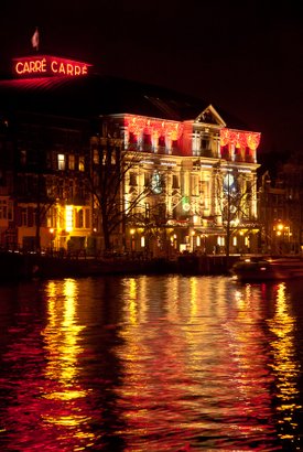
Amsterdam Light Festival
Of sliders and curves
Browsing through the panels and frames of Lightroom's Develop module and Photoshop’s Camera Raw, one may notice that “contrast in the raw processor” consists of a multitude of different items. There are probably too many options to just pick one example image, process it is a few different ways and draw conclusions from the results. Instead, I will follow a more theoretical approach, and illustrate my ideas and conclusions with some individual examples.
The following groups of contrast-related items can be identified in Adobe's raw processors:
- In the Basic panel: Exposure, Contrast, Highlights, Shadows, Whites and Blacks
- Also in the Basic panel: Clarity
- Tone Curves
- In the HSL panel: the Luminance sliders (in Lightroom this is the same as the Luminance sliders in the Color panel)
- In the Detail panel: Sharpening and Noise Reduction
- In the Effects panel: the Dehaze slider
See figure 1 for how some of these look in Lightroom.
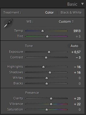
Figure 1. Basic (left) and Tone Curve (right) panels in Lightroom
Not all of these five are relevant in the context of this article. Following the same order, this is my first shifting:
- All of Exposure, Contrast, Blacks, Whites, Shadows and Highlights are about global contrast and as such must be looked at here.
- The Clarity slider makes me hesitate. It can be considered a contrast-enhancing vehicle, but one could as well call it a variant of sharpening. Clarity is more about local contrast than about global contrast, although I suspect it has a bit of both. I decided to keep it out of scope for now, and promise to look at it carefully in a following article.
- Curves must definitely be taken into account.
- Adjusting luminance per color (e.g. make the reds lighter, make the greens darker) can certainly be beneficial for artistic reasons, but I think it must be kept out of scope for the current analysis. The PPW doesn't have similar actions (except Darken Sky) so it would not be fair to include them in the raw processing phase and then perform some kind of comparison.
- Sharpening and Noise reduction have already been dealt with in two earlier articles. No need to consider these again.
- Dehaze, like Clarity, is a case of doubt. It is definitely contrast-enhancing but also touches color (saturation). It may benefit certain images in a way that is otherwise much harder to accomplish. Let me again postpone a discussion to a future article (maybe combined with the Clarity adjustment).
So, items 1 and 3 are relevant, the others I will ignore for now. And if you might think that the Basic sliders are special cases of what can be done with a Curves adjustment, this is not true. There are crucial differences between the two which I will explain below.
The recovery phase
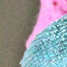
Following the more-or-less standard workflow for raw processing, the first thing the retoucher needs to consider is: do I have to recover blown-out highlights or clipped shadows? The rationale for this comes from one of the most important properties of raw files: they can hold more dynamic range than processed 8- or 16-bit image files can – and consequently, more dynamic range than a computer monitor shows. If an image shows white areas in the raw processor, there may actually be recoverable detail hidden in there! See example figure 2 showing this phenomenon. The original shows very dark (practically black) parts as well as an overblown area in the top of the object. By using just the Exposure slider in the raw processor, a lot of detail can be recovered.

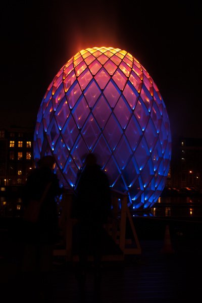
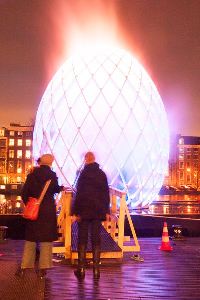
Figure 2. Original image - and the same image processed with Exposure -3 and +3 resp.
The only way to recover highlight or shadow detail is by using either of the Exposure, Whites and Blacks sliders of the basic panel. Curves don’t accomplish this – this is the main difference between the two.
- The Exposure slider changes the overall brightness of an image. (This is the luminosity-and-not-contrast element that I discussed in the introduction.) Increase exposure and blacks can start to show detail. Decrease it and the same may happen for whites.
- The Whites slider sets the white point. Move it left and highlight detail may turn up.
- Blacks sets the black point. Similar remark applies.
This recovery is a capability of post-processing that is not available in Photoshop proper (except in 32-bit mode, but that requires a completely different workflow). Start the PPW with a blown-out image area, and no action or button can bring back the detail that may have been available in the raw file. To go even further, I am convinced that having plenty of highlight and shadow detail is essential for effective processing later. Plenty, that is: more than just a recovery of what would otherwise be lost. Better acquire detail during the raw phase, because a raw file has more available.
Of course, highlight or shadow recovery does not apply to every raw file – far from that. It all depends on the dynamic range of the captured scene. For backlit landscapes, it’s probably a crucial aspect. For studio photographs, it may be irrelevant. Also note that not every clipped white or black needs to be recovered. This is ultimately an artistic decision. A photographer or retoucher may prefer to keep blacks or whites for dramatic contrasts. See figure 3 below for an example.
Figure 3. Image processed twice: left conservative, right with clipped shadows and highlights
What’s left?
After we have set proper white and black points, the question is: do we need to further increase or reduce contrast? Or does it depend on the image?
The simple answer to this question is: it doesn’t matter because step 2 of the PPW will do a curves adjustment for contrast anyway. What we can do in ACR or LR is possible in Photoshop as well, and better.
Let me explain. When range has been established, there is no significant difference any more between the luminosity sliders, a tone curve in the raw module, or a curves adjustment in Photoshop proper. By that, I mean: the net results of the various types of contrast adjustments are not fundamentally different. (An exception is that curves allow a retoucher to make extremer edits than a bunch of sliders.)
But there is a major advantage of Photoshop over Lightroom or Camera Raw. To understand why, you need to realize that manipulating contrast in the raw processor always impacts color as well. Increase contrast, and color intensifies. Diminish contrast, and color dulls. See figure 4 for an example of this. Three versions of one image, Contrast 0, Contrast +100 and Contrast -100 respectively. Note the color impact. I sampled the LAB color values of a single pixel somewhere in the middle of this image. The original measures AB 18, -72. In the contrasty version it's 33, -88 and in the dull one 10, -54.
The same effect occurs when contrast is adjusted with a Curve.
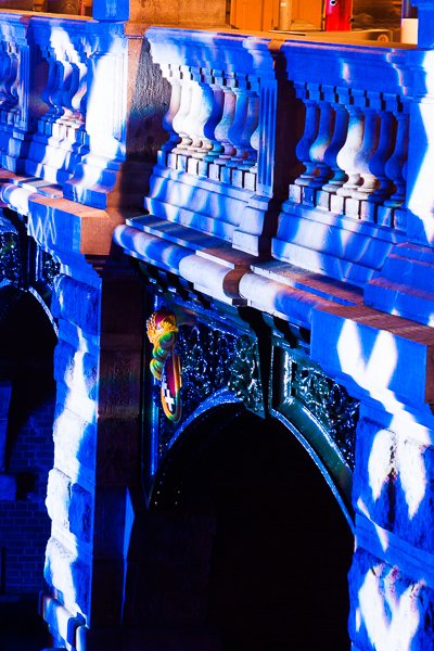

Figure 4. Image processed with Contrast 0, +100 and -100 resp.
Contrary to this, Photoshop proper offers the important option to put the adjustment on a separate layer and change its blend mode to Luminosity. This averts any impact on color, a definite advantage. Why accept a color change if we are concentrating on contrast?
Looking at the three versions of figure 4, the obvious question is: if we had to choose between these three, which one is preferred to start the PPW with? The answer, I believe, is: the rightmost one. Note the almost white spots in the image. In the dull version these areas are the least blown-out. This enables the retoucher to regain some detail and color. Also, starting with less color is an advantage.
Not accidentally, step 2 of the PPW prescribes to do contrast moves on a layer set to Luminosity. The result may be less colorful than possible, but that’s more advantageous than harmful. We have seen in the previous article that later workflow phases – MMM and Color Boost - yield more effective color enhancements.
The recommendations
Let me go back to what the Modern Color Workflow book recommends about the raw phase: don’t make your image over-contrasty, as this will hinder later processing. Better save the contrast-enhancing steps for the PPW: they are more powerful and more versatile than what can be done in the raw module.
I think my above analysis confirms this guideline, including what I say about highlight and shadow recovery. Recovery is in essence reducing contrast. One primarily needs the raw processor for that. Once that’s done, better employ the PPW for enhancing contrast.
So here are my recommendations:
- When applicable, use the raw processor to recover highlight and/or shadow detail.
- After that, don’t bother fine-tuning contrast in the raw processor, because one of the early steps of the PPW does the same, with the added advantage to do it on a Luminosity layer.
I repeat that Clarity and Dehaze are outliers – more magic than mathematics. They defy a theoretical analysis. I will explain my vision on them in relation to the PPW in a next article.
Gerald Bakker, 6 April 2017 / rev. 15 May 2017
Related articles
Picture Postcard Workflow