The PPW Sharpen review pt. 1 – The “conventional sharpening” layers
The action plan
Photoshop’s Unsharp Mask filter has three parameters and can be applied on any pixel layer. If users want to do their sharpening on a separate layer instead, they have to create it manually. The Sharpen by Halo maps action that I introduced some weeks ago has no parameters; it creates a group consisting of two layers. The PPW Sharpen action can be customized with a Preferences and an Options window. It creates a group of five to seven layers, depending on the user’s preferences. It comes with a 24-page PDF user documentation, and if that’s not enough, the PPW book dedicates a full chapter to it (15).
PPW Sharpen is, to make an understatement, ambitious. The corresponding Photoshop action, as delivered together with the panel, contains more than 150 steps (I didn’t even bother to count them). Maybe you expect me to unravel this action step by step and come up with an explanation of how everything works, but no, it’s too much and too complex. It wouldn’t make an interesting article by the way.
Instead, I will focus on my own experience with the action. Some of what I write will be an analysis of what I think the action does, some will be my personal opinion about it. Overlap with the manual and the book chapter is inevitable, but I will try to keep that to a minimum.
It’s my intention to work bottom-up through the layer stack. See figure 1 for how the Layers panel may look after a run of the action. For the current article, all I do is look at the bottom two layers, called “Dark Halos Multiplied” and “Light Halos Screened”. They constitute what is usually called “conventional sharpening”.
Device
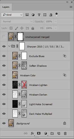
Figure 1. Layer stack after applying the action
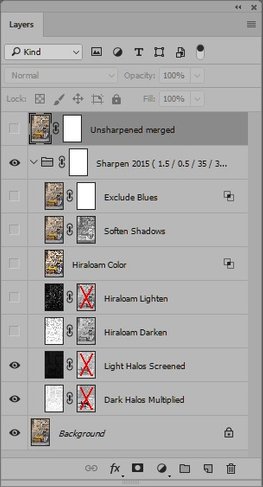
Figure 2. Modified layer stack used for comparison
Multiplied and Screened
The clue of the first point I want to make is in the names of the bottom two layers. To explain, I opened an image, duplicated it and sharpened each instance in a different way. One, the PPW Sharpen action (or Sharpen 2015 as it’s called in the current version of the panel). The other, the Sharpen by Halo Maps action (called SHM henceforward) that I explained in this article and you can download from here. (I chose these for my comparison because they share some similarities, the most important of which is that they put much less emphasis on light halos than on dark ones.)
To make a somewhat fair comparison (or better, to show my point), I changed opacities of the two layers of the SHM version to 100%. In the PPW version, I hid all layers except Light Halos Screened and Dark Halos Multiplied, disabled their masks and set both opacities to 100%. See figure 2 for how the layer stack now looks.
The resulting two versions are not much different. This is no surprise because the corresponding layers are constructed in a similar way. The layers themselves are so-called halo maps, i.e. pixels are black (or white for the Dark Halos Multiplied layer) where they are not impacted by the sharpen, and some grey value where they move. The “Dark Halos” layer only makes pixels darker, the “Light Halos” layer only makes pixels lighter.
On close inspection, there are subtle differences between the two versions that we now have. I show you a fragment of each, see figure 3. Left: original. Middle: PPW. Right: SHM.
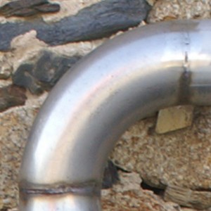

Figure 3. Original (left) and two differently sharpened versions. Middle: PPW (modified). Right: SHM.
First, look at the dirt on the pipe. Small dark spots that are hardly visible in the original. In the PPW version (middle), they get more pronounced than in the SHM version (right). Their irregular patterns indicate that we’re not looking at sensor noise but at real dirt. Who wouldn’t love such accentuation of fine texture? To me, it makes the pipe look more realistic. If this is what a sharpen action delivers, I say it’s very good.
One could object that the PPW version is just stronger, but this is not the case – which brings me to my second point. Look at the background wall, bottom right in figure 3. The holes in-between the stones are darker, almost black in the SHM version (right). In the PPW version (middle), more detail is retained in these larger dark areas. You may not be able to see it, but on the Info panel the difference is significant.
How come?
First, the simple part of the explanation. The Unsharp Mask that the PPW Sharpen applies - hidden somewhere in the 150-step action - is stronger than what the SHM uses. That's why fine detail is more brought out in the PPW version.
For the second part - better protection of blacks and whites - a bit of arithmetic is involved. (If you don't like that, you may skip to the section called "An intermediate summary".)
I believe the crucial difference is in the layers' blend modes. If we look at the Dark halos layers: for PPW Sharpen, it's Multiply; for Sharpen by Halo Maps, it's Subtract.
So what happens? Performing a strong Unsharp Mask inevitably plugs dark pixels. Imagine an original channel value of 20 for a pixel that borders to something lighter. Chances are that a strong sharpen will turn that to 0. Roughly speaking, the resulting halo map will code this as 20: the difference between original and sharpened value. Applying Subtract will simply render a result of 0.
But Multiply works differently. It multiplies the original value with what the halo map contains, on a scale of 0 to 1. The value of 20 in the halo map corresponds to approximately 0.9 on this scale – so the outcome of the multiply is 20 times 0.9 = 18. Quite a difference compared to the 0 of the other version. For midtones, the difference is not so relevant, for shadows it is.
For an example, look at figure 4. A small fragment, zoomed in at 300%.The sampled point, about in the middle, measures LAB values 15,4,11 in the original (not shown here): a dark brown. The PPW version turns L to 11, somewhat darker. The SHM version makes it 2, practically black.
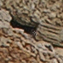
Figure 4. A small fragment enlarged. Left: PPW. Right: SHM.
An intermediate summary
Enough arithmetic - let me summarize the above in a few sentences without numbers.
The Unsharp Mask that the PPW Sharpen applies is stronger than what the SHM and most other sharpening algorithms use. Hence, fine detail is more brought out in the PPW version. However, dark shadows are better protected from plugging in the PPW version because of the usage of a different blend mode. The same is true for the highlights.
This, in my opinion, is a double advantage. Small texture is well enhanced, but edges that are already pronounced (dark or light) are not much amplified.
It’s obvious that there is a drawback to this: the two layers, and mainly the Dark Halos Multiplied, is prone to exaggerate noise. Noise is like fine texture, but unwanted, not corresponding to real detail. The action cannot know the distinction – I think no action can. For noisy images, multiple strategies are possible:
- Disable the Dark Halos Multiplied layer, or reduce its opacity. Not recommended if you ask me, because it also eliminates (or reduces) the beneficial effects of the layer.
- Mask out the noisy image parts. More work but also more control.
- Apply a curve on the halo map that erases its darkest pixels. The user manual describes the procedure. This has a similar effect as the Threshold parameter of the Unsharp Mask filter.
In most cases, option 3 works fine. It’s not an intuitive action though. I would prefer to have a Threshold field on the PPW Sharpen Options panel – better than tell the user to manually apply a specific curve in cases of excess noise. More about this later.
What about the masks?
Let’s continue looking at our example image. Remember we disabled the masks of the two PPW Sharpen layers. What happens when we re-enable them?
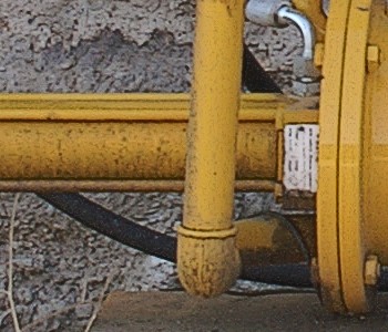
Figure 5. PPW Sharpen, conventional layers only. Left: mask disabled. Right: mask enabled.
Figure 5 gives the answer. A different fragment of the same image. Left the sharpened version without masks, right with. (From now on, we don’t look at the SHM version any more.)
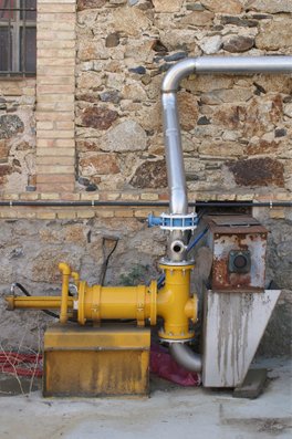
The difference is striking. What happened to all this wonderful gritty rust on that yellow device? Photographers love rust: the crispier the better. The mask eliminates at least half of it. Why?
The answer: because PPW Sharpen tones down the sharpening of colored areas. The mask is close to what we call a “saturation mask”. The more colorful the pixel, the darker the mask, the less sharpen. The logic behind this strategy is that many colored things do not need much sharpening, or none at all. Blue skies, flowers, skin, to name a few examples.
I must say, I am hesitant about this reasoning. Yes, everyone would agree with the given examples. But it's for different reasons, not particularly because they are colored. A blue sky must not be sharpened because it’s featureless by nature – any sharpen attempt will increase noise or do nothing at all. A flower must not be sharpened because it’s supposed to have a delicate texture which might otherwise be destroyed. Skin must not be sharpened (or moderately at most) because it tends to make a person look older. I believe color is not the defining factor here. A sky may be a featureless white or light grey – no color, but still better off unsharpened. A flower may be white as well – and still as delicate as a yellow or red one.
Maybe it works as a kind of strategic trade-off. The question could be, given any sharpening layer, would a user prefer to:
- start with an empty mask, and then manually mask out image elements that do not need sharpening (colored or not), or:
- start with a saturation mask and then manually mask in (?) image elements that need sharpening despite their color
Speaking in general, I am not sure. Looking at my example image, I definitely would prefer the first option and mask nothing out. All these objects and background benefit from sharpening, including the yellow device that we are looking at in figure 5. When asked to choose one version, I would pick the left, fully sharpened version. What about you?
Reducing the mask and some ranting
If you want all colored image elements to be sharpened full power like everything else, it’s easy enough to disable the mask. (The Dark Halos Multiplied layer counts mostly for this effect, so that’s the one to handle.) If you do appreciate what happens, but you think there’s too much of it, you can lower the mask’s density. (Double-click its icon to open the mask’s Properties panel, and then move the Density slider to your liking.)
And here’s the opinion of a spoiled IT professional. I think the extent of suppressing the sharpening of colors should be configurable. It should be an item on the Sharpen Options window, like all the other options. Ideally a slider, allowing a user to enter a value between 0 and 100.
You see, that’s what happens when someone provides me a highly sophisticated sharpen. After some time I start complaining that not all of the built-in functionality is configurable. I know, I am ungrateful. In the course of this article, I suggested two extra configuration items: a Threshold setting (a better name might be Suppress noise) and a Suppress color sharpening slider. And note, the options window is already full of configurable things, see figure 6.
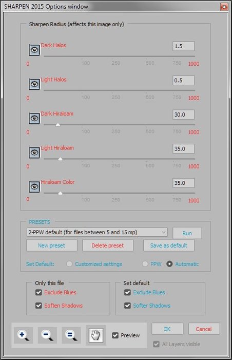
Figure 6. The current Sharpen Options window
Actually, it’s not ungrateful. I'm not complaining either: I'm just writing a review, expressing my opinion. But I can assure you from professional experience that a powerful and intuitive user interface is highly important for the acceptance of any piece of software. Many (potential) users search for a good sharpen but are too lazy to read the manual or study in detail what happens when they click a button. As soon as they find out that something is not as they like – too much noise or whatever – they judge the product as inferior. Now that is ungrateful, but it happens all too often. I have colleagues who react like this, even though they should know better.
Photoshop users who choose Menu: Filter – Sharpen – Unsharp Mask, first see a panel, inviting them to enter three values. They may mindlessly click OK, but at least they get a trigger that something can be done to impact the outcome. Users who click the PPW Sharpen 2015 button get a full layer stack, but no hint how to adjust whatever they may dislike. Supplying a Threshold entry field may help such users, leading to better quality sharpening results for them and a wider acceptance of the PPW panel in general.
Let me stop my ranting here, hoping you didn't find me exaggerating. The short conclusion is that the PPW Sharpen action is very good for what it does, but it requires study to reach its full potential.
Next time I will look at the three Hiraloam layers.
Gerald Bakker, 29 January 2018
Related articles
Picture Postcard Workflow