The PPW Sharpen review pt. 2 – The “Hiraloam” layers
An example image and another contest
A few weeks ago I explained that two more or less different ways of sharpening exist. One is the genuine (or “conventional”) way of sharpening: amplifying edges. The other is what is often called “shaping”: mildly intensifying local contrast. In PPW-context, this is called "Hiraloam" – High Radius, Low Amount.
The PPW Sharpen action does both: conventional sharpening in the two bottom layers and hiraloam sharpening in the following three layers. The subject of this article is this second set: Hiraloam Darken, Hiraloam Lighten and Hiraloam Color.
A comparison of the PPW Hiraloam implementation with other, comparable actions is not as easy as it was for the conventional sharpening. Many different varieties of “shaping” methods exist: from simple tutorials available on the web to commercial products. No doubt each has its own merits and drawbacks. For now, to present a comparison that is as fair as possible within the limits of just one article, I chose the following “rules”:
- Only compare contrast and rule out any color impact
- Choose an image that contains both strong highlights and dark shadows, both small detail and large solid areas
- Compare PPW hiraloam not with just one, but with multiple other methods.
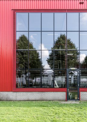
A red building
I picked three other methods, each of which is freely available for those with Photoshop CC or later:
- A simple application of Unsharp Mask with Radius 35 amount 35%
- The Clarity slider set to +50 in the Camera Raw filter
- A more sophisticated action that tries to simulate Clarity without using the ACR filter
The third item deserves a little explanation. I learned it from a tutorial years ago, added it to my Actions panel and have used it regularly since then. While preparing this article, I searched back for the original tutorial but couldn’t find it. I did find another one explaining the same action, it’s here: https://layersmagazine.com/the-high-contrast-portrait-look.html.
All three of these are applied on a layer that is set to Luminosity. The comparison will be done with the combined Hiraloam Darken and Hiraloam Lighten, which also only affect luminosity. I will discuss Hiraloam Color later.
I must admit, there is still an aspect of arbitrariness in my contest, notwithstanding the defined rules. Pick a different image, or a different alternative method, and the conclusions may be different. But I believe my example image is good enough to show a few features that I consider generally true. Perform your own tests if you like.
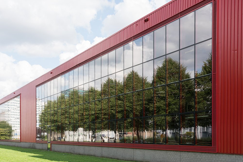
Figure 1. Original image
Figure 1 shows the original image. I opened this image in Photoshop and duplicated it three times. On the first instance I applied PPW Sharpen 2015. On the second, third and fourth, the other actions as described above. See figure 2 below.

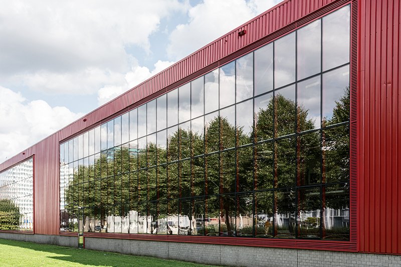


Figure 2. Four versions for comparison
- Upper left (named PPW): PPW Sharpen 2015, where I switched off all layers except Hiraloam Darken and Hiraloam Lighten, and set opacities of these to 50% and 30% resp.
- Upper right (named USM): Unsharp Mask, 35/35/0, on a layer set to Luminosity
- Lower left (named ACR): Camera Raw filter, Clarity slider set to +50, on a layer set to Luminosity
- Lower right (named CLA): The result of the aforementioned Clarity simulation action, on a layer set to Luminosity and opacity 50%
The opacities were chosen to get a more or less comparable look.
In the small versions as shown above, there may be not much visible difference, but I will show the distinctive characteristics of each by zooming in on small image areas.
Shadows, highlights and midtones
First, let’s have a look at shadow detail. A good “hiraloam” method should lighten small details in dark areas. Look at figure 3 below for how the four contestants perform.

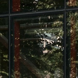
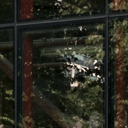
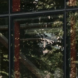
Figure 3. A comparison of shadow detail
I think that PPW (top left) and CLA (bottom right) win here. Take into account that the Hiraloam Lighten layer is only set at 30%, and one can imagine what it's able to accomplish. This aspect is explicitly mentioned in the PPW Sharpen documentation, but I find it important enough to re-emphasize it here. For those images where shadow detail is important, it’s worth raising the opacity of the Hiraloam Lighten layer.
My feeling is that the ACR version (bottom left) does the worst job in this respect. Overall, it seems to darken the image somewhat. One could get the impression that a global contrast curve was applied in addition to a local contrast enhancement.
Second: highlight detail. Similarly to what I said about shadow detail, we’d prefer to see small darker elements in light areas to be darkened, in order to bring them out. Figure 4 shows the results.
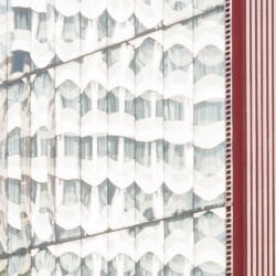

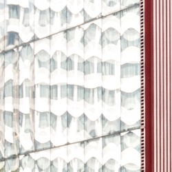
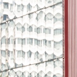
Figure 4. A comparison of highlight detail
Again I have a preference for PPW (top left) and CLA (bottom right).
To show you what’s possible when opacities are increased, look at figure 5. Left: PPW with Hiraloam Darken set to 100%. Right: CLA set to 100%. Which is best? I would say: CLA, but it's a close call.
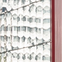
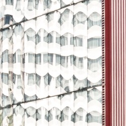
Figure 5. PPW and CLA both set to 100%
Third, what about midtone contrast? Have a look at a fragment of the stone wall: figure 6.
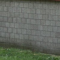
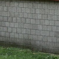
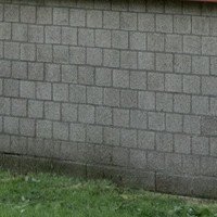
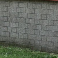
Figure 6. A comparison of midtone detail
Which of the four is the most contrasty? I would say: ACR (bottom left). Interestingly, this version also makes the wall considerably lighter, presumably because it’s surrounded by darker areas. The PPW version is not so convincing here, leaving the distinction between lighter and darker stones somewhat weak.
Trying to come to a verdict
Now let me step back and contemplate what I’m doing… I am comparing four different versions that all aim to enhance local contrast. I tried to set opacities such that the alternatives looked about equally strong. Doesn’t it follow that if some aspects are better in one version, other aspects are expected to be weaker? How meaningful is this comparison really?
Sure, it’s useful to note that PPW Sharpen is strong in emphasizing shadow and highlight detail, and less successful in bringing out midtone detail. But until now I really don’t feel able to appoint a winner. It depends on the character of the image and the preferences of the retoucher.
But there is something else to look at: artifacts, unwanted side-effects of the actions and filters. In one of my recent articles about sharpening I already noticed that the USM filter, when invoked with a large radius, is prone to haloing. This is definitely visible in our example image: in the clouds just above the building. The other three versions don't suffer from that, but they suffer from other "abnormalities", if that's a proper term.
The Clarity slider of the Camera Raw filter (ACR) tends to make an image darker at high values.
The CLA action shows strange hard-edged "spots" in image areas where one of the channels is blown-out. This is not the case in our example image, but I didn't need much time to find an example.
Unfortunately, the PPW version is not free of artifacts either. And because I am writing a review of this very action, I show what may happen.
The philosophy of artifacts
Hiraloam Lighten sometimes causes a strange artifact in the form of a light triangle, where a featureless light area touches a dark corner. It happens in our example image in the large windows, most prominently on the very right. See figure 7. Left the original, middle the PPW version, right the CLA version.
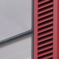
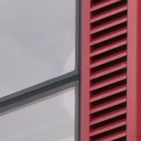
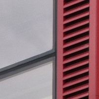
Figure 7. Example artifact. Left: original. Middle: PPW. Right: CLA.
I assume everyone will agree that these triangles are not supposed to be there. Yet, they do not harm this particular image very much. (I've seen worse than this though.) In the default opacities of the Hiraloam layers, they are close to invisible. A viewer could well miss them completely, even on close inspection. And even with the increased opacities of figure 7 someone who doesn’t know the original could assume that the glass was damaged, or that a window cleaner did a sloppy job in the corners.
I discussed the issue with Dan Margulis, and his reaction was that this is a known side-effect of the Median filter, which in most of the cases gives superior results over other methods. It happens only in a small minority, say 5%, of all images. An understandable trade-off. The question becomes almost philosophical:
- Do we accept unwanted artifacts in 5% of the cases for significantly better results overall?
- Or do we prefer an inferior method because of the risk of missing an anomaly like we see here?
The choice is rather personal in my opinion. For those who work with landscapes only, the problem may be non-existing. In architecture work, the percentage will be a lot higher than 5, and more attention is required. Also, one should consider the consequence of overlooking a small error. Is it easily correctable later? In that case, not much to worry.
Should you notice such a little triangle, it is most likely caused by the Hiraloam Lighten layer. Switch it off to verify that this is indeed the case. If so, the following options are available:
- Enable the mask of the Hiraloam Lighten layer. Chances are that this solves the problem, but it weakens the layer somewhat.
- Switch Hiraloam Lighten off completely. This removes all beneficial effects too, so the price is high.
- Replace Hiraloam Lighten by any other layer that has a similar effect.
Option 3 is not as far-fetched as it may seem. I do this every now and then, using the CLA action as described above for this (taking care that I don't introduce new artifacts!).
As a final remark, I found no mention of these triangles in the Sharpen 2015 documentation: an omission if you ask me.
Hiraloam Color
There is a good description of Hiraloam Color in the panel documentation, well explaining in which cases it’s beneficial and where it may cause problems. I would say, a small minority of images really benefits from this layer, but if it does, it’s quite effective. Think small streaks or patches of color that are nicely emphasized. It can do harm as well, but on the default opacity (as low as 20%), this is rare.
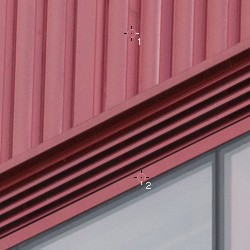
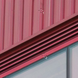
Figure 8. Left: original. Right: Hiraloam Color at 50% opacity.
Hiraloam Color comes with a Blend-If setting that suppresses its effect on extreme darks and lights: a basic protection against haloing. Yet, the user must be aware of a potential haloing effect in larger colored areas. Look at figure 8: original (left) and Hiraloam Color only, strengthened to 50% (right). The red area is practically unaffected in the middle, but it gets redder close to the border where it touches neutrals. In the default 20% opacity, this is almost invisible (and not objectionable at all), but it’s dangerous to increase opacity in cases like this. If you still want to do that because it has a nice effect elsewhere in the image, mask out areas where it’s unwanted. By default, the layer has no mask.
Hiraloam Color is an outlier in the PPW Sharpen layer stack. It is the only layer that strengthens color. Photoshop websites and books teach you that color should not be affected by any sharpening algorithm. Well, here is the exception. If your image is worth the effort of a full PPW treatment, it is also worth considering for a second or two if its color deserves a bit more accentuation. On a local level, that is. If so, increasing opacity of the Hiraloam Color may well have a favorable effect.
Gerald Bakker, 12 March 2018
Related articles
Picture Postcard Workflow