The PPW Sharpen review pt. 3 – The “toning down” layers
Artifacts again
If any step in an image enhancement process is susceptible to unwanted artifacts, it’s probably sharpening. A sharpen action introduces artifacts by design: small light and dark halos. The skillful retoucher makes sure that they remain invisible while having maximum effect.
It follows that good sharpening is walking a fine line. Go too far and halos become visible. Don’t go far enough and the final image remains soft. But that’s not all. What is “too far” on one part of an image, may be “not far enough” elsewhere on the same image. What works well here, looks mediocre there. Different approaches are required, not just between two images, but often enough within one image. The same dark halos that have a wonderful effect on gritty texture, do nothing but bring out noise – an unwanted artifact! – in a featureless area like a blue sky.
The question is, how to deal with such cases. Reducing sharpening everywhere to prevent problems somewhere is a weak approach, isn’t it? Why accept a softer image to prevent excess noise in an unimportant background? Better mask out the problem areas, either manually or by some blend-if setting. This may not always be straightforward though; effective strategies are different for every image.
It makes sense, doesn’t it, to have automatic mechanisms available. Mechanisms that make a clever guess where the sharpening effects are not needed or counterproductive. This is exactly what the two top layers of the PPW Sharpen action aim to do. Both are optional; by default they are off, meaning they don’t show unless the user explicitly asks for them, either as a default or on a per-image basis. The layers are called “Exclude Blues” and “Soften Shadows”. Let’s examine what they are supposed to do, and how well they do it.
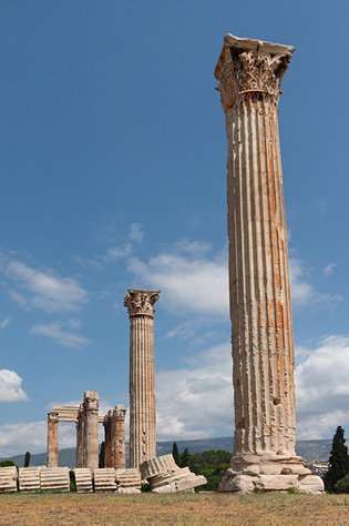
Athens
Exclude Blues
Coming back to the risk of emphasizing noise in a blue sky, this layer is exactly meant to mitigate that. Of course, there is no way for a layer or an action to know blue skies from anything else, so it uses the best possible distinguishing feature: color. This layer is a copy of the unsharpened image, limited to blues only. Simply said, the sharpening of blue pixels is, well, undone.
This is an obvious oversimplification. But it works nevertheless, as long as you are aware of the limitations.
- First, everything blue is included; not just sky. For sky, it’s as desired. For other blue objects, it’s usually not. Fortunately, blue is a not so common color in the real world. Mask out blue objects, if they exist in the image, and the problem is solved.
- Second, the layer uses the LAB definition of blue, meaning anything with a negative B component. This is questionable, as cyans and purples are included too. Cyans are fine, because sky color tends towards cyan. But I think purples should be left alone. Admittedly, purple objects are even rarer than blue ones, but they do exist: flowers and clothes come to mind. Why exclude the sharpening of a purple jersey by a layer that is called Exclude Blues?
Be aware that the layer precludes all sharpening of blues: both conventional as well as high radius (hiraloam). Excessive noise is caused by conventional sharpening, not hiraloam. One might feel that a better place for the Exclude Blues layer is below the Hiraloam set, but I am not so sure. Let me show you an example.
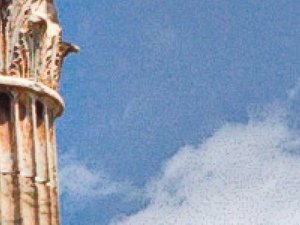

Figure 1. Exclude Blues switched off (left), at its default place (middle) and below the Hiraloam layers (right)
Figure 1 is a fragment of an image, sharpened in three different variations.
- Left: without Exclude Blues - note the noise in the sky.
- Middle: with Exclude Blues as top layer, ruling out all sharpening of blues. Note how this also softens the clouds, a good thing if you ask me.
- Right: the result of moving Exclude Blues between the small halos layers and the Hiraloam layers. There is indeed not much noise, but the sky isn't really better either in comparison with the middle version. Some might say it's livelier, but I tend to disagree. Let's face it, what good can Hiraloam sharpening do to something as flat as a blue sky?
My own practice is to leave Exclude Blues on by default, and hide it when not necessary. This means that I always remove the layer when an image does not contain blue sky or other uniform blue areas that better remain unsharpened.
Soften Shadows
The purpose of the Soften Shadows layer is harder to explain. The name seems self-evident: one would assume that it reduces the sharpening of dark image areas, making them softer, less harsh. But it’s not so simple.
The documentation doesn’t say very much about it. To quote the paragraph that is supposed to explain the purpose of Soften Shadows: “The original idea of this option was to combat shadow noise. We have since seen that it has a pleasant effect whenever softer shadows are desired. It is useful, for example, in fashion work where the model has dark hair; the layer softens it as well as eyebrows.”
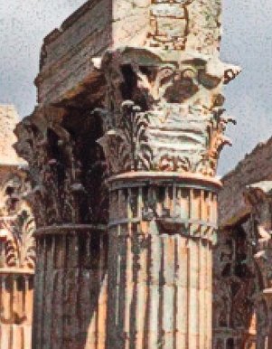
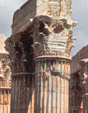
Figure 2. Left: unsharpened. Middle: sharpened without Soften Shadows. Right: with Soften Shadows.
Let’s have a look at what happens. Figure 2 shows a different fragment of the same image where figure 1 was taken from. Left unsharpened, middle sharpened without Soften Shadows, right sharpened with. To me, it seems that the layer only tones down small dark image areas. Note the vertical shadow lines of the front pillar. In the right version they are considerably lighter (could one say: softer?) – that’s the effect of the Soften Shadows layer. The dark shadow area under the pillars' top however has remained as dark as it is without the layer. Also, the noise in the clouds remains mostly untouched. The Soften Shadows layer softens small, narrow darks but leaves larger dark areas mostly alone.
To be honest, I am not too fond of this part of the PPW Sharpen. Its ability to reduce shadow noise is quite limited, and it removes a lot of crispness at the same time. Below I give you three different recommendations related to this layer.
- The simplest one is, switch it off by default. (See the Sharpen 2015 Preferences window, accessible from the PPW Preferences panel.) If you feel that shadows have become too brittle in an image, activate Soften Shadows from the PPW Sharpen options window and see what it gives.
- If you have more time, leave Soften Shadows on by default, and examine the layer’s effects every time you invoke the PPW Sharpen action. I predict, you will often prefer to turn it off or reduce its opacity.
- And third, you may try an alternative that I think works better. Replace the Soften Shadows layer by a copy of the unsharpened image, while keeping its mask and opacity unchanged.
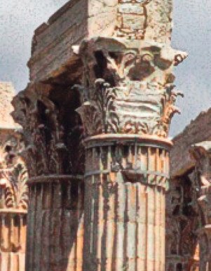
Figure 3. Left: unsharpened. Middle: sharpened without Soften Shadows. Right: with alternative Soften Shadows.
Figure 3 shows what I mean. Left the unsharpend version (same as figure 2 left). Middle the sharpened version without Soften Shadows (same as figure 2 middle). Right the result of the alternative Soften Shadows procedure as suggested in alternative 3 above.
The ultimate advice is probably to experiment yourself and find out what suits you best.
Finalizing comments
I closed my first part review of the PPW Sharpen action by remarking that it’s very good but not easy to use. Now that I am about to finish the third and final part, my overall conclusion is still the same. Despite my criticism here and there, I still find the action very good. It’s way better than Photoshop’s Unsharp Mask and Smart Sharpen filters.
But as I showed in the three review articles, PPW Sharpen does not always give superior results. To be honest, I wouldn’t apply the action to a batch of images without doing a quick verification afterwards. This is no surprise: an action cannot know the characteristics of the image it runs on. Techniques that work well for most images may cause problems in certain, hopefully rare, cases. That’s acceptable provided that the user knows how to deal with them. And there’s the Achilles heel of PPW Sharpen: troubleshooting is not always intuitive.
The video on moderncolorworkflow.com that accompanies the action is called “Sharpening for the Connoisseur”. See figure 4.

Figure 4. From the PPW website. (No, the video can't be started from here.)
According to my dictionary, the word connoisseur has two meanings:
- First, someone who loves the good things of life, particularly matters of taste
- Second, an expert in any field
The title could not have been chosen better. This action gives a lot of enjoyment to those who have mastered it. I say: study the manual, experiment on your images and become a connoisseur of PPW Sharpen.
Gerald Bakker, 17 April 2018
Related articles
Picture Postcard Workflow