Bit Depth part 2: The magic of 32-bit coding
8-bit, 16-bit, 32-bit
While comparing 8-bit with 16-bit images, I noted that 16 bits of data per channel give room to an excessive amount of different colors and gradations. More than a human eye can distinguish, more than a monitor can display, more than a printer can print, and probably more than a retoucher needs for normal, everday editing.
Yet, 16 bits are not the limit for some, as Photoshop supports an even higher amount: 32-bit coding. Well, if 16-bits seems like overkill, why on earth would we use 32-bits? Read on. Just note: I didn’t say you need it, but there is an idea behind 32-bit coding.
I suggest to do some experimentation in Photoshop.
Open Photoshop and from the menu, File – New. In the dialog, choose a reasonable width and height (say, 500 pixels each). Resolution does not matter. Background Contents white. For Color mode (while still in 8-bit), we have 5 options: Bitmap, Grayscale, RGB Color, CMYK Color and Lab Color. A quick test shows that 32-bit is only supported for the color modes RGB Color and Grayscale. As the reasoning for either is the same, choose RGB.
Sweets in HDR
First observation. 32-bit coding in Photoshop is only available for RGB and Grayscale.
Still in the “New File” dialog, do not pick the 32-bit option yet. Choose 8-bit instead and hit Create. We get a white document, but just white is not so interesting. Select roughly one third of the image and hit Menu: Edit – Fill. Choose black and OK. Next, select about half of the remaining white part, and fill with 50% gray. To make the image a bit more colorful, make a big selection that crosses all three neutral areas and paint a rainbow gradient over it. If all is well, the image now looks like figure 1. The exact layout and colors do not matter much.

Figure 1. Example "image"
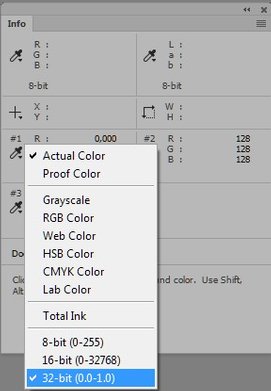
Figure 2. Switching to 32-bit readouts
32-bit readouts
Sample three points, black, gray and white. Open the Info panel and read out their RGB values. They should be 0,0,0 – 128,128,128 – and 255,255,255 respectively. No surprise so far. Remember that we are still looking at an 8-bit image.
Now, without converting the image in any way, change the readout of the sampled points from 8-bit to 32-bit. See figure 2 for how to do this. Note how the sampled values change from something between 0 and 255 to values between 0.0 and 1.0. This is how 32-bit coding works: pitch black is 0, full white is 1. Anything in-between is a fracture. (As you may see, middle gray translates to 0.502, 0.502, 0.502.) We will see in a minute what “pitch black” and “full white” in 32-bit mean, but for now we have an important notion.
Second observation. The 8-bit RGB or Grayscale values 0 - 255 translate to 0.000 – 1.000 in 32-bit.
Should we start with a 16-bit image and perform the same steps as above, the observation would be similar. The lightest possible white in 16-bit corresponds to 1.000 when read out in 32-bit. This matches with the statement of the previous article that the dynamic range of 8-bit and 16-bit images are equal.
Still keeping the image in 8-bit, let’s continue with another simple experiment. Add a Levels adjustment layer and in the Levels properties panel, move the left (black) triangle to the right, say to 50, and move the right (white) triangle leftwards by an equal amount, so to 205. See figure 3.
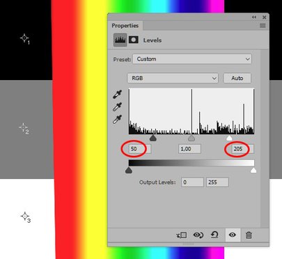
Figure 3. Adding a Levels adjustment to the 8-bit image
This roughly translates to telling Photoshop: “Plug the shadows and blow the highlights”. What happens? The neutrals, including the readings in the Info panel, remain unchanged. This makes perfect sense, because nothing can become darker than black, and nothing lighter than white. As we moved the left and right triangle equal amounts, the middle gray will not change either.
The colors however get brighter - the adjustment moves them closer to the full primary and secondary colors, so the red, yellow, green etc. stripes have widened in comparison with the original.
Of linearity and gamma corrections
Now remove the Levels adjustment layer and change to 32-bit mode. Menu: Image – Mode – 32 Bits/Channel. The look of the image doesn’t change but something weird happens with the sampled values in the Info panel. White and black remain 1.0 and 0.0 respectively, but gray changes from 0.502 to 0.216. The reason for this has nothing to do with the amount of bits per channel, but with the so-called gamma correction of digital imaging systems.
Gamma correction deserves an article of its own, but nevertheless I will provide a quick explanation here. The gray that people and Photoshop call “50% Gray” is far from 50% gray for a machine that measures the amount of light. It’s a lot darker, more like 21% gray or so. The real (machine-measured) 50% of a monitor’s white is a lot lighter, seemingly (for humans) much closer to white. Yet, our eyes don’t perceive it like that. We see many more levels of brightness in darker tones than in lighter tones: a non-linear way of seeing. The gamma correction that most RGB systems use emulates this non-linearity.
This gamma correction is absent in Photoshop's 32-bit coding.
Third observation. The 32-bit way of coding employs gamma 1.0. In other words: It is linear.
In contrast, the default gamma of 8-bit sRGB is (roughly) 2.2. For those who desire a mathematical formula, I’ll give a hint. Here is the applicable computation for our middle gray:
If you really want to know more, many websites exist that provide excellent explanations of gamma corrections. The following picture may clarify the concept a bit more:
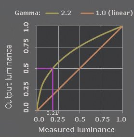
Figure 4. Gamma 1.0 and 2.2 in one graph
Whiter than white, blacker than black
Let’s continue our experiments to find out how 32-bit coding behaves. Again we add a Levels adjustment layer and set the three triangles at the same positions as we did before (50, 1.00, 205). The effect on our image seems similar to when it was still an 8-bit image, but there are a few quite relevant differences. First and most prominent: the middle gray gets considerably darker this time, a consequence of the linearity - after all, we started with lower-than-half RGB values for our 32-bit coded gray.
But the most important difference is only visible in the Info panel. Note the new values of black and white. Black has changed from 0 to -0.322 – a negative! – and white from 1 to 1.323. Darker than black and lighter than white are possible in 32-bit. You won’t see it on your screen, but a lot of detail may be poked into these “sub-black” and “super-white” areas. Reading 32-bit R,G and B values of the colored part of the image, you will see that many have become negative or greater than 1 as well.
Fourth observation. In 32-bit, higher values than the maximum light, and lower values than the minimum dark of 8-bit and 16-bit are possible.
To see the potential of this in terms of numerical values, add an Exposure adjustment layer, on top of the Levels layer. In the properties panel, set the Exposure slider to 4. Effectively, this means: make everything 4 stops lighter. “4 stops” is really four times twice as much. In mathematical terms, this means 2x2x2x2 or 16 times as much light (or: as much darkness). In the linear way of 32-bit coding, the simple effect on the figures in the Info panel is that every value gets multiplied by 16.
Doing that, the values for black become -5.160 according to the Info panel. Can you imagine such a dark black? For white, the RGB’s have now gotten a mind-boggling value of 21.16. See figure 5, in which I have added a sample point in the green area.
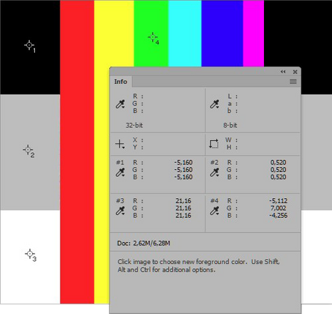
Figure 5. Info panel after exposure adjustment
The rainbow gradient has turned into six vertical stripes, red, yellow, green, cyan, blue and magenta respectively. Any gradual transition between adjacent colors has been swallowed by this extreme move.
To verify that the detail is still there, add another Exposure adjustment and set the exposure slider to -4. This undoes the previous move. The image looks identical to what it was before the +4 Exposure adjustment. In 8-bit, an "undo" of such an extreme move is absolutely unthinkable.
Really, this is only the beginning of what is theoretically possible. You can add another Exposure adjustment and set Exposure to +20 (the highest allowed). The blacks and whites get into millions. Don’t ask me what the absolute maximum value is – I don’t know and I don’t need to know. The dynamic range of images coded in 32-bit is practically unlimited.
Any practical value?
So, why would someone need these ultra-high positive or negative values? They don’t give any more detail on a computer screen, let alone in print. The answer: HDR (High Dynamic Range). HDR will be the subject of a future article, in which I will also look at what happens when the 32-bit image needs to be converted back to 8- or 16-bit.
Gerald Bakker, 9 Feb. 2017
Related articles

Photoshop by the Numbers
