Color Correction by the Numbers pt.3: The tricky mixed lighting
Introduction
The previous article in the Color Correction by the Numbers series discussed the correction of blue shadows. An image with both sunlit and shadow elements in fact contains a mix of two different light colors. Shadows are blue (illuminated mainly by sky), whereas sunlight is neutral or slightly warm.
This particular imbalance can be corrected easily under the assumption that the blue cast is limited to the darker areas of the photo. For the general case of a scene illuminated by two differently colored light sources however, this does not work. Instead of looking at dark and light parts, we have to find out which parts of the photo are illuminated by one light source and which by the other. Then the question is how we can effectively distinguish the two, preferably without the need for meticulous and time-consuming selection or masking work.
Introducing an example
It took me some time to find a suitable example from my own photo library. The conclusion may be that this is a rare situation, but obviously this depends on one's preference and style of photography. Whatever the case, figure 1 is what I found. The issue may not be immediately clear, so let me explain it.

Figure 1. Original image
A trick with two flashes
This photograph was taken indoor without flash. The lighting is thus determined by the available light sources. The foreground is illuminated by a light bulb above the table, resulting in a warm (orange) light. Above the background table is a window, providing much cooler (bluer) light.
These two light sources are invisible in the photograph, but their effect is clearly visible in the numbers. The clue is the white table cloths. To make the difference in color clear, I look at the AB values of the LAB coding. The foreground cloth measures AB 2,-4, the background one 2,-19. The B value of the background is distinctively more negative: we are looking at a bluer color.
The analysis
Before I show a technique to handle this, a few remarks.
- Some may argue that the background, being considerably out-of-focus, is not relevant. The main focus is the foreground. A background cast is not objectionable. I don't agree. For sure, the background is less important than the foreground, but it is still part of the image and thus should have a correct color.
- Some may argue that a bluer background is desirable because it gives a sense of depth. This makes sense although the question remains how much bluer you want the background to be. Letting this depend on the arbitrary presence of a window is not a good idea. Some correction may always be necessary.
For now, let's assume that we want to remove the inequality between foreground and background color. The first thought may be, find out which parts of the image are illuminated by the warm lightbulb, and which by the window, distinguish the two by a mask or selection and apply two different corrections. This is a hopeless task, simply because most, if not all, image elements are to some extent lighted by both sources. A good distinction cannot be made.
A better assumption is that image elements on the top part of the photograph are more window-lit, and on the bottom part more tungsten-lit. The closer to the top, the cooler the color.
Well... everyone can see that this assumption is not completely true. The cast doesn't follow the composition exactly. But it is at least approximately true. We may be helped by a gradual correction: the closer to the top, the more warming the color.
The Photoshop tool that we can use to accomplish this is called Gradient. Before I explain how to invoke it, let me do some analysis on our example image. We want the background cloth to get the same color as the foreground one, so we need curves to reduce the blue.
The question is: how should these curves look?
A better sampling technique
This time we look at the RGB numbers to find out. First, the foreground. It may be tempting to click a random point on the white cloth, but there may be some local color variation. So, let's sample an area to eliminate the risk of clicking a deviant pixel. Follow below procedure, starting with a background layer only.
- Select an area that is representative for the foreground table. See figure 2.
- Hit ctrl-J to copy that area into a separate layer.
- Press ctrl and click the layer thumbnail of the new layer. The selection now comes back.
- With the new layer active, Menu: Filter - Blur - Average. The selected area is now averaged over its RGB values.
- Move the mouse pointer above it and read the Info panel. In my case, I got 185,183,192.
- Delete the new layer.
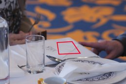
Figure 2. Sampled area 1
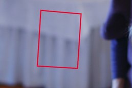
Figure 3. Sampled area 2
Note that these values are slightly blue. The foreground table is not white either. We will correct that later.
Now sample the color of the other table. Run the same procedure. See figure 3. My readings are 136,145,178. As we saw before, considerably more blue.
Correcting the color
Now the goal is to change the color of the far table to that of the near table. We do that not by selecting and correcting it as a separate object, but by gradually changing RGB values from foreground to background. The closer a pixel is to the bottom of the image, the less it will change. The closer to the top (where the blue light source is located), the more it will change. Again: the assumption is that the closer to the background table, the heavier the blue cast.
We have the RGB values of the two chosen areas. The second area measures 136,145,178. We have to move that to 185,183,192 to make the color of the far table equal to the near one.
So here goes.
- Create a curves adjustment layer.
- From the RGB dropdown, choose Red.
- Click a point somewhere on the middle of the curve.
- In the input field below the curve, enter the Red value of the color that we need to correct: 136. Output: the value that we want it to be: 185.
- Choose Green from the RGB dropdown and follow the same steps. Input 145 and output 183.
- Choose Blue and repeat the procedure, input 178, output 192.
Close the Curves window. See figure 4 for the result so far next to the original.
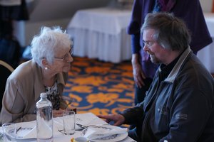
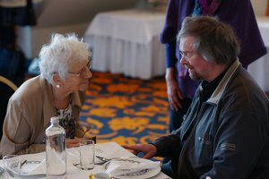
Figure 4: Original and after curves applied
The image now looks considerably warmer. Everything has become yellower and lighter.
The background table in the corrected image now has the same color as the foreground table in the original image. (Can you see that?)
Invoking the Gradient
Now we can apply a gradient to limit the correction to the upper areas.
- On the toolbar, pick the Gradient Tool. It is there together with the Paint Bucket Tool and the 3D Material Drop Tool. See figure 5.
- Set the options as shown in figure 6. Default colors (white to black), Linear gradient, mode Normal, opacity 100%.
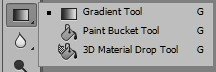
Figure 5: The Gradient Tool
Figure 6. The Gradient options bar
- Now click the layer mask of the Curves adjustment layer. Make sure it gets an extra black box around it. We are now ready to create the gradient.
- On the image itself, click and hold the mouse on the background table, somewhere in the middle of the area that we sampled before.
- Without releasing the mouse, drag it to the foreground table (the first sampled area). See figure 7.
- Release the mouse.
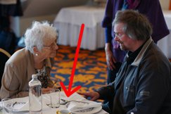
Figure 7: Gradient course
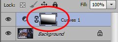
Figure 8: New layer and mask
The mask should now look like figure 8. This mask is key to understand what we've just done. Where the mask is black, the adjustment is blocked. There we look at the color of the image itself. This is the case for the lower left part of the photograph. Where the mask is white, the adjustment is fully applied. This holds for the upper right part.
Everything in-between these areas gradually changes from fully blocked to fully corrected.

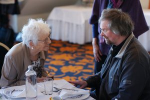

Figure 9: Original, corrected with gradient mask in Normal mode, and in Color mode
So how does this look? Well, not satisfactory yet. The background has become considerably lighter. Not good. We only wanted to change the color, not the luminosity. So: click the Curves layer and set blend mode to Color. See figure 9 for original, corrected in Normal mode and corrected in Color mode. Better.
The final touch
I could now say: this is it. But there is some finishing work to do.
First, I already noticed that the foreground table is slightly blue. After having done the above correction, the other table now has the same cast. Let's correct that first. Blue slightly too high and Red slightly too low.
This requires a curve without a gradient. See figure 10 for before and after of this action.
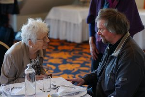
Figure 10: Before and after global color correction
Second, a blue cast is still present in some areas. Look at the lighter parts on the very left of the scene and at the other background table on the far right. To correct these too, we can use a third Curves Adjustment layer and invoke another gradient. Or alternatively, carefully paint the mask of the first adjustment to apply the correction in more areas. In a situation like this, where each pixel is for some percentage illuminated by a window and for the rest by tungsten light, the result will never be perfect. That's the very nature of images with mixed lighting.
But let me state that for most practical purposes, the rightmost image of figure 10 now has acceptable hue. The gradient did the most important and tricky work of correcting an inbalanced color.
Gerald Bakker, 12 Nov. 2015
Related articles
Photoshop by the Numbers
