Color Correction by the Numbers pt.4: Some miscellaneous techniques
Introduction
Most color casts can be easily corrected by a simple set of curves. But every now and then you may be confronted with an image that is so off-color that the usual correction techniques don't seem to work. I cover a few alternative techniques in this article. None of them will deliver proper colors at once, but they may help you turn a very bad image into one which is "a lot better" or "almost there". Starting from there, getting the colors right may be a lot simpler.
1. The Match Color - Neutralize method
The first technique is a simple Photoshop action that does a reasonable job in many cases. It appears to work best for photos that have a really severe color cast, where the whole image has gotten red, blue, yellow or whatever.
The procedure is as follows.
- Copy the background layer, or create a composite layer.
- On the new layer, do Menu - Image - Adjustments - Match Color.
- In the dialog bos that pops up, click the Neutralize button. Hit OK.
- In case the correction goes too far, reduce opacity of the layer.
That's it. See figure 1 for an example photo. It was taken indoor without flash, and the warm tungsten light hasn't been properly corrected by the camera. The whole image looks brown-orange, so it should be a good candidate for this neutralize method.
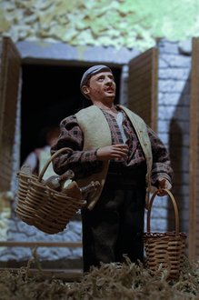
Figure 2. Result with 100% opacity
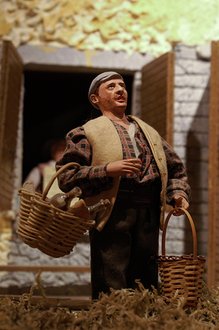
Figure 3. Result with 50% opacity
See figure 2 for the result of the procedure. Too much, but that's easily corrected: see figure 3 for the result of a 50% opacity reduction of the top layer. It's that simple. I tried to get an equivalent result by one set of curves, but failed. This method is quicker and in many cases, quite effective.
Figure 3 is not perfect yet. The top right corner has become green; this should be corrected. But other than that, I'm content with the result. The general advice though is: use this method as a first rough correction, and fine-tune afterwards with curves or levels by the numbers.
2. Reducing saturation beforehand
Many times I have downloaded photos from the internet, just to practice my color correction skills. Correcting images that others have already processed is an interesting and instructive experience. Techniques that work perfectly well with photos arriving from your camera, appear to fail for downloaded images. People sometimes cripple colors, either on purpose or because of lack of skill. Such photos often give me the impression that saturation was increased without first properly setting correct white balance.

Figure 4. A bad original
See figure 4 for an example. This is not a downloaded image, but an image that I "corrected" myself by first applying a "wrong" color correction and then increasing saturation. A nice colorful image, right? Ready to go to flickr...
A quick color assessment reveals that there is a huge cast practically everywhere, especially in shadow areas. The darker asphalt measures RGB 40,79,102, a greenish blue, the lighter parts 125,123,99, more like dark yellow. The lightest part of the clouds comes at 227,242,228, an unacceptable green.
Figure 5. First correction attempt
Figure 6. Fragment of figure 5
Fixing all this in one set of curves is not easy at all. I tried and arrived at figure 5. Not bad, but there is still way too much bad color in the foreground. See figure 6 for an enlarged fragment. Note the color noise in the shadow, and the yellow cast in the sunlit part. Should this image go through the PPW, especially the MMM and Color Boost actions, the final result would be even worse.
I found out that in many such cases, starting with a saturation reduction makes color correction a lot easier than curving from the starting image right away. This works for badly corrected images, but also for images that come overly saturated out of the camera. It's a simple trick that works very well.
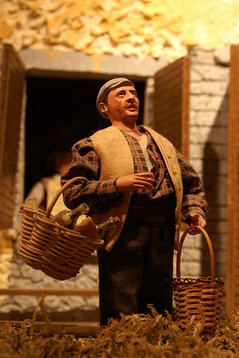
Figure 1. An original
Figure 7. Reduced saturation
Figure 8. Correction of figure 7
See figure 7 for a version which is figure 4 plus a Saturation adjustment of -30. This looks more like a natural color saturation, and turns out easier to correct. Figure 8 is the corrected version, again using one set of curves starting from figure 7. See figure 9 for a fragment of the building, and figure 10 for the same fragment in figure 5.
Figure 9. Fragment of figure 8
Figure 10. The same fragment taken from figure 5
Going through the PPW, or any image enhancement workflow, is easier when starting from figure 8 than from figure 5.
Of course, first correcting hue and then reducing saturation would give a comparable result, but I find color correction easier on an image that is not overly saturated.
The advised way of working could thus be (this fits in with the starting phase of the PPW):
- Judge if the starting image is overly saturated. If so, reduce saturation to taste
- Continue with the usual color correction by the numbers method
Of course this suggestion not only applies to other people's images. Any photo that is more saturated than desired may benefit.
3. Recovering faded channels
This is a method that especially works for discolored prints.
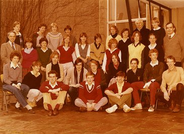
Figure 11. A scanned print
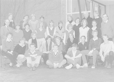
Figure 12: The Cyan of figure 11
See figure 11 for a scan of a print - a 6th grade secondary school class (I am one of these youngsters).
The print was glued in a book offered to all students after the final exam. My print is still in that book and has always been, so it has been well protected for about 35 years. Yet, the color is way off, a bad red cast overall.
How come? All I can say - forgive my limited knowledge of printing and ink properties - is that the cyan ink must have faded, more than the others. Less cyan means more red. That's what we see.
There is an easy way to validate this assumption. Open the scan in Photoshop and convert it to CMYK. Now look at the cyan channel. It is shown in figure 12. Not much left of it, right?
This immediately sets us on track how to correct such an image. It turns out to be a straightforward task, but I will list the complete procedure anyway:
- Open the digital version (scanned or photographed) in Photoshop
- Make sure you are only processing the print itself: no borders, frame or passepartout included. If necessary, crop.
- Menu: Image - Mode - CMYK Color and click OK if you get a warning about profiles
- Open the Channels window (Window - Channels if not already open)
- Click each of the color channels (Cyan, Magenta and Yellow) and give special attention to the corresponding histogram
- If any has a bleak look similar to what we saw in figure 12, continue with step 7
- Copy the background layer
- On the new layer, Menu: Image - Auto Tone
That's it. If the result is satisfactory, merge the layers and convert back to RGB.

Figure 13: Auto Tone applied in CMYK
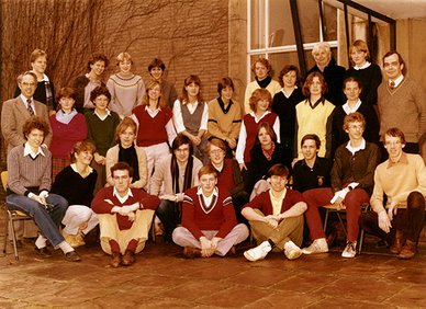
Figure 14: Auto Tone applied in RGB
See figure 13 for the result. Again: not perfect, but a lot better than what we started with. Surprisingly, the Match Color - Neutralize method does not work very well here. Also, in this case the Auto Tone in CMYK does a better job than the same command applied in RGB. See figure 14 for evidence. I'm not sure if that is always the case - try and compare for yourself for your own photos.
A final remark, when one of the channels has completely vanished (i.e. shows either completely white or completely black) there is no simple recovery possible. Recolorize your image manually, make it black/white or go for a sepia version, that's about it.
Gerald Bakker, 14 Jan. 2016
Related articles
Photoshop by the Numbers
