Color Correction by the Numbers pt.1 - The basics
Introduction
The very first article in the "Photoshop by the Numbers" series ended with the following sentence:
"In a later article, I will explain how to use the RGB values to assess an image's color accuracy and correct color casts."
It's now time to present that 'later article'.
Reading that last sentence again, the first question could be: what exactly is color accuracy, and related to that, what is a color cast? If we make a photo, wouldn't the camera, more than anything else, store the colors as accurately as possible? How could we end up with incorrect colors then?
To answer that question, we have to look at how our eyes and our brain see the world around us.
The case of the cast
Most objects do not emit light by themselves. We can only see them because they are illuminated by some external light source: the sun, a light bulb, a fire, etc.
This implies that these objects take some of the color of these light sources. Take a white sheet of paper, illuminate it by yellow light and it reflects yellow light. When we look at this paper, yellow light hits our eyes. Still, what we SEE is... a white piece of paper. Given the yellow light source, everything illuminated by it gets a yellow cast. Somehow, our brain recognizes that and corrects such cast automatically.
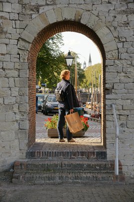
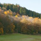
Example image. Correct color or not?
So what happens when we make a photo of a white sheet illuminated by yellow light? If the camera doesn't do any color correction, the sheet will be yellow on the photo. Again, without any color correction we make a print and the sheet on the print still looks yellow. Do we now see the paper as white, like we did before? No, because there is no yellow light source that triggers the correction. We see the sheet on the photo as yellow, and quite likely we don't like it because of that.
What went wrong here? Should we tell the camera to correct for the yellow cast, just like our brain does? Or should we do this correction ourselvers, in postprocessing?
Fortunately, both are possible. Doing it in the camera requires a proper white balance (WB) setting. Provided that it is done carefully, this solves most if not all of the problem.
Unfortunately, some correction on the computer will always remain necessary, except maybe for those who only work in a highly controlled studio environment.
Why?
- Because the photographer misjudged the scene and chose an incorrect WB
- Because the photographer relied on the auto-WB, but the camera misjudged the scene
- Because the photographer forgot to set the correct WB and the setting from the previous shot was applied
- Because light conditions changed rapidly, and the photographer didn't have time to adjust WB accordingly
- Because the photographer did not know that setting WB is necessary at all
- Because the scene was illuminated by multiple light sources, so there was no single correct WB setting
Remember, no matter how disciplined you are as a photographer, from time to time you may be asked to enhance other people's photos. For these cases only, being able to recognize and properly handle incorrect color is a must.
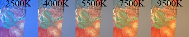
The same image under five different White Balance settings
The theory
To correct a cast, I suggest the following 4-step approach, identified by 4 C's:
Collect - Compare - Correct - Criticize.
- Collect - sample a number of points in the photograph for areas of which we may know the desired color.
- Compare - check these values against so-called "reference values". The more deviation, the more reason to correct.
- If no correction is necessary, move to step 4. Otherwise, continue step 3. - Correct - counter the deviation by a set of curves or by a levels adjustment.
- Criticize - judge the result, by checking the updated RGB values and artistically.
- If all looks OK, you're finished. Otherwise, act on what's not good yet. If necessary, resample. Repeat the process.
This requires more explanation. What is meant by "desired color" and how can we know it? And what are these "reference values"?
I will discuss each step in detail. First, a bit of theory.
The classic example of a color cast detection, and probably the simplest case, is when an object that you know is neutral - white, grey or black - turns out to have a color in your photo. You may not *see* that color, but it can easily be traced: by the Photoshop Info panel. Sample a point on this neutral area, and read out the RGB values. If they read 120,120,140 then there is a good indication that we have a blue cast, and some blue must be removed. If they read 120,120,100 it's the other way round.
So what did we do here? For the neutrals, our "reference values" - well, not values but ratios - are R = G = B. That's what we would ideally see. A slight deviation of this (say, 120,118,122) is no big deal, but the values of the previous paragraph are definitely suspect.
The good part of this method is that the deviation that we see in the Info panel immediately tells us what the correction must be. The combination 120,110,100 suggests a slight decrease of the red and a slight increase of the blue.
For neutrals, this is straightforward. But we don't have neutrals in every image. Plus, the more elements we check, the more reliable the correction.
Fortunately, we have more options. Image elements for which we have reference ratios. They are not so decisive, but they can help.
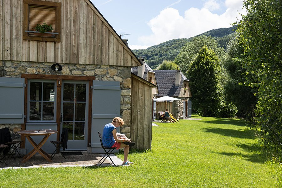
Figure 0. Example image
Below I list the most important reference values. I will use figure 0 to give examples of each category.
The reference values
1. Neutrals: B = G = R.
Already mentioned. See figure 1.
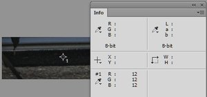
Figure 1. The black door mat: 12/12/12
2. Blue sky: B > G > R.
Usually, the difference between B and G is about the same as the difference between G and R. A typical combination is 180,210,240. When the sky gets lighter, the numbers get higher too and closer to each other. (Obviously, no reference values exist for a sky in setting or rising sun.) See figure 2.
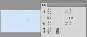
Figure 2. Blue sky: 211/228/248
3. Skin: R > G > B.
This goes for all races. In my experience, G is closer to B than to R. A typical combination for Caucasian skin is 230,180,150. Asian skin is yellower, so the difference G-B is almost as high as the difference R-G. Black skin is of course darker, but also more saturated and redder: R-G is bigger than G-B. See figure 3.
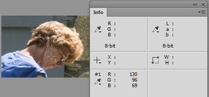
Figure 3. Skin: 130/96/69
4. Natural greens: G > R > B.
A large majority shows R much closer to G than to B. A typical combination is 140,160,80. However, much variety exists. Dried out green can get yellow, in which case R may get bigger than G. See figure 4.
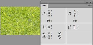
Figure 4. Greenery: 143/164/62
5. Wood: R > G > B.
Wood (not painted) always has a brown hue. A large variety is possible within that range. Light and dark, saturated and greyish, yellowish or reddish, all is possible. Dead wood moves towards grey. See figure 5.
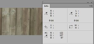
Figure 5. Wood: 122/107/87
6. Hair and fur: R > G > B.
Again, considerable variation is possible. Fur can be white or black, but it will never move to the green or blue side. What seems white or grey is often a creme-white or beige, very light brownish. The same is true for grey hair. See figure 6.
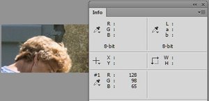
Figure 6. Hair: 128/98/65
7. Sand and most brick: R > G > B.
Brown or light brown. Rock is practically neutral, but never on the blue or green side. See figure 7.
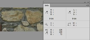
Figure 7. Brick: 128/109/73
8. Clouds: B > G > R.
This may be surprising as clouds are thought to be neutral. Lightest clouds are indeed white, but anything darker tends to pick up sky color, hence the ratio values. See figure 8.
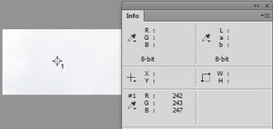
Figure 8. Clouds: 242/243/247
9. Anything that we know the color of can function as reference value. You may have a photo of a person wearing jeans. If you know the jeans to be blue, B must be highest. See figure 9.
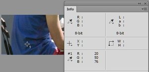
Figure 9. Blue shirt: 20/50/76
Now let's go through the correction process. Remember: collect, compare, correct, criticize.
Step 1: Collect
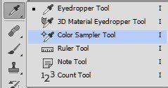
Figure 10. Color Sampler Tool
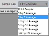
Figure 11. Set sample size
1. Open the photo in Photoshop. On the toolbar, click the Color Sampler Tool (figure 10).
2. Set Sample Size to 3 by 3 Average or 5 by 5 Average (figure 11). This prevents clicking a spot that doesn't have the color that we wish to sample, due to noise or other artifacts.
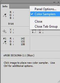
Figure 12. Info Panel options
3. Open the Info panel: Window - Info if it's not already open. From the panel menu, make sure that Color Samplers is checked so that the color values of samples are displayed (figure 12).
4. With above list of reference values in your head, click a few relevant spots. Think of sky, natural green, skin, etc. Try to use as much variety as possible: use elements of different types, different lightness etc. Avoid very light and very dark spots. Up to Photoshop CS6, the maximum number of samplers is 4. From version CC on, the maximum is 8. Make sure you memorize where you put the samplers, because it may be hard to find them back in a busy image.
Step 2: Compare
1. For each of the samplers, the Info panel shows the corresponding RGB values. Carefully examine the values and compare them to the reference values above. Do you see significant deviation? Examine all samples before you move on to the next step. Is R too low in each sample, then clearly we have a case for correction. Is R too low in two samples, and all right in two others, then we have to be careful.
2. If all values are fine, then there is no reason for correction (yet). Continue with the Criticize part. Otherwise, move on with the Correct phase.
Step 3: Correct
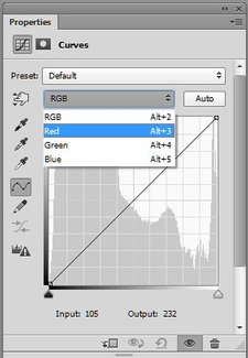
Figure 13. Curves adjustment targeted on Red.
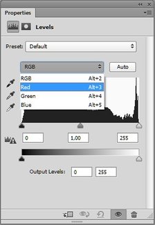
Figure 14. Levels adjustment targeted on Red.
1. So, you have found suspect or clearly wrong RGB values. Ask yourself, which of R, G and B must get higher or lower? Make sure you know in what direction you have to move. For now, let's assume the R is too high: you have to lower it.
2. Open a Levels or Curves adjustment layer. Curves is harder to grasp but more versatile. If you feel confident with it, it's the preferred choice.
3. In the Curves window, select "Red" from the RGB drop-down (figure 13). Pick the curve around the middle and move it slightly down (up if you want to increase the red).
Alternatively, in the Levels window, select "Red" from the RGB drop-down (figure 14). Pick the middle triangle just below the histogram and move it to the right (to the left if you want to increase the red).
4. If necessary, adjust more until you think you have finished. Continue with the Criticize step.
Step 4: Criticize
1. Now that you have done your correction, it is time to judge the results. First, look at the Info panel and see if the "wrong" RGB values are now better. Maybe they are not all perfect, but they are supposed to be significantly closer to the reference values.
If not, then you have reason for more correction.
2. If all RGB samples look fine, use your eyes to see if they agree. Switch between the corrected image and the original image by clicking the eye icon before the adjustment layer. How do they compare?
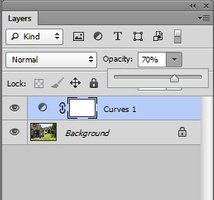
Figure 15. Reduce opacity
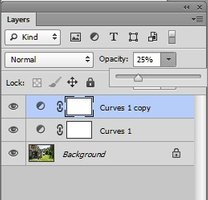
Figure 16. Duplicate layer
3. Maybe the optimal version lies somewhere in-between. In that case, use the Opacity slider to find the optimal version (figure 15).
4. Maybe you like the result, but more correction seems necessary. In that case, duplicate the Levels or Curves layer and reduce opacity of the copy (figure 16).
5. Maybe you like some parts of the image but not other parts. In that case, further correction will be more difficult and beyond scope of this article. (Be assured that I will write about such situations in a future article.)
For now, try to find a compromise.
6. If the above leads you to believe that you have not finished yet, repeat from step 1 (if more or different points need to be sampled) or from step 3.
The main message of the Criticize step is that your eyes, i.e. artistic judgment, have the final word. The "by the numbers" approach is an effective way to trace a cast, but not more than that. If you are convinced that your final version is good, even though not all RGB values satisfy the reference ratios, you are done. Just make sure that you have at least seen a version where the RGB numbers have been corrected "by the numbers".
See below two versions of the example image on the top of this article: the original and the corrected. Do you notice the difference? Do you understand why it was corrected this way? And most importantly, which version do you prefer?
Gerald Bakker, 28 June 2015

Figure 17. Original image
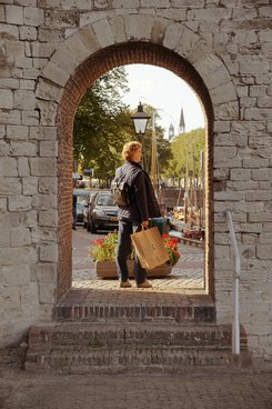
Figure 18. Corrected version
Related articles
Photoshop by the Numbers
