Color Correction by the Numbers pt.2: The case of the blue shadows
Introduction
In Color Correction by the Numbers pt.1 I described the basic method to detect and correct a color cast in a photograph. In most images with a cast, this method is effective enough. A simple curves or levels adjustment layer suffices to correct it.
However, some images are more difficult, and a more complex procedure may be necessary. Coming time, I will show some of these more advanced ways of color correcting. The current article is the first in that series.
A blue cast in the shadows
Our first case is a specific example of a more general situation: a scene illuminated by multiple, differently colored light sources. Correcting such situations is generally not easy at all. Fortunately, they are not very common, except for this one: the case of the blue shadows. Again fortunately, a blue shadows cast is usually simple to handle.
A blue cast in shadow areas may happen in sunlit outdoor pictures. The explanation of this effect is that shadow areas are mainly illuminated by the sky - that is, by a blue light source. Areas that are illuminated by the sun do not have this cast, as sunlight is practically neutral or even a bit warm in color.
Removing a blue cast is straightforward if it applies to the whole image. Limiting the correction to "shadow areas only" takes a few more steps. We have to account for "darkness" as the cast is limited to the darker parts of the image. I will show two techniques, which both appear to work in a large majority of the cases.
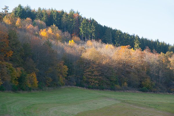
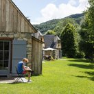
Figure 1. Original image
See figure 1. At first sight, it may look good. But in this outdoor and uncontrolled light, a check "by the numbers" is definitely advisable. So there we go, all RGB values:
- sky: 229 / 243 / 252
- sunlit trees: 164 / 181 / 86
- shadow trees: 43 / 75 / 89
- foreground grass: 87 / 118 / 90
For reference values, see Color Correction by the Numbers pt.1. The measured numbers for the sky and sunlit trees are perfectly OK. However, the darker parts of the same trees and the foreground grass are definitely too blue, and maybe not red enough. Both lie in shadow.
What we should do is reduce blue and maybe add a bit of red in the darker parts of the image, and leave the lighter parts alone. These are the techniques to accomplish this:
- One set of curves targeting darker values only
- Curves or levels masked by a channel mask
Technique 1
Create a new Curves adjustment layer. From the RGB drop-down, click Blue. Remember, lower values are on the left, higher values on the right. We have to bring the 80-90 range down to say 60 but protect anything above say 150. (Exact numbers are not so important.) Control points are (83,60) and (168,166).
Now from the RGB drop-down, click Red. Here we do the same: raise the curve on the lower half only. Set control points at (78,90) and (158,160). See figure 2 for the actual curves.
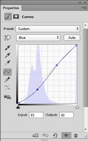
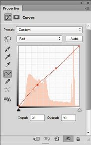
Figure 2. Blue and Red curves used in technique 1
For safety reasons, set the blend mode of the adjustment layer to Color. We don't want the image to get darker or lighter just because we were doing a color correction.
This looks a lot better in my opinion. See figure 3 for the before and after versions.
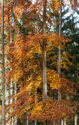
Eifel in autumn colors

Figure 3. Before and after versions of technique 1
Technique 2
For this technique, we can choose between a Curves or a Levels adjustment layer. The idea is to simply lower Blues and increase Reds for the whole image, and then target the darker areas by a simple mask.
To give you some variation, I show you how it can be done by a Levels adjustment.
We start with the original image. Keep the Info panel open.
Create a Levels adjustment layer and from the RGB drop-down, select Red. I have tried to find values that give a similar look as the other correction. That took some trial and error. (In reality, exact numbers are not so important.)
Move the middle slider left while keeping an eye on the changing Red values in the Info panel. Points #3 and #4 are important, the others will be masked out later. In my case, I arrived at 1.20. The image has become redder, but that's OK.
Now from the RGB drop-down, choose Blue. Move the middle slider right until the Info panel readings seem to be right. A good value seems to be 0.68. This makes the image considerably less blue, i.e. more yellow. See figure 4 for the screenshots and figure 5 for the result.
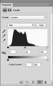
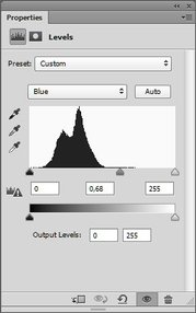

Figure 4. Red and Blue levels used in technique 2
Figure 5. Resulting image: too orange overall
Note that the whole image has gotten an orange cast, also the lighter parts. That's not what we want, so we have to reduce that.
The way to do that is to create a mask that is light in the dark areas of the image, and dark in the light areas. That sounds difficult and time-consuming, but it's not. We will use the image itself for that - by means of the Apply Image command.
Simply said, Apply Image can copy or blend a channel or layer into another layer or channel. For our case, we need to copy an inverted image into the layer mask of the Levels adjustment layer. An inverted image is dark where the image is light, and vice versa.
Exact instructions follow:
- Click the layer mask of the Levels adjustment layer. This defines it as the target of our operation. It should get a black border around it.
- From the menu, Image - Apply Image. The top part of the dialog defines the source. Enter the following values:
- Source = current image
- Layer = Merged (background would be ok too)
- Channel = RGB (for advanced users, Red gives slightly better results, but RGB is fine)
- Invert = checked
- Blending = Normal
- Opacity = 100%
- See figure 6. - Click OK.
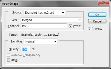
Figure 6. Apply Image
You will see the layer mask as we just described. It is dark in the light areas of the image (especially the sky) and light in the dark areas. Presto: the adjustment gets blocked in the sky and sunlit trees, and applied everywhere else. Just like in the first technique, set layer blend mode to Color.
See figure 7 for a comparison of techniques 1 and 2. I could show you some differences, but they are minor and not very relevant.
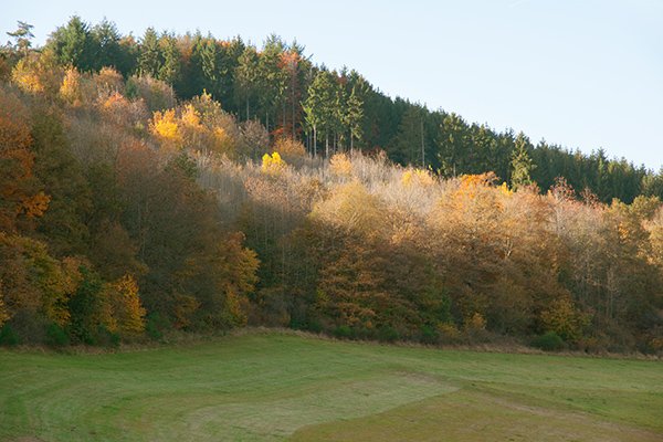
Figure 7. Corrections from techniques 1 and 2 compared
Some final notes
Note that both techniques assume that the shadow areas - the ones with the cast - are indeed the darker areas of the image. This is not necessarily the case. Imagine someone wearing a white T-shirt standing in the shade. The shirt may appear blue and require correction. However, it may actually be *lighter* than other, sunlit parts - think of background trees.
In such cases, above techniques are both inferior. Either the shirt remains bluish, or the background trees become too yellow. A more complex, image-specific method is required: I cannot give a general advice.
Speaking from my own experience, such cases are rare. Remember that the human visual system is able to automatically correct color casts. This happens a lot less when we look at a photograph than at the scene itself, but it happens still. Some blue cast may remain - it may even give a more natural look than when we try to remove it completely.
Gerald Bakker, 1 Oct. 2015
Related articles
Photoshop by the Numbers
