Color Profiles part 1: The basics
An intimidating list
Who ever created a new image file in Photoshop, knows that somewhere in the bottom of the presented dialog, a Color Profile has to be entered. In my Photoshop installation, the default value of this field is a rather intimidating “sRGB IEC61966-2.1”. Unfold the drop-down list and you are confronted with an enormous list of Color Profiles, from the familiar sounding Adobe RGB to many obscure items like SMPTE-C. See figure 1.
This complete list of Photoshop’s color profiles is a lot bigger than what you’ll likely ever use. Maybe some of you are even happy using just one, the cryptic sRGB IEC61966-2.1 which seems to be some sort of historical standard.
It’s time to take a close look at what profiles really are and how their mechanics work. A word of warning beforehand. Perform a google search for “sRGB vs. AdobeRGB” and you’ll find a lot of web pages and forum discussions from people trying to convince you that their choice of RGB is the only good one, and that you are a stupid idiot if you deviate. I really don’t have such a strong position. In fact, don’t expect much guidance at all from me. Remember, I am just a mathematician, not a color or print expert by any means.
Time for some numbers
Let's get into action.
Open Photoshop. From the menu: File - New. In the New dialog, enter a meaningful name. Enter Width and Height both 500 to get a reasonably sized image. Color Mode RGB Color, 8 bit. Background White. Under Advanced, choose Color Profile sRGB IEC61966-2.1 (or any other entry that starts with sRGB). Hit OK.
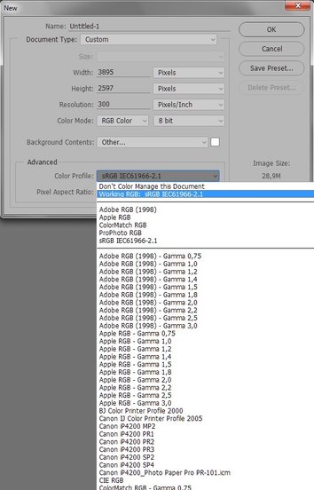
Figure 1. Color profiles to choose from
Now fill this document with a fully saturated red. Menu: Edit - Fill… In the Fill dialog, choose Color… in the Contents box and enter R 255, G 0 and B 0 in the resulting Color Picker box. Hit OK on both dialogs and an intense red appears. See figure 2.

Figure 2. Maximum red?
So this is the most red we can ever get, is it?
Well, it’s not so simple. In Photoshop, open the Info panel, switch to LAB readouts and sample the color we just entered. On my system, the measured LAB values are 54, 81, 70. L is not relevant, but the color components A and B are clearly far from their maximum value (127). More red than what we see now is definitely possible. We can see more red than this, we can record it with a good enough camera, display it on a good enough monitor and even – if I’m well informed - get it on paper with a good enough printer.
Why profiles at all?
We stay in Photoshop for another experiment that will make the point clear. From the open image, go to menu and Image – Duplicate… Enter a meaningful name and OK. Now in the new document, menu: Edit – Convert to Profile. Enter Adobe RGB (1998) as destination space, uncheck Use Dither and click OK. Compare the two documents. For the eye, they are equal, aren’t they? Just to be sure, check the LAB values in both files. They are 54, 81, 70 in both, so the color has indeed not changed. Now use the Color Picker to sample the RGB values of the second file. In my case, they are RGB 219, 1, 0. See figure 3 in which the two files have been juxtaposed.
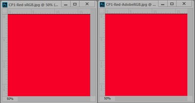
Figure 3. The same red in sRGB and in AdobeRGB
So, the color that one might have thought to be the “most red possible” is a good bit away from that in the AdobeRGB profile. In sRGB, the current red that we are looking at is the brightest red possible. The collection of possible reds stops there, so to say. In AdobeRGB, this is not the case. With an R value of 219, brighter reds are possible. The same color gets different RGB values when switching from sRGB to AdobeRGB. This turns out to be a general truth: convert to a different color profile and RGB values change, even though colors may be preserved.
To understand this, we have to think a second about “RGB Color Coding”. The example I started with – RGB 255, 0, 0 – is definitely a highly saturated, pure red in the RGB way of coding. But how red exactly is nowhere specified. To know the exact amount of red, one needs to specify the color profile. RGB 255, 0, 0 is an unknown red without a profile. Add a profile - sRGB, AdobeRGB or any other one - and it becomes an exact, known red, standardized and universally agreed.
First observation. RGB values are not absolute. The exact color they denote is undefined unless a color profile is enclosed.
The fact that the R value in AdobeRGB (219) is lower than the R for the same red in sRGB (255) means that, using the AdobeRGB color coding, more red is possible. It means that AdobeRGB covers a wider range of reds - and more generally, colors - than sRGB.
Color spaces
The range of colors covered by a profile is called a color space. It is now clear that the AdobeRGB color space is wider than the sRGB color space. Or to put it differently: one step of R in AdobeRGB is slightly bigger than one step of R in sRGB. The same is true for the other components G (more so) and B (less so). With these larger steps, our red is reached at step 219, whereas in sRGB the full 255 steps are required.
See figure 4 below for a graphical representation of the two color spaces. Think of the full graph as all colors visible for the human eye, and the two triangles denoting the AdobeRGB and sRGB color spaces.
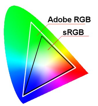
Figure 4. sRGB and AdobeRGB plotted in one graph
Be aware that the statement “In AdobeRGB more colors can be specified than in sRGB” is not true. The amount of distinct colors and luminance values is the same in both, namely 256 * 256 * 256. It’s just that in AdobeRGB, the colors lie slightly more apart.
Second observation. A wider space RGB profile space has lower RGB values than a narrower space profile to define the same color.
And, the same property formulated differently:
Third observation. Any triplet of RGB values in a wider color space defines a brighter color than the same values in a narrower space.
Referring to the red we are still looking at: this is the most saturated red within the boundaries of the sRGB IEC61966-2.1 color space. But in AdobeRGB, there is considerable room for a saturation increase. To show that, close the second file and make a new copy of the sRGB version. This time, on the copy, go to menu and Edit – Assign Profile. Like before, choose Adobe RGB (1998).
See figure 5 for the resulting images, again shown next to each other for comparison. The difference in color is there, although it is small. Whether you actually notice a difference depends on the properties of your monitor.
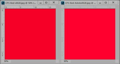
Figure 5. Equal RGB values, different red
Assign or Convert?
So what’s the difference between Convert to Profile and Assign Profile? Simple: Convert to Profile will adjust the RGB values to retain the colors as far as possible. Assign Profile will not change one RGB value, it will only change the profile. Be assured that your image will look different after you've done this, because the present RGB values will be interpreted differently.
Fourth observation. Both actions Convert to Profile and Assign Profile change an image's profile.
Convert to Profile changes RGB values in an attempt to retain appearance;
Assign Profile keeps RGB values unchanged, causing a shift of colors.
There is a good reason why I wrote “change RGB values in an attempt to retain appearance.” It’s simply not always possible to keep colors equal. Think of converting back from AdobeRGB to sRGB. For all colors that happen to fall within the boundaries of the sRGB color space, there is nothing to worry. But what will happen to colors outside those boundaries? Whatever Photoshop chooses to do, these colors will always change because they are not available in sRGB.
Using ProPhotoGRB
There is one other profile that deserves attention next to sRGB and AdobeRGB: ProPhotoRGB. The ProPhotoRGB color space is extremely wide. According to wikipedia, it encompasses 100% of the "likely occurring real world surface colors". For many professional photographers, this is reason enough to do all image processing in this color space. See figure 6 below which is figure 4 with the ProPhotoRGB space added.
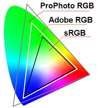
Figure 6. Three color spaces compared
Following the above examples, I again duplicated the first, sRGB coded file and converted it to ProPhotoRGB. The “full red” of sRGB translates to RGB 179, 70, 26 in ProPhotoRGB. Clearly, a lot more red is possible in this color space.
Working in ProPhotoRGB is not without risk. One such risk is that one increment of R, G or B may become a visible step. This phenomenon is called banding: losing smooth color transitions.
Fifth observation. In extremely wide color spaces there may be a risk for banding: uneven, visible color transitions.
Banding can be prevented by working in 16-bit mode (bit depth is definitely worth an article by itself).
Also, the vivid colors of ProPhotoRGB may turn problematic when a conversion back to a smaller color space is needed. What to do with colors that fall outside some target space is not easy at all. The problem applies not only to the Convert to Profile action, but it may also occur if you ask for a color on a monitor that is unable to display it, or when you try to print a color that is out of range for the target printer.
Some of these aspects – the pitfalls of switching between different color spaces, so to say – will be the subject of a next article.
Gerald Bakker, 28 July 2016 - rev. 18 Oct. 2016
Related articles

Photoshop by the Numbers
