Color Profiles part 2: The pitfalls
Of profiles and pitfalls
The last sentence of my previous “Color Profiles” article mentioned pitfalls when working with color profiles. One of my readers remarked that I had opened “an interesting can of worms”. Obviously, there are some risks involved when working with profiles. In this article, I will try to explain why. Contrary to most work in this series, it will be a rather inexact article, full of I don’t know’s. Yes, there is a lot that I don’t know, but moreover, there is a lot that I can’t know. That’s the nature of color profiles.
Don’t dare to forget them
The first risk is forgetting to include a profile at all. Including a profile is an option in the Save dialog (did you know that?). See figure 1 below. Imagine that for some reason, this button gets unchecked. Let me write out a possible scenario that will show the danger.
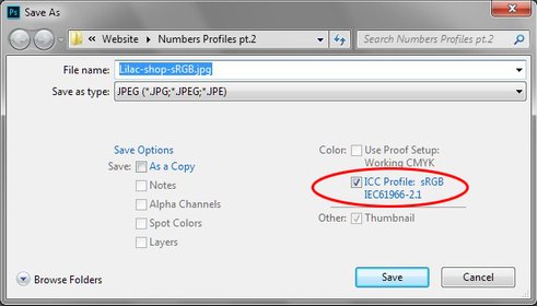
Figure 1. Save As with Profile checkbox

Lavender shop
- Open any colorful image in Photoshop.
- If the color profile is not already AdobeRGB, convert to it. Menu: Edit – Convert to Profile… and enter Destination Space “Adobe RGB (1998)”.
- Save the image with its profile. Menu: File - Save As… Enter a meaningful name and make sure that the ICC Profile checkbox bottom right is checked.
- Now save this image again without a profile. Menu: File – Save As… Enter a different name and uncheck the ICC Profile checkbox this time.
Now you have two versions of the same image file, same RGB values overall. Open them with an image browser – I bet they look different. How come? The version with included profile is interpreted with this profile: colors are correctly displayed. The other version lacks a profile. Any software having to display this image will need to guess. The most likely candidate? sRGB. So that’s what you see: AdobeRGB color values shown as if they were sRGB values. See figure 2 below.
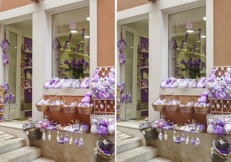
Figure 2. Two versions, left with profile, right without.
First observation. Omitting a color profile in an RGB file is a guarantee for misinterpretation of the RGB values and thus for incorrect color reproduction.
Interestingly, Photoshop supports a default RGB profile other than sRGB. Go to Menu: Edit – Color Settings… Top left, there is a frame titled Working Spaces. The top field labeled RGB enables the user to enter a default RGB color space. If I enter Adobe RGB (1998) here and open the two images that I just saved, they look identical. The one with missing profile is now correctly interpreted because I told Photoshop to pick AdobeRGB by default.
Needless to say, when I now open an sRGB-coded image file without enclosed profile, it will look way too colorful.
The deceiving display
Even when a correct profile is included, things may go awry. Let me revisit the exercise of the previous article, this time with a different color.
I created three image files, each RGB, each filled with just one color: RGB 0,255,0. We may call this a "full green", although by now we know how relative full is in this context. Next, the files got different profiles assigned. In the first: sRGB, in the second: AdobeRGB, and in the third: ProPhotoRGB. Just to make sure that the resulting colors are supposed to be different, I sampled the AB values of the LAB space:
- In sRGB: AB -79, 81
- In AdobeRGB: AB -128, 87
- In ProPhotoRGB: AB -128, 128
Clearly the colors are different, at least in theory, and not by just a few points. To support this statement, have a look at figure 3. The three color spaces differ most in the greens.
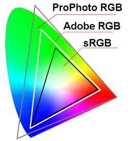
Figure 3. Three color spaces plotted in one graph
Now the important question is: how do these three supposedly different colors look? I don't show you (yet), but I try to describe what I see.
On my monitor, the sRGB and AdobeRGB versions are clearly different. Not much, but definitely so. AdobeRGB shows a harder green. The difference between AdobeRGB and ProPhotoRGB however is not visible at all. Despite the 40 points deviation in the B value. Despite the extra range in the greens of figure 3. Why do I not see that difference?
We are confronted with the second and third of the pitfalls of working with larger color spaces. My monitor simply cannot show such highly saturated colors. This observation can be different however on better monitors. Maybe on a professional, high-end monitor, the three greens actually look distinct. But I don't know.
Note that a monitor has a color space too, the range of colors that it can display. It’s usually called a gamut. Similarly to color profiles, narrow and wide gamut monitors exist.
I had to search the manual to figure out my own monitor’s gamut. In it, I read: sRGB compliant. Any other RGB profile is not mentioned at all. See figure 4 for some text elaborating on this compliancy (the referred website, www.srgb.com, does not exist any more).

Figure 4. Fragment of my monitor's manual
Given the difference that I see between the sRGB green and the AdobeRGB green, there is likely at least some extra coverage outside the sRGB space. How much, I don’t know. How accurate the AdobeRGB green on my monitor is, I don’t know. No guarantees from the manufacturer, that’s for sure.
Second observation. Working in a color space that is wider than the gamut of one’s monitor involves the risk of seeing a different color than what it’s supposed to be.
Now have another look at figure 3, and in particular the peak of the ProPhotoRGB triangle on the green side. It sticks out of the cone of colors, so to say. Believe it or not, this means that ProPhotoRGB tries to represent colors that are not visible at all: they are out of gamut for the human eye. Some call these "imaginary colors". Some argue that "what we can't see, can't be called a color".
The question is: what can we expect from a device asked to display such "colors"?
Third observation. Very wide color spaces like ProPhotoRGB encompass imaginary, non-visible, non-existing colors. For these, it is up to the software or hardware to show some approximation to the user.
Just think a minute what that means when you are processing an image in ProPhotoRGB. You are interpreting and editing colors that you may not see reliably represented on your monitor, or that do not even exist at all. Isn’t that a disturbing thought?
The unknown other side
Until now, we have only looked at some problems in local representation of images. What if we move our image to a foreign computer? Let me tell you: more dangers lurk.
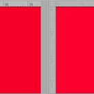
Below, figure 5, I show the three greens - sRGB, AdobeRGB and ProPhotoRGB - next to each other. Three image files with equal RGB values but with different RGB profiles attached. I'd really want to tell you about the differences between them. But no. If you think you see three different colors, it's your imagination. The colors are equal on your side.
How do I know that?
After having uploaded these three rectangles, I downloaded them back from my own site. And guess what... the profiles had been removed. Apparently my web provider, trying to save a few bytes on their hard disks, automatically strips color profiles from image files...


Figure 5. Three greens: sRGB, AdobeRGB and ProPhotoRGB
But even if the profiles had been retained, I still wouldn't know what you see on your end. Not only do I not know on which display you see my web page, there may be a browser issue too. Not every browser correctly interprets attached profiles; some ignore them and instead assume a default - and this default is always sRGB. (So far for standardization!) Remember what you get when an AdobeRGB-coded image is interpreted as sRGB? Right: dull colors.
The general advice for images going to the web is: use sRGB. The image may be presented on a poor quality monitor not supporting much more than sRGB; or in a browser not being reliable to understand and honor color profiles. In any case, the viewer sees inferior quality images and will blame the author for uploading rubbish. No one wants that, right?
Fourth observation. A browser cannot be trusted to correctly display an image containing an RGB profile other than sRGB. The problem for someone uploading images to the web is that they don’t know which browser will be used to view them.
Of printing and proofing
One last item: printing. A printer, just like a monitor, has a gamut, but it’s really unlike any RGB space. A printer follows a CMYK profile, even if you can feed it an RGB coded image file. That implies that we are even less sure about what colors a certain printer can output. A color profile like sRGB, AdobeRGB is well-defined. A printer’s gamut may be well-defined too, but it’s probably different from any other printer’s. Press printers have a considerably smaller gamut than inkjets. Professional lab printers cover even more. Also, a lot depends on paper quality.
Photoshop and Lightroom support something called “soft proofing” – showing a preview of how an image will look printed. For a personally owned printer, that may be useful. Idem for a printer for which we know the exact output profile. But when you send a photo to a print lab… do you know how to proof it?
Fifth observation. Sending files with an embedded profile other than sRGB to a printer is a risky thing to do, unless the profile in question is guaranteed to be supported. And even sRGB may not be fully covered by all printers.
A word of hope
Despite all the above warnings, the situation is not hopeless. When converting between different color spaces, options exist that can help to limit the damage: most importantly, the so-called rendering intent. This topic is beyond scope of the current article, but it's interesting enough to give it a later treatment.
Do I have an advice for you concerning color spaces? Just this. Study the above, and then ask yourself if you are familiar enough with the properties, peculiarities and pitfalls of color profiles to deviate from the standard and safe sRGB. If the answer is yes, then be happy to use whatever suits you best. No doubt you are able to make the right choice for yourself.
Gerald Bakker, 21 Oct. 2016 / rev. 9 May 2017
Related articles
Photoshop by the Numbers
