Histograms part 1: Basics and numbers
The familiar panel
No doubt most of you know what a histogram is, and how to get useful information from it. Yet, recommendations about what to do with that information vary considerably. Many Photoshop books tell you to examine the histogram carefully and if it has a suspect shape, something must be wrong with the photo: time for action. Some authors however instruct their readers to ignore the histogram altogether and exclusively look at the image.
In this article I will take no position in this discord and study the histogram merely for what it is: its mechanics and numbers. Nevertheless… time for action.
Open any RGB coded image in Photoshop and make sure you have the Histogram panel open. Menu: Window – Histogram if it’s not already somewhere on your workspace. For the time being ignore the image (!) and, neglecting all good retouching practice, look at the histogram only.
The Histogram window has various appearances. For now, choose the Expanded view as it seems the most interesting to start an explanation from. From the histogram panel menu, click Expanded View. Next, in the Channel drop-down, choose Red. We start with the individual color channels, again because that makes the explanation easier.
A small graph is shown, see figure 1 (it’s either red or black, switchable by the “Show Channels in Color” option in the panel menu). This is the Reds histogram of the Frontierland image shown on the right.
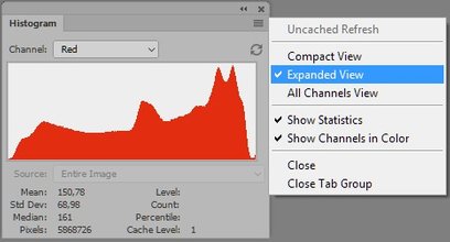
Figure 1. The Histogram panel in Expanded view
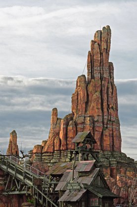
Frontierland
Let’s have a close look at this graph.
Digging the numbers
The histogram window is not resizable. Its size may change with the layout that the user chooses, but not by a resize action. For the Expanded view that we have now open, the width of the graph is 256 pixels, the height 100.
- The width (256) corresponds to the number of possible values of each of the color components. Remember, in RGB the minimum value is 0, the maximum is 255.
- The height of the graph is normalized, meaning: the highest point is always fixed to 100. I will come back to that.
To draw the graph that we’re looking at, Photoshop has to count the number of pixels having each of the values between 0 and 255. I did this myself for a number of example values (well, not quite… I read out these values on the Statistics frame of the Histogram panel):
- R(ed)=0: 394 pixels (the leftmost point of the graph)
- R=100: 15895 pixels
- R=200: 30579 pixels
- R=232: 53658 pixels (the highest point of the graph)
- R=255: 2454 pixels (the rightmost point of the graph)
Now PS needs to do the normalization. The highest point is settled to height 100 (pixels). This is at position 232. The real counted value there is 53658. To arrive at 100, this figure must be divided by 536.58. The normalization simply means for this case: divide every count by 536.58 – the results are the actual height of the graph.
- For R=0 the height is 394 / 536.58 = 0.735, rounded to 1
- For R=100 the height is 15895 / 536.58 = 29.62, rounded to 30
- For R=200 it’s 57 (you can do the computation for yourself)
- For R=232 it’s 100 (no surprise there)
- For R=255 it’s 5
All these values are then plotted in the graph: starting with R=0 on the very left, ending with R=255 on the very right. So there we have the histogram defined in numerical terms.
See figure 2 for an enlarged version of our histogram with the above figures painted in.
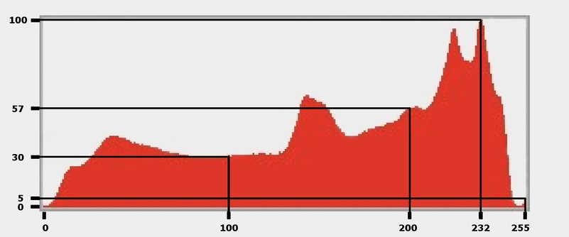
Figure 2: The Reds histogram enlarged
(Usually a more concise definition of histograms is given, something like “the histogram shows the distribution of the luminosity levels of an image”. Of course that makes perfect sense, and is a lot easier to follow than my explanation above. Yet, I like to dive into the details and numbers to really understand what goes on.)
The other Channel options
Now that we (hopefully) understand this, let’s investigate the other histogram appearances. Back to the Channel drop-down, here are the other options:
- Green and Blue: similar to Red
- Colors (the default): this plots the Red, Green and Blue graphs over each other, mixing colors where they overlap. Strangely, the intersection of all three colors is a greenish grey.
- RGB: this plots the sums of the R, G and B counts over the 0-255 scale.
So, for X = 0 (leftmost on the horizontal axis), all pixels that have R=0 plus pixels that have G=0 plus pixels that have B=0 are counted. (Note, this is different from counting pixels that have R, G and B = 0 simultaneously!) Similar for other values of X up to 255. All these counts are plotted on the vertical (Y) axis, and normalized.
- Luminosity: different altogether. For each pixel, Luminosity is calculated, being the result of the following formula:
Lum = 0.3*R + 0.59*G + 0.11*B
This is similar to saying, add up 30% of the red, 59% of the green and 11% of the blue for each pixel. Instead of counting plain R, G and/or B values, count these Luminosity values. Again, the amounts are normalized so that the highest is 100 and then plotted in one (black) graph.
See figure 3 and 4 for how these appearances look for our example image.
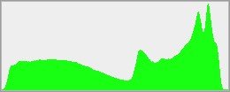
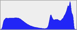
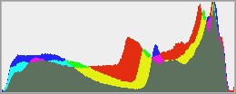
Figure 3. Histograms of Green, Blue and Colors.
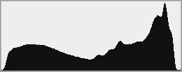
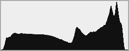
Figure 4. Histograms of RGB and Luminosity
At first thought, the difference between RGB and Luminosity may not be clear. In most real-world images the two graphs will indeed look similar. However, a simple experiment reveals the different mechanisms behind them. See figure 5 for a single-color image file and figure 6 for the two corresponding histograms.


Figure 5: An image file
Figure 6: The RGB and Luminosity histograms of this image
All pixels in this image have R,G,B = (200,150,100), an orange brown. The RGB histogram has three single-pixel peaks: one on 100, one on 150 and one on 200. In Luminosity however, each pixel has the same value (0.3*200 + 0.59*150 + 0.11*100 = 159.5) resulting in a graph with one single spike.
The other View options
The other views of the Histogram window can be explained quickly.
- Compact View is just about 25% smaller than the Expanded view, and lacks the Channel drop-down. Its Channel appearance is whatever was chosen in Expanded or All Channels view.
- All Channels View is equal to the Expanded view, except that three extra histograms are shown for R, G and B. See figure 7.
The choice of channel appearance in the Compact view is a bit tricky. Let’s assume I want to see the Luminosity mode. As I cannot switch between channel views in Compact mode, I have to first change to Expanded, then set appearance to Luminosity, then switch back to Compact. That’s fair, but the choice is not fixed after that. Whenever I click any channel Red, Green or Blue in the Channels panel, the histogram (still in Compact view) automatically shows the chosen channel. Switch back to RGB in the Channels panel, and the histogram goes back to RGB, not Luminosity. As far as I could find, there is no way to come back to Luminosity except via the Expanded or All Channels view. Slightly annoying if you ask me.
Selections and Layers
Make a selection and the histogram of the selected area only is shown. Whether or not this is useful behavior, it’s not overridable as far as I know.
In a multi-layered document, an extra option presents itself (presumed the histogram is not in Compact mode). It’s called “Source” and provides three possible values in a drop-down:
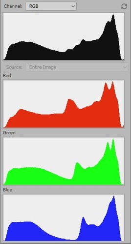
Figure 7: All Channels View
- Entire image – the histogram represents the composite image. The word “entire” suggests that it doesn’t matter if a selection is active, but that’s not so: make a selection and you see the histogram of the selected area only, even when this option Entire image was chosen.
- Selected layer – this shows the histogram of the selected layer only, discarding all other layers. For an adjustment layer, the histogram of the layer mask is shown. Again, with a selection active, only the selected area is plotted.
- Adjustment composite – this option is only active when an adjustment layer is selected. It shows the histogram of the composite of the adjustment layer plus all layers below it – with the histogram of the composite without the adjustment superimposed in grey.
If you don’t get that – see below for an example.
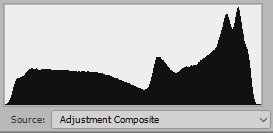
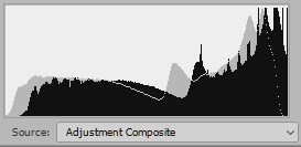
Figure 8: Adjustment Composite Histogram of original image (left), and with lightening curve (right)
Of caching and refreshing
Quite likely you have already noticed that sometimes – in fact, quite often – a little triangle with an exclamation mark appears in the top right corner of the Histogram. If you ask me, this is the stupidest part of the whole panel. The exclamation mark means something like, hey, before I show you the real, correct histogram, let me show you another one that probably looks like it, and add a little icon to warn you about that. See figure 9 below for what the actual difference may look like.
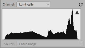
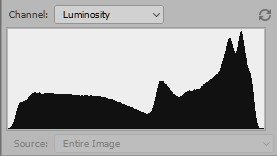
Figure 9: Cached and uncached histograms of the same image
I say “stupidest” – but presumably there were times when this was a clever implementation: when calculating a full histogram took so much computer resources that it degraded responsiveness. The current mechanism – called caching – simply bases the histogram on just small (“cached”) parts of the image. Definitely faster, and usually providing a good approximation of the full graph. Fair enough, but with today’s fast computers a trick like this has become obsolete, hasn’t it? It forces a user wishing to see a correct graph to lose time with an extra click, which takes longer than the program calculating the full thing right away. From clever it has become mainly annoying.
There are no less than four ways (!) to replace the cached display with a graph representing the full image. They are: double click the histogram; click the exclamation mark; click the double arrow icon top right of the histogram; and click “Uncached refresh” from the panel menu. In contrast to this overkill, there is no single way to disable the whole caching mechanism and just let Photoshop always show an uncached histogram. How stupid is that? Let me tell you: the more I see this exclamation mark appear, the more it irritates me.
The small irritators
So having discussed the basic functionality of the Histogram panel, I noticed no less than three annoyances:
- No way to show the histogram of the full image while a selection is active
- No way to prevent Photoshop from automatically switching Channel in Compact view
- No way to switch off the caching mechanism
In my job as IT professional, we call these "small irritators". Not bugs, but user interface design flaws that hinder an efficient workflow. Such problems - provided they are recognized as such - always get low priority (after all, nothing goes wrong!) and thus are likely to be excluded from release fix lists.
From experience I know that end users cannot be made more happy than by solving at least a few of these small irritators in every release. So... Adobe, do you hear me? Above you find a few simple ideas to make your customers happy.
Gerald Bakker, 29 June 2017
Related articles
Photoshop by the Numbers
