The specialties of the LAB Color Space
LAB: What is it?
The next color space that I will explain has a completely different structure from RGB and CMYK. The name - LAB - has nothing to do with Laboratory. It corresponds with three components, like RGB does. Still, it's not an acronym, strictly speaking.
- L is Luminance. That's as far as the acronym goes. Its value is anything between 0 and 100, like the CMYK percentages.
- A is a color scale ranging from -128 (a bluish green) to +127 (a pinkish magenta)
- B is a color scale ranging from -128 (blue) to +127 (yellow)
One aspect that's new and very important to understand LAB is that one and only one component (L) contains the luminance information. Make a pixel darker without changing the hue or saturation, the L will change but not the A and B. Similarly, change the color without making it darker or lighter, and L will remain the same while A or B (or both) will change.
To emphasize that, let me formulate the previous paragraph the other way round.
Given a pixel coded in LAB. Make its L value higher and the pixel will become lighter but keep its color. That's easy and intuitive.
Increase its A value and the pixel will become less green, more pink without changing its lightness. Decrease the B and the pixel will move towards blue and away from yellow, while getting darker nor lighter.
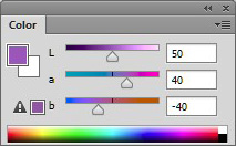
Figure 1
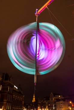
Amsterdam Light Festival
That's a new thing. In both RGB and CMYK, changing the value of one component will always change both color and luminosity. Put more R and you get more red plus more light. Put less C and you get less cyan plus less ink.
First observation. In LAB, coding of luminance and color are strictly separated. One component (L) represents lightness only, the other components (A and B) represent color only.
See figure 1 for how the LAB sliders in the Color panel look for a purple hue.
Properties of LAB
Let's try some examples to see how it works.
Like in previous chapters, start Photoshop and open the Color Picker window.
Set all of R, G and B to 0 and check the corresponding LAB values (Photoshop lists them as L, a and b). They are 0,0,0 too. Is that as expected or can we be surprised?
Obviously Luminance must be 0, or we wouldn't have black. But A and B? What's the color of black? They are both 0, which in my opinion makes sense because black is a neutral. Black is not green nor magenta. It is neither blue nor yellow. So, A and B must be 0.
Now the question is, what if we keep L to 0 and move A or B to any positive or negative value? I save this question for later.
Set each of R, G and B to 255 to make white and read out the LAB values.
You can guess them. Luminance must get its maximum value, 100. The color components must still be 0 because white is as neutral as black.
Now set R, G and B to any value other than 0 or 255, but keep them equal. You will see that A and B stick to 0, and L is something between 0 and 100.
Second observation: In the LAB way of coding, all neutrals have A and B equal to 0.
That's a good thing, because it makes neutral colors easily recognizable. RGB has that same property, CMYK doesn't. The opposite is also true: anything that has A or B not zero cannot be a neutral color.
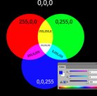
A question. What would you expect RGB 128,128,128 to convert to?
A and B definitely 0, because it's a perfect neutral. L? Halfway between 0 and 100, right?
Well, it's not 50. On my system, it's 54. See figure 2 if you don't believe.
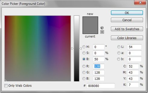
Figure 2
So there is a surprise. But it's not a mistake at all. LAB was not designed to model physical or electronical devices. It doesn't represent an RGB monitor implementation or ink colors. Instead, LAB is a model for human vision. The L value is supposed to represent the human perception of lightness. And because humans distinguish more lightness values in darker ranges than in lighter ranges, more values are reserved for darker areas. Hence the higher value for middle grey.
Just for fun, set RGB to 119 or 120 each and check that the L value becomes 50.
Third observation: In LAB, middle grey is set to around L 54. Or more generally, the L value of a pixel is somewhat higher than what its RGB values would suggest.
Color values in LAB
Now what about the colors?
Still in the Color Picker, set R to 255 and B and G to 0. The purest red possible in RGB. Note the LAB values. Mine are 54, 81, 70. Yours may be a little different depending on the exact RGB profile you chose, but I expect not by much.
Consider those numbers. The L is all right, we have a color which is (approximately) as light as middle grey. Fair enough. Then, it is about two third the maximum A (pink/magenta) mixed with just over half the maximum B (yellow).
So: unlike what we saw in CMYK, in LAB the values of the "pure" colors are far away from their maximums. The LAB gamut is far wider than the sRGB gamut, and obviously far wider than the CMYK gamut.
Coming back to our earlier statement "LAB is a model for human vision", we can say that the LAB color space contains all colors that humans can see. Name any color, show it, and LAB has a code for it.
Believe it or not, we can go further than that. LAB contains more colors than humans can see. LAB even contains non-existing colors. Impossible colors. Colors that do not exist in nature and cannot possibly be generated by any monitor, laser, ink, or whatever device.
How is that possible?
The answer to that question lies in the strict separation of luminosity and color. In LAB, one can specify L=100, A=127, B=127. The A and B values indicate a full, highly saturated red. The L value indicates maximum lightness, i.e. no lighter possible.
There is the impossibility. Any red, no matter how saturated, can be made lighter by adding green or blue to it. We know that from the RGB model. Thus, any combination of L equal to 100 and positive or negative A,B values is by definition impossible.
Fourth observation: LAB has a huge gamut, much wider than RGB and CMYK, wider than the human vision and even wider than physically conceivable.
Physically possible or not, Photoshop allows us to specify whatever LAB numbers we want within the allocated range. So what happens when we specify an impossible color?
Let's try. Set L to 50 and A and B to 100. The high A and B (pink and yellow) together form red. No doubt about that. In middle lightness, what we get is indeed full red, RGB 255,0,0.
Now increase L to 80 and read out the corresponding RGB values. In my system, they are 255,71,0. So Photoshop, while trying to translate our almost impossible combination of LAB values, finds an intermediate between our "highly saturated red" and "very light color". That compromise is somewhere between orange and red, lighter and somewhat less saturated than full red. The resulting color is neither red nor very light, but something in-between.
See figure 3 for what it looks like.
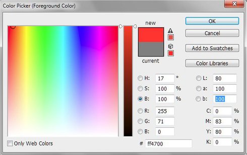
Figure 3
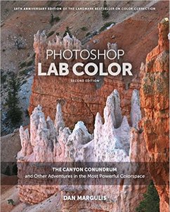
Figure 4
(Why no blue gets added to the mix to keep the color red and not orange, I don't know. It probably has to do with our perception of color in combination with lightness.)
Now set L to 90. What we get is clear orange, not red, light but not extremely so. Certainly not a color light enough to justify an L value of 90.
Just for fun, you can find out what we are really looking at, in LAB terms. For LAB 90,100,100 I read out RGB values 255,112,12. Now change the RGB values and change them back to 255,112,12. Look at the LAB values: they are... 65,52,71. Far away from the 90,100,100 that we asked for.
Obviously the resulting color is within RGB gamut. It is still not printable yet in the default CMYK profile. Therefore, do the same trick on CMYK. The values will be 0,70,100,0. Click that and read out the LAB values: they have now become 63,48,64 - even less saturated.
There is one more observation to do. It is am obvious truth, one that should have become clear from the above little experiments and that I don't have to explain further.
Fifth observation. The more the A and B are away from 0, the stronger, more saturated the color is.
This ends my explanation of LAB. A lot more can be said about it. Dan Margulis dedicated a whole book about LAB and all its retouching possibilities. It's called Photoshop LAB Color: The Canyon Conundrum and Other Adventures in the Most Powerful Colorspace and definitely worth a read. If you buy it, make sure you pick the second edition from 2015 (see figure 4).
Gerald Bakker, 8 Jan. 2015
Related articles

Photoshop by the Numbers
