Picture Postcard Workflow and raw processing: The importance of white balance
The first question
The top section in Lightroom’s Develop module is called White Balance. In Camera Raw: the same. Step 1 of the Picture Postcard Workflow is called Kill incorrect color with RGB curves. All serve the same goal: to remove a color cast. There seems to be some sort of agreement that incorrect color should preferably be adjusted first, before further enhancements are done.
I just started a series of articles about raw processing in combination with the Picture Postcard Workflow. Well, here is the first question that pops up. While working in the raw processor, do we have to set a correct initial white balance, or can we skip that part on the assumption that step one of the PPW will take care of it anyway?
Stated differently: if we are careless in the raw processor – let’s say we rely on the software’s Auto WB without further checking – will that impact further processing and possibly give an inferior end result? Or will proper curving in Photoshop compensate, so that the initial WB setting doesn’t really matter?
In this article, I will try to answer that question.
Setting up a test
The test that I am about to explain requires comparison of multiple versions of an image. If different methods of color correction yield different results, I want to assign a winner. The question is: how? This is not as simple as it may seem. Obviously, I don’t want to tell you “I like that one better”. You may simply disagree. What I really want is some objective method to decide that one candidate has “more accurate” color than another.
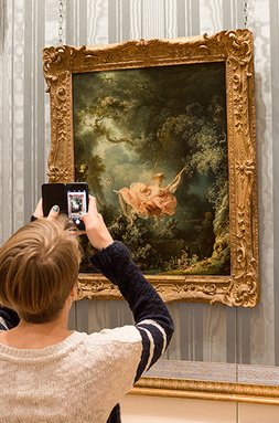
Wallace Collection, London
The problem is that for real world images, this judgement of color correctness is very difficult, if not impossible. For that reason I decided to use a color checker chart. It’s something I don’t happily do, but it enables me to verify color accuracy in a non-subjective way.
For those who don’t know, a color checker chart is a rectangular card with 24 painted squares in different colors and shades of gray. See figure 1.

Figure 1. Color checker chart
All these 24 colors and grays have been quantified in various color spaces like sRGB and CIELAB: the so-called colorimetric values. These values are publicly available, see for example this web page:
http://xritephoto.com/ph_product_overview.aspx?ID=824&Action=Support&SupportID=5159
No doubt the chart is often used in situations where exact color reproduction is crucial.
Now let me describe my test.
I make a photograph (in raw) of the test chart and load it into Camera Raw. Even though I now have 24 samples to verify, I pretend that this is a real world image with only one known neutral area: the third one from the left on the bottom row.
On this area I base the white balance setting that I assume to be the correct one. The White Balance Tool does its work: Temperature comes at 4950, Tint +7. Also, I adjust Exposure so that the RGB values become what they should be according to the above page (160 / 160 / 160 for the indicated square). See figure 2.

Figure 2. Processing the image in Camera Raw
Without further corrections, I open this image in Photoshop. This is version 1, a version with “correct initial white balance and no curving”.
Next, I reopen the same photo in Camera Raw. This time, I change the WB settings to deliberately wrong values: Temperature 3500, Tint 0. I open this image in Photoshop and, using the Color picker and Info panel, add a curves adjustment layer that changes the RGB values of our reference area to the same as they are in version 1 (160, 160, 160). This is version 2, a version that simulates “quick and dirty raw processing corrected by curving”. See figure 3 for the actual curves.

Figure 3. Curves as used to create version 2
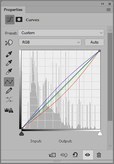
Figure 4. Curves as used to create version 3
Last, I repeat the previous step with a version that also has wrong WB, but in the other direction. I choose Temperature 7000 and Tint +20. This is version 3, assuming the same sloppy raw processing as version 2. Figure 4 shows the used curves, and figure 5 the three results.


Figure 5. Three versions resulting from the test
Comparison one
At first sight, you may not see much difference at all, but look at where the backgrounds touch each other. (More about that later.) But let's not trust our eyes. Instead, use Photoshop to sample colors and compare them to what the card manufacturer published as correct values.
This is how:
- Select all 24 squares one by one and average each, to exclude errors due to noise and other inaccuracies (to save some time, I created an action to do this)
- Sample each color in LAB and put the A and B values into a spreadsheet
- Compare these values with the given reference values
- Average the deviations (24 A values and 24 B values) – the smaller this figure is, the better the contestant
I executed this procedure for each of the three versions, and here are the results:
- Version 1 (correct WB and no curves) has an average deviation of 2.4 per channel, the best score of the three
- Version 2 (incorrect WB corrected with curves) scores 4.6 per channel, the worst of the three
- Version 3 (idem) arrives at 3.6, good for the second place
The first, simple conclusion is that starting with a correct white balance provides more accurate color than correcting a wrong initial white balance with RGB curves.
That’s nice, but there is more to say.
Comparison two
The test as described above omits an important step in the color correction process: setting white and black points. I did that on purpose, assuming that we only had one definite neutral, a gray point.
However, many images have a white and black point too, and our test chart has them as well. Let's incorporate them into the test and see how much difference that makes.
The test image and procedure are the same, but the curves for version 2 and 3 are different this time. We make sure that the lightest and darkest squares on the bottom row are neutral too. This requires some extra control points on the curves. See figure 6 for the curves that I used (version 2 and 3 resp.).


Figure 6. Curves as used in the second test
The resulting figures are better than in the first test (as expected) but versions 2 and 3 are still worse than version 1.
- Version 1 averages 2.4, equal as in the previous run
- Version 2 and 3 score 4.1 and 2.8, respectively
Arriving at a conclusion
It’s not so easy to translate the above test results to a guideline. How bad is it really to deviate 4 points per color channel instead of 2.4? Maybe unacceptable for a professional studio photographer, but for the hobby shooter… perhaps not at all.
For myself, the decisive factor is the background of the test photo (this happens to be our garden table). Mind you, I’m not going to tell you which of the three renditions looks best, although I do have my preference. But look back at the differences in figure 5. They are… significant, aren’t they? If one of the three versions shows the correct color of that tabletop, you wouldn't accept the color of any of the other versions, would you?
The test results tell me that version 1 is best in terms of color accuracy. The backgrounds of the three image versions tell me that the differences, although seemingly small, matter. This leads me to the conviction that it’s crucial to set a proper white balance in the raw processor.
Simple images and complex casts
Hoping you are still with me, I have one final and very important remark.
It’s this: whatever the tests may reveal, Photoshop’s RGB curves are infinitely more versatile than white balance sliders. The WB section of the raw processor corrects color uniformly over the whole image. That's an essential limitation for some images. Removing a double cast like the blue shadows case as discussed in this article is not possible that way, let alone more complex cases. In Photoshop however, one can add a mask to a curves layer. Multiple casts in one image can be corrected by as many curves layers as desired, each having a mask if necessary.
My point is this. No matter how much effort you put into setting an accurate white balance during raw processing, step one of the PPW is still necessary for many images.
I believe in this context it’s useful to define a category of images that I call “simple”. A simple image can be roughly defined as an image with two characteristics:
- It must not have multiple casts. Or better, the scene photographed must be lit by single-colored light only. Studio photos meet this condition, but also most flash-illuminated scenes, outdoor photos taken in overcast weather, etc.
- Correct color must not be absolutely critical.
See figure 7 for some examples of such simple images. I assume they speak for themselves.
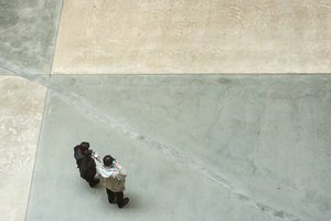

Figure 7. Some example "simple images" as defined in the text
My recommendations
Given all the above, here are my recommendations.
- For simple images, as defined in the previous paragraph, I advise to carefully set white balance in the raw processor, and not bother to fiddle with curves afterwards.
- For all other image types, or in case of doubt, I recommend to do both. Set a white balance that is about right in the raw processor, and fine-tune with curves in Photoshop.
Gerald Bakker, 4 Oct. 2016
Related articles


Picture Postcard Workflow
