Exposure and Contrast adjustments part 1: Brightness/Contrast
A new set of articles
Open an image in Photoshop. Click the menu, Image: Adjustments and note how the list of available adjustments is divided in five blocks. The blocks roughly correspond to five categories, although one would have a hard time exactly defining the boundaries.
After an intermission of almost a year and a half, I decided to write a few more articles in the Photoshop by the Numbers series. The subject will be the four image adjustments of the upper block of the list: Brightness/Contrast, Levels, Curves and Exposure. (Note that, if you open the Layers palette and click the “Create new fill or adjustment layer” icon, the same four items make up the second block from above. No big deal, but I can’t help mentioning this.)
The set can be well described as adjustments that affect exposure and contrast. This is not about color, at least not primarily. (We will see that color is touched, but more as a side-effect.) Simply stated, using any of these four adjustments, an image can be made lighter, darker, more contrasty, and, not unimportantly, white and black points can be moved. Each does it in a different way, although there is obviously considerable overlap. The focus of this and the next three articles will be to investigate each of the set, describe similarities, differences, advantages and disadvantages.
Brightness/Contrast: an introduction

Groninger Museum
We start with the adjustment at the top of the list: Brightness/Contrast. This is not difficult to explain, and the name fits the general theme perfectly.
There are two ways to apply the Brightness/Contrast adjustment: from the Layers panel and from the Image menu item. When using the latter option, it’s better to work on a copy of the background layer, because adjustments will be made on pixels directly. The dialog boxes shown for the two options have a different design, but they contain the same controls and, as far as I know, work the same.
I prefer to work from the Layers panel and get a “Brightness/Contrast” adjustment layer. The popup of figure 1 is shown. We have – not surprisingly – a Brightness and a Contrast slider and we have an Auto and a “Use Legacy” button. The rest is layer control and not interesting for now.

Figure 1. The Brightness/Contrast popup
First, let me explain the “Use Legacy” button. This button does not change brightness or contrast in any way – instead, it controls how the other controls behave. The “Legacy” way of Brightness/Contrast processing is what was the only way up until Photoshop CS2. From CS3 on, new algorithms were introduced. By clicking this button, users can switch between the old and the new implementation. From a numbers perspective, the old algorithm is easier to explain; but we'll see the drawbacks of an all too easy algorithm.
Brightness the antique way

Figure 2. Original image

Figure 3. Brightness increased the "legacy" way
So, open an image of your choice and invoke the Brightness/Contrast adjustment. I will follow the procedure starting from the image of figure 2. On the popup, make sure “Use Legacy” is checked. Next, slide Brightness to +20. See figure 3 for the result next to the original. At first sight, there may be nothing wrong: the image has become lighter, as expected. But look at figure 4 for a detail of the light sources in the top of the image. Highlight detail is destroyed by the action.


Figure 4. Detail of figure 2 (left) and figure 3 (right)
The cause of this is simple to understand. A Brightness adjustment of +20 (in the Use Legacy version) adds 20 to each channel value (red, green and blue) – up to the maximum of 255 of course. Everything that read 235 or higher in the original is now stuck at 255. Similarly, set the slider to -20 and 20 is subtracted from all channel values. Simply said: there is no protection against clipping whites or blacks. This action can wipe out a lot of highlight and shadow detail!
Moreover, a carefully set black point is discarded by the same +20 adjustment. Start from an original channel value of 5, after this adjustment it reads 25. Every black or near-black pixel will be lightened to some dark grey, while no extra detail is obtained at all.
This is indeed a very simple algorithm from a computing perspective. It’s quick and straightforward, no doubt a huge advantage in the early days of Photoshop, when computers were slow. But the disadvantages can be considered unacceptable today. Let’s have a look at what the legacy version of Contrast accomplishes – not much better as we will see.
Contrast the antique way

Figure 5. Original image (same as figure 2)

Figure 6. Contrast increased the "legacy" way
While keeping the “Use Legacy” button checked, reset Brightness to 0 and set Contrast to +20. See figure 6 for the result, next to the original. The simple description of what happens is: channel values below center value 127 will get lower – the more away from it, the bigger the move – and everything above 128 will get higher, again more so for higher values. Just like Brightness, the Contrast moves have no protection against clipping. Let me give some examples of the +20 move. At 127, pixel values do not move. 150 moves to 156. 200 moves to 218. And everything at 229 and higher bumps into 255. A similar schema goes for values below 127. The detail area that I showed in figure 4 won't look much different for this version than for the Brightness +20 version.
A primitive way to increase contrast, isn’t it? Compare the before and after, and you may agree that contrast has become stronger. But the negligence of white and black points makes this adjustment questionable to say the least. (I wanted to show you a detail like in figure 4. But the result is so similar to figure 4 that another comparison doesn't provide any new insight.)
A curious move is to set Contrast to +100. This forces every channel value to either 255 or 0. Consequently, the resulting image consists of primary colors only: red, green, blue, yellow, magenta, cyan, white and black. Contrast -100 will make the full image middle gray.
Here is an interesting mini-tutorial. Given a hypothetical image that is slightly overexposed. It has a proper white point (say, RGB 250/250/250) but a too light black (say 35/35/35 darkest). Using the specific properties of the legacy Brightness/Contrast, the following is a quick way to fix the situation:
- Switch "Use Legacy" on and set Brightness to -15. This moves the black down to 20/20/20 and the white to 235/235/235. Now the lightest and darkest points have exactly the same distance to their absolute maximum/minimum values.
- Set Contrast to +13. This moves the black to 4/4/4 and the white to 251/251/251. Voila!
Brightness the modern way
All right, now it's time to uncheck Use Legacy and find out what happens. (Note that when you change the state of Use Legacy, both sliders are reset to 0. This makes sense, because the meaning of the sliders changes as well, but it can be annoying if you click it accidentally.)
Again, set Brightness to +20 while leaving Contrast at 0. The result is quite different from what we saw before. Well, no pixel is darkened, but that’s about it. Let me see:
- Black remains black. More precisely: 0 in any channel remains 0.
- The lightening is gradual. An original pixel measuring 10 in some channel, will increase to just 11. 60 becomes 68. 128 becomes 145. Between 160 and 190, the increase is 21 (the maximum amount). 220 moves to 235. 250 to 253.
The difference with the legacy way of working is twofold. First, no clipping occurs. Anything that was not white or not black before the move, will remain so. And second, there is no loss of black and/or white point. Anything white or black will also remain so. Figure 7 clearly shows the protection of highlights. Compare this with what happened in figure 4.

Figure 7. Detail of original (left) and increased brightness the modern way (right)
One may think that this makes the adjustment weaker. But in fact, it’s a better way of lightening your photo. It won’t make an image bleak or muddy. It won't blow out highlights.
Of course, for a negative value of Brightness, a similar schema applies.
Contrast the modern way
Still with the Brightness/Contrast Properties panel open (and "Use Legacy" unchecked), reset Brightness to 0 and set Contrast to +20. We can make a similar observation as for the Brightness slider: the adjustment is gradual. At channel values of 128, there is no change – the same as before. Looking at values above 128, it seems that the maximum increase is 5 (between 175 and 208); for example, 200 changes to 205 by the adjustment. Above 208, the increase diminishes until it becomes 0 at very high values. The maximum decrease is also 5 (between 80 and 47). Below 47, the decrease gradually diminishes until it hits 0 just before an original value of 0.
Needless to say, a negative value of Contrast results in a similar adjustment.
Again, we see that this type of adjustment cannot cause clipping of blacks or whites. And again we can say that if we start with proper white and black points, the adjustment will retain them.
Setting non-0 values for both Brightness and Contrast in one adjustment is, for the new algorithms of the adjustment, practically the same as applying two adjustments, one for Brightness only and one for Contrast only (in that order). The Info panel may show very minor deviations in this case, but I think they are the result of rounding errors. Doing the two adjustments the other way round does give different results.
This is not generally true for the old (legacy) implementation of Brightness/Contrast.
The Auto button
Instead of moving the Brightness and Contrast sliders ourselves until we get a satisfactory result, we can ask Photoshop to have a shot at an optimal setting: just click the Auto button for that. This option is available no matter the "Use Legacy" button is checked or not. Figure 8 below shows the two results: left, the legacy version; right, the modern version.


Figure 8. Results of invoking the Auto button: left, with "Use Legacy"; right, without.
Even though the differences are hard to spot by looking at two thumbnails next to each other, I can tell that the right version is the better one. For evidence, look at figures 9 and 10 below. In each, the original left, the legacy version middle and the modern version right. Figure 9 shows that the newer algorithm achieves a richer blue in the bottom image areas, and figure 10 shows that the legacy implementation still suffers from blowing out the critical highlights of this image.

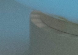
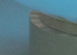
Figure 9. Details of original (left), legacy Auto (middle) and new implementation Auto (right)


Figure 10. Details of original (left), legacy Auto (middle) and new implementation Auto (right)
Of course, after clicking the Auto button, you can change the two sliders to taste.
Conclusions and final remarks
The Brightness/Contrast adjustment is not as bad as some websites and books may tell you, provided you avoid the “Use Legacy” button. It is a bit ill-reputed, but I think this is undeserved. If you use it as a simple, quick way of lightening, darkening or contrast-boosting your image, not much can go wrong. On the other hand, it’s not very versatile. The contrast move always uses 128 as its center. There is no way to increase contrast around a different center value, although a combination of Brightness and Contrast can make it look like that. In later articles I will show how to mimic the Brightness/Contrast adjustment with Levels and with Curves, and how much more can be accomplished with those.
As a final remark, be aware that, although the words Brightness and Contrast would suggest a lightness-only adjustment, both sliders, especially Contrast, can affect color intensity as well. This is due to the nature of the RGB way of color coding. Remember that color is the result of different values of the red, green and blue primaries. The larger the differences between the three, the more intense the color.
For example, start with a mildly saturated orange, let’s say with Red 200, Green 125 and Blue 50. Now invoke Brightness/Contrast and set Contrast to +50. This will increase the Red, as it’s higher than 128. Green remains untouched. Blue will decrease as it’s lower than 128. The net result is a color with channel values further away from each other, so it has become a more intense orange. See figure 11.

Figure 11. Original (left) and contrast-boosted (right) orange
Should this effect be unwanted, then the obvious solution is to change the blend mode of the Brightness/Contrast layer to luminosity.
Gerald Bakker, 7 May 2020
Related articles


Photoshop by the Numbers
