Exposure and Contrast adjustments part 5: Using the eyedroppers
Introduction
Photoshop offers four adjustments in the Exposure and Contrast category. I discussed these in four dedicated articles: Brightness/Contrast, Levels, Curves and Exposure. The one that you just started reading, being the fifth in its series, is the first encore. While working on my commentaries – I think it was the Levels study - I started to write something about the “Auto options”: what are the eyedroppers meant for, what happens when the user clicks the Auto button, is any tuning of this “auto” behavior possible, etc. But there was so much to say that I decided to postpone these discussions to a separate article. While working on that, I came to realize that there is enough material for… not one but two full-size articles. The first, the one that you just started reading, deals with the eyedroppers. The second will discuss the Auto button and everything related to that.
For now, be aware that:
- The Brightness/Contrast adjustment only contains an Auto button
- The Exposure adjustment only contains three eyedroppers
- each of which I already discussed in the associated articles. That leaves us with Levels and Curves.
What are eyedroppers used for?

On the beach
Let’s start with Levels then. Open an image in Photoshop and add a Levels adjustment layer. Figure 1 shows the popup that appears. Left of the histogram on this window, you see three eyedropper icons. Look carefullly, and you’ll see that they are filled – top to bottom – black, gray and white. These are handy little controls that can help you set a white, gray or black point in your image.

Figure 1. Level adjustment panel
(You may note that Photoshop has an Eyedropper tool as well. It’s on the toolbar, sixth from above, in a group together with the Color Sampler tool. The icons for these tools are empty pipets. The tools are used to sample colors from an image file and not adjust them in any way. The Eyedropper tool copies a sampled color to the current foreground or background color. The Color Sampler tool reads out channel values and lists these in the Info panel.
For the rest of this article, we don’t consider these tools but concentrate on the eyedroppers that come with the Levels and Curves panels.)
Before we dive into the technique, first a word about the why of all this. Every photo has a so-called dynamic range, being the luminosity values between its lightest and darkest points. In most images, it works best to have this dynamic range as wide as possible, because that maximizes global contrast. In other words, it’s usually a good idea to have the darkest point black and the lightest point white.
Photoshop supports this idea by providing black and white eyedroppers. The procedure is to first choose the black point of your image: the darkest point, or something close to it. Click the black eyedropper on this point, and an automatic adjustment happens which makes this point indeed black (according to some configured value that I’ll talk about later). More precisely: anything as dark as the chosen black point, or even darker, will become black and lose detail. The rest of the image is adjusted accordingly. Anything lighter can retain detail.
Obviously, the story for the white eyedopper is the same, using a target white point.
In addition, there is a gray eyedropper. This is supposed to neutralize a photo. Find a point that you think should be some shade of gray (preferably not too close to black and white). Click the gray eyedropper on this point. If it was not neutral, this action makes it so. The idea is that this removes a color cast, if there was any.
Basic configuration
The first question is what you want your white, gray and black points to be. The defaults are (0,0,0), (128,128,128) and (255,255,255) which definitely make sense, but you can change them. To do so: click the menu icon on the Levels properties window and choose Auto Options… On the bottom half of the popup that Photoshop shows, in a frame called “Target Colors & Clipping” you see three rectangles, filled with, you guessed it, black, gray and white. See figure 2.
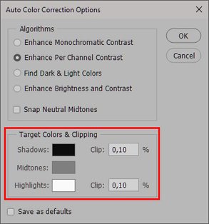
Figure 2. Auto Color Correction Options popup for Levels

Figure 3. Color picker for target shadow color
I don’t think there is a good reason to change the middle (gray) box, but it’s quite common to deviate from the default values for white and black. In fact, it’s recommendable to keep the darkest point of the image a bit higher than 0’s because, well, I’m not 100% sure, but let’s say it works better in print. The same is true for the lightest point: better keep it a bit lower than 255.
Now let’s see how that works. Click the black rectangle and yet another window is shown: the Color Picker. See figure 3. Assume we want to set it to 5 for each of the channels. On each of the entryfields labeled R, G and B, enter value 5. Hit OK to save this value. Next, on the Auto Color Correction Options window, click the white rectangle. Follow the same procedure, this time setting 250 for each of R, G and B.
The Clip percentages tell Photoshop how much of the image to ignore when searching for the darkest and lightest pixels. The higher the figure, the more clipping - hence, the stronger the contrast after establishing black and white points. How much stronger on a given image is hard to say. I would say, the fewer pixels reside on the extreme sides of the histogram, the more noticeable the effect will be. It's worth doing some experimentation, as a small change in the percentage can sometimes make a considerable difference.
When everything is settled, hit OK on the Auto Color Correction Options window, and Photoshop will ask the important question if you want these new values to be saved as defaults. If you say Yes, the new values will be used for any subsequent image. If No, they will only be used for the current Levels dialog and forgotten afterwards.
The eyedroppers in practice

Figure 4. Example image
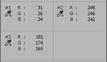
Figure 5. Fragment containing three sample points, and measured values
Figure 4 is an example image. We have to determine where the white, gray and black points of our image reside. For some images this can be a non-trivial task (I consider the process out of scope for this article) but here it’s rather straightforward. Sample point #1 is the black – darkest – point of the image, #2 the white – lightest. Sample #3, a midtone set on the surf area: under the overcast sky we can reasonably assume it to be neutral. See figure 5.
The overlayed panel on figure 5 shows the measured values of these points: all three deviate considerably from what black, white and gray points are supposed to be. This implies that we are missing out some of the potential dynamic range, and that we may have to do with a serious color cast. Time for action!
Back on the Levels panel, click the black (top) eyedropper once and click again on the exact spot that you had chosen to be the black point of your image. Voilà! Photoshop sets the black (left) controls of the Red, Green and Blue channels in the Levels dialog such that the pixel you just clicked changes to whatever you configured "black" to be (5 for each). Click again on the black eyedropper icon to release it. Depending on the old channel values of your chosen pixel, the change may be anything from invisible to substantial.
Do the same for the white eyedropper and the white point. Red, Green and Blue are now 250 each.


Figure 6. Left: original. Middle: after setting proper black and white points. Right: after setting gray point as well.
See figure 6 for a comparison of original (left) and intermediate result (middle).
Contrast: increased. Color: slightly stronger, maybe bluer. The white and black eyedroppers are supposed to correct the contrast of your image, but they can change its color as well.
To finish the procedure, pick the gray eyedropper and drop it on the third sample point. Bingo! The image is a lot bluer now. See the right image of figure 6. Be aware that this action doesn’t move the sampled pixel to the target values of 128 for each channel: it only forces them to be equal. Or better: it forces them to get the same relation to each other as we configured in the previous paragraph. The gray eyedropper is not supposed to make your image lighter or darker, only to adjust its color.
A snag and a conclusion
Whether the final result of figure 6 is successful artistically is not of interest for the current discussion, but another thing is worth mentioning. Clicking an eyedropper (whichever it is) in the image simply sets the channels' black, gray or white sliders of the Levels adjustment. But there is an inconsistency in the behaviour. To see what I mean, do the following steps:
- Start with the original image and add a new Levels adjustment layer.
- Pick and drop the gray eyedropper on the chosen midtone sample point. The effect is that the RGB values of this point change from 181,174,165 to 173 each.
- Open the Red, Green and Blue tabs of the Levels popup. Note that the gray (middle) slider has moved away from the default value of 1.00. See figure 7. The white and black sliders have not changed. This is all as expected.


Figure 7. The result of applying the gray eyedropper on each of the three RGB channels.
- Next, apply either the white or the black eyedropper to their corresponding sample point.
- The white (or black) controls move for each channel (as expected), BUT: the gray slider is reset to its default. The effect of the previous steps is undone! See figure 8.

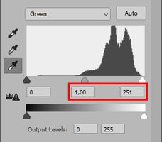

Figure 8. The result after applying the gray eyedropper first, and the white eyedropper next.
Whether this behavior is “as designed” I don’t know, but it’s really deceptive. Applying the white or black eyedropper resets the gray controls to their default value of 1.00, that’s what I see. The other way round it’s not true: clicking the gray dropper doesn’t touch the white and black controls.
So here is my recommendation:
If you plan to use all three of the eyedroppers for a given image, always apply the gray one last!
To finish my treatment of the eyedroppers, let me tell you that their behavior for Curves is exactly equal to what they do for Levels. No need for more explanation.
So that’s a lot of text about some very primitive controls. Their only benefit is that they save some manual sliding. But beware: Adobe’s advice about using the eyedroppers is “to use them first and then fine-tune your adjustments with the Levels sliders or Curves points.”
So there you are. I think it’s worth considering to ignore the eyedroppers completely and do all the work manually.
Gerald Bakker, 7 March 2021 / rev. 25 May 2021
Related articles


Photoshop by the Numbers
