Exposure and Contrast adjustments part 6: The Auto options
Introduction
What you are about to read is the sixth article about a subject as mundane as “exposure and contrast adjustments in Photoshop”. That’s a lot of text for something that is admittedly very important but also very basic. Getting exposure right is first of all a matter of following a few simple rules. Every camera has an Auto button for it - only the better ones provide options to override automatic choices. It seems natural that a software algorithm is very capable of finding a close-to-optimal exposure and contrast for most images, and to a large extent that is true. Whether or not you will always be satisfied with the result is a different story.
Just for fun, open any image in Photoshop, add a Curves adjustment layer and, without touching anything else, click the Auto button. Quite likely this will adjust your image in some way or another. It may be beneficial for your image or degrade it. The result may look snappier and colors may have shifted. And very importantly, what you are now looking at may be different from what I get when I carry out the same steps for the same image.
What happens when you click that Auto button, and how you can influence that, is the subject of this article.
Sunrise
First, let me get a potential source of confusion out of the way. Both Levels and Curves offer an Auto button. Interestingly, the auto options of these two are related. Configuring something on one impacts the other. But the important observation is this: as far as I could verify, their behavior is identical – except in one case, which I will of course give proper attention. So even though in all my explanations I employ a Curves adjustment layer and Options popup, everything applies equally for Levels – except when stated explicitly.
One button, multiple algorithms
In comparison with the eyedroppers (see this article), the Auto button offers an even more automated way of working. But the seeming simplicity of a single button is deceiving: multiple different algorithms and parameters are hidden behind it. Again, go to the menu of the Curves Properties window and choose Auto Options… (Or alternatively, click the Auto button while keeping the Alt key pressed.) A popup appears which is called “Auto Color Correction Options”. It offers the user a lot of choices, almost all of which play a role in what happens when the Auto button is clicked. See figure 1.
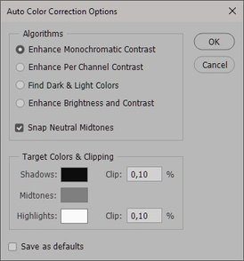
Figure 1. Auto Color Correction Options
First, let me note that the mechanics of this dialog are a bit odd. Contrary to what its name suggests, what the user can do here is not quite a matter of setting options. Click one of the four radiobuttons on the top, and notice how the image changes with it. Clicking these buttons has not the effect of updating some configuration, but instead offers a preview of applying the underlying algorithm to the image. Clicking the OK button simply applies the adjustment into the open Curves window. Hitting Cancel recovers Curves to its before state. Only when the user switches the “Save as defaults” button on, the chosen settings will be saved and reapplied any next time.
I will now elaborate what each of the four algorithms on the popup window mean. Short descriptions are available as tooltips (shown when the mouse is positioned over the button or the accompanying title).
Algorithm 1: Enhance Monochromatic Contrast
Tooltip: Clip color channels identically to increase contrast while preserving color (Auto Contrast)
This algorithm performs the following steps. First, when “Snap Neutral Midtones” is switched off.
- Find the pixel with the darkest value in any channel, bar a clip of the percentage specified in the Target Colors & Clipping frame.
- Adjust the R, G and B curves in equal moves, such that the darkest channel value gets equal to what is specified as Shadows color in the Target Colors & Clipping frame.
- The same steps for the lightest channel value.
NB. Only the endpoints of the three color curves are moved, each by the same amount. The RGB (composite) curve is left alone.
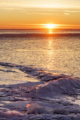
See figure 2 for an example image, before and after applying this procedure.


Figure 2. Original image (left) and processed with algorithm 1 (right).
The original image has enough whites (small spots reflecting the rising sun) but it appears to miss a good black point. The procedure fixes that by moving the black control points of the R, G and B curves slightly to the right. The after image has consequently somewhat darker shadows.
I think the idea of the algorithm deserves a numerical example. Assume the following settings:
- Target shadow color set to RGB (5, 5, 5).
- Target highlight color set to RGB (250, 250, 250).
- Clip of shadows and highlights both set to 0.00%.
- Pixel with darkest channel value RGB (15, 25, 20).
- Pixel with lightest channel value RGB (245, 240, 235).
Now the Auto button will move the 15 (lowest value in any channel) to 5, hence move the black control point 10 positions right, for all three color curves. It will also move 245 (highest value in any channel) to 250, hence move the white control point 5 positions left, also for all three colors. The net effect is always that contrast is enhanced but colors are preserved. The darkest pixel will move to (5, 10, 15) and the lightest to (250, 245, 240).
Snap Neutral Midtones
Now what if “Snap Neutral Midtones” is switched on? There is an additional step in that case. The algorithm will add extra control points in the middle of the three color curves, with the purpose of making the midtones neutral. If you work with a very colorful image, this extra step may make a considerable difference. It may even change colors, contrary to what the tooltip says. For the example image of figure 2, it doesn't make any difference at all, but in figure 3, an image that was constructed as a simple linear gradient, it does. Left: original. Middle: Auto Contrast without midtone neutralization. Right: the same with neutralization. Somewhere in the middle of the third version, color is close to neutral. Notice the serious color shift that this causes.


Figure 3. Left: original. Middle: processed without midtone neutralization. Right: idem with.
NB. The algorithm for the midtone neutralization sometimes gets seriously confused when the darkest pixels have a high value in one of the channels. As an example, look at the images of figure 4 which were put together in the same way as figure 3.


Figure 4. Left: original. Middle: processed without midtone neutralization. Right: idem with (no difference).
On the far left of the original, pixels measure RGB (80, 40, 240). On the far right, RGB (150, 255, 150). Even though the purple is clearly the darkest area of the image, this color has the highest value in the B channel. The green on the right is the lightest color, but has the lowest B value.
For some reason the "Snap Neutral Midtones" setting has no effect here. The original definitely contains no neutral midtones and the algorithm doesn't force any. Don’t expect me to explain this result, any more than simply assuming that the software wasn’t designed for such hypothetical, constructed cases. This is true for all of the algorithms.
Algorithm 2: Enhance Per Channel Contrast
Tooltip: Clip color channels independently to increase contrast and alter color cast (Auto Tone)
This algorithm resembles the first, but with an essential difference. Let’s go through the steps, first when “Snap Neutral Midtones” is switched off:
- Find the pixel with the darkest value in the Red channel, bar a clip of the percentage specified in the Target Colors & Clipping frame.
- Modify the Red curve such that the darkest channel value gets equal to what was specified as Shadows color in the Target Colors & Clipping frame.
- The same steps (1 and 2) for the lightest value in the Red channel.
- The same steps (1, 2 and 3) for the Green and the Blue channels.
See figure 5 for before and after versions of this procedure.
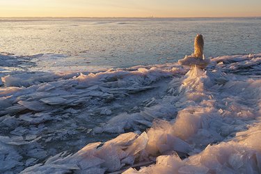
Figure 5. Original image (left) and processed with algorithm 2 (right).
Notice how color is shifted this time. The after version is considerably more blue, as if the warm glow is a cast that needs to be corrected. I don't think this is a beneficial move, but it's important to understand the mechanism. The crucial difference with the first algorithm is that the color channels are modified independently of each other. As a consequence, both color and contrast can change. Again, the RGB curve is left untouched.
Note that this procedure doesn’t force neutral whites and blacks. This follows from the fact that three different pixels can be the basis for the enhancement.
Switching on the “Snap Neutral Midtones” button has the same effect as in algorithm 1. Extra control points are added in the middle of the Red, Green and Blue curves where necessary to force a neutral midpoint. In the case of our example image, this reduces some of the blueness of figure 5.
Algorithm 3: Find Dark & Light Colors
Tooltip: Analyze image to find light and dark colors and use these as the shadow and highlight colors (Auto Color)
This is a more intuitive move, one that may be more effective in finding and correcting a color cast in an image. The procedure can be roughly described as follows:
- Sample the darkest pixels of the image. How many, I don’t know. Average them: the result is the “dark color” that the tooltip mentions.
- Adjust the Red, Green and Blue curves in such a way that the resulting “dark color” is neutralized according to the configured Shadows color.
- Repeat the steps for the lightest pixels of the image.
Figure 6 shows before and after, this time with "Snap Neutral Midtones" switched on.
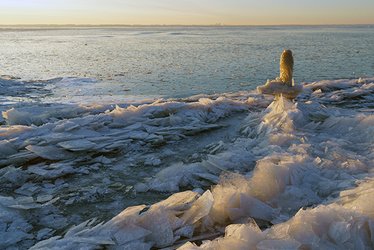
Figure 6. Original image (left) and processed with algorithm 3 (right).
Notice the significant neutralizing of the image. It’s almost as if the rising sun has been replaced by a gray sky. What happens here is not unlike what algorithm 2 did. The dark color here is clearly a blue. The light color is a yellow. Neutralize both, and the result is flat and dull. I think the contrast between the bright warm lights and the dark cool shadows is essential for this image.
Without the "Snap Neutral Midtones" setting, the result is way more blue, even more so than in figure 5. The midtone neutralization accounts for much of the dullness of figure 6.
Algorithm 4: Enhance Brightness and Contrast
Tooltip: Analyze image to do content-aware monochromatic enhancement
This is a relatively new option. Older versions of Photoshop only offer three choices. This algorithm is fundamentally different from the first three in the following aspects:
- It updates the RGB curve and leaves the color curves untouched
- Its result from a Curves adjustment is significantly different from what the same option under Levels delivers
- It doesn’t allow a user to switch the Snap Neutral Midtones checkbox, and it also grays out the target colors and clipping percentages.
- I only have a vague notion what the underlying algorithm is – but I’ll try to describe it nevertheless.
Figure 7 shows what this procedure does to our example image.
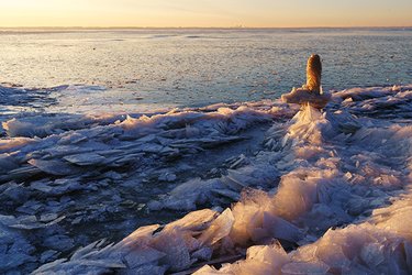
Figure 7. Original image (left) and processed with algorithm 4 (right).
Notice a serious contrast boost, making the shadows considerably darker and the sunlit areas lighter. The tooltip mentions “monochromatic” – a somewhat misleading term. The contrast curve strengthens colors as well as contrast. There is no hue shift, true, but saturation is certainly touched.
I did some testing with a number of example images, and came to the following (cautious) conclusions.
- The algorithm leaves the black control point alone (!). This is the case even for images with a dark point that is considerably lighter than black.
- The white control point is moved left if the algorithm feels so. In rare cases, it moves the point down but never by much.
- One, two or three control points are added on the RGB curve. The main underlying goal of these control points seems to be to add contrast in areas that are lacking it.
To illustrate point 3, have a look at figure 8 which shows the histogram of the original image, the curve that algorithm 4 comes up with, and the histogram of the resulting image.
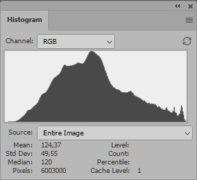
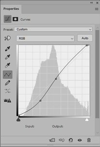
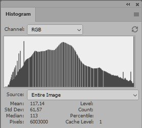
Figure 8. Original histogram, applied curve and resulting histogram.
Note that the peak of the original histogram is just below midpoint. The highest pixel counts are found between RGB values of around 80 and 140 (on a scale of 0 to 255). Looking at the image: these are the darker tones of the distant ice field, plus the lighter shadow areas in the bottom half of the image. The luminosity values of these areas together contribute to the peak of the histogram. Let’s call this the peak zone of the image.
Now the fourth Auto algorithm adds two control points: one at (134, 133) and one at (78, 54). This makes the darkest pixels of the peak zone considerably darker, while keeping its lightest pixels more or less untouched. The peak zone of the original histogram look more spread out in the histogram of the resulting image. The net result is more contrast in the peak zone. I believe this is roughly what the algorithm tries to accomplish. It’s a questionable objective. Image areas containing the least contrast (hence, that show a peak in the histogram) aren’t necessarily the most important parts of an image. To what extent the “content-aware” part of the tooltip takes this aspect into account, I don’t know.
Last but not least, setting control points that can add contrast in any range of luminosity values is something that is not possible with the Levels adjustment. For that reason, Curves and Levels differ considerably in this fourth Auto-option. Figure 9 shows the result of the current Auto option applied on a Curves (left) and on a Levels (right) adjustment layer. On Level, three control points can be moved: black, gray and white, but the result is significantly weaker than it is for Curves.
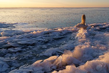
Figure 9. Result of algorithm 4 on Curves layer (left) and on Levels layer (right).
What next?
As soon as you’re happy with the chosen algorithm, click OK. Now what? The adjustment has already been applied to the image. The Auto Options popup is simply closed. But the Curves window (or Levels if you worked from that) is still open. You may be not fully content with the result so far, and continue adjusting the controls. There is nothing wrong doing that – however be aware that right when the Auto Color Correction Options dialog is reopened, these fine-tuning adjustments are rolled back and the same automated algorithms are reapplied!
The Auto menu actions
Photoshop’s Image menu contains three actions that have Auto in their names: Auto Tone, Auto Contrast and Auto Color. Each of these is mentioned in the tooltip of three of the Auto algorithms, and of course this is not accidental: they are linked. Let’s have a look at each.
- Auto Tone does the same as Enhance Per Channel Contrast, in its currently saved settings, except for the Snap Neutral Midtones switch (in Auto Tone, it is assumed off).
The settings that it does take into account are Shadows, Midtones and Highlight and the clip percentages. Change these, save as defaults and an application of Auto Tone will follow these. - Auto Contrast does the same as Enhance Monochromatic Contrast, including the currently saved clip percentages. It ignores the Snap Neutral Midtones switch (assuming it off) and the Shadows, Midtones and Highlights definitions (assuming them to be 0, 128 and 255 for each channel).
- Auto Color does almost the same as Find Dark & Light Colors, in its currently saved settings, except for the Snap Neutral Midtones which it assumes to be on.
I say almost because in my testing, there was a minimal difference, I think in the midtones. But for normal practical usage, the two alternatives give pretty much equal results.
Note that there is no equivalent menu action for the fourth Auto algorithm, at least not yet. Maybe some future Photoshop version will provide one.
The Auto actions on the Image menu are simple but powerful actions that may give an indication that something is not right in your image, whether color- or contrast-wise. They should never have the final word, but can serve as a “sanity check” for your image. You may be looking at a serious color cast without being aware of it. Auto Color may bring it out, even though you are of course entitled to ignore its result if you disagree.
But… be aware that all Auto actions, just like the Auto button itself, depend on some saved defaults in the Auto Color Corrections Options panel. A mindless click is in general not a good idea. Make sure you know which algorithm is applied, and if you don’t, open a Curves or Levels adjustment layer, Alt-click the Auto button, pick your parameters and see what happens. Automatic is not the same as invariable.
Explaining all the auto options provided enough material for a full-sized article. Understanding them is the key to using the Auto button and Auto menu actions to your advantage. And if you still don’t like what they do, ignore them and revert to the native Levels or, better, Curves adjustment.
Gerald Bakker, 9 May 2021
Related articles


Photoshop by the Numbers
